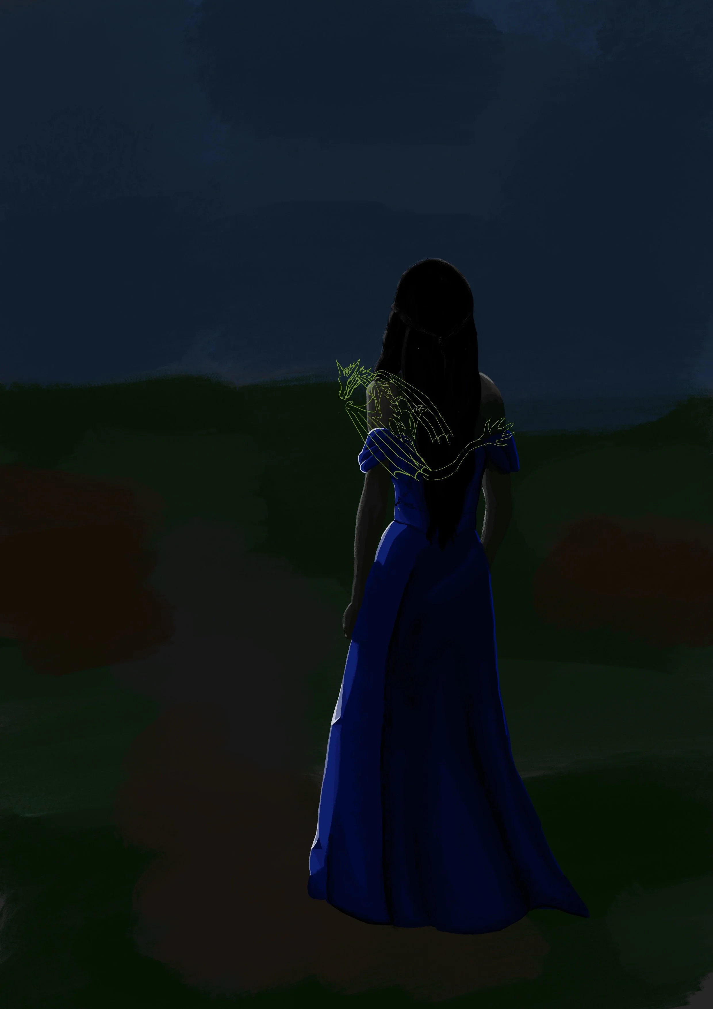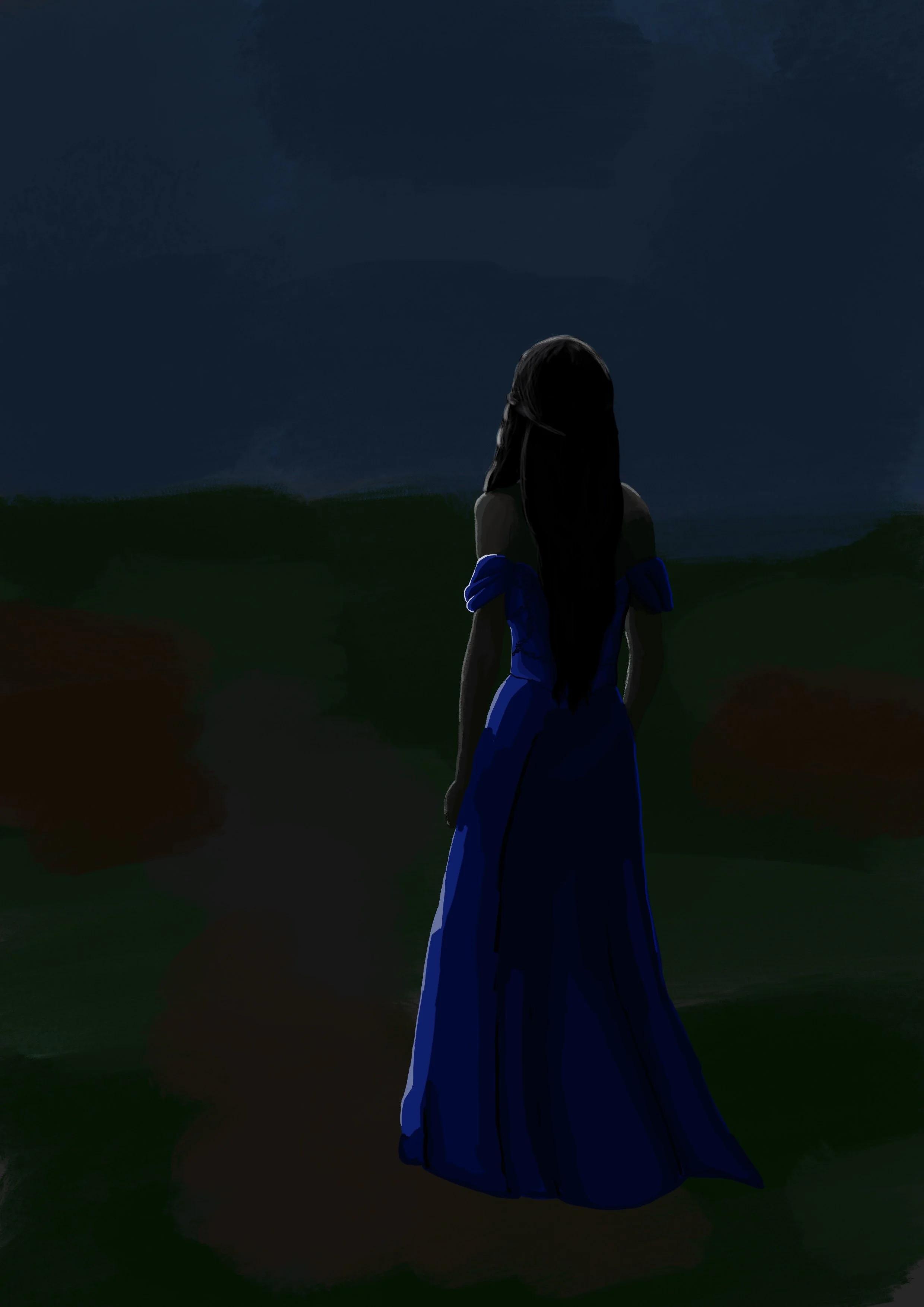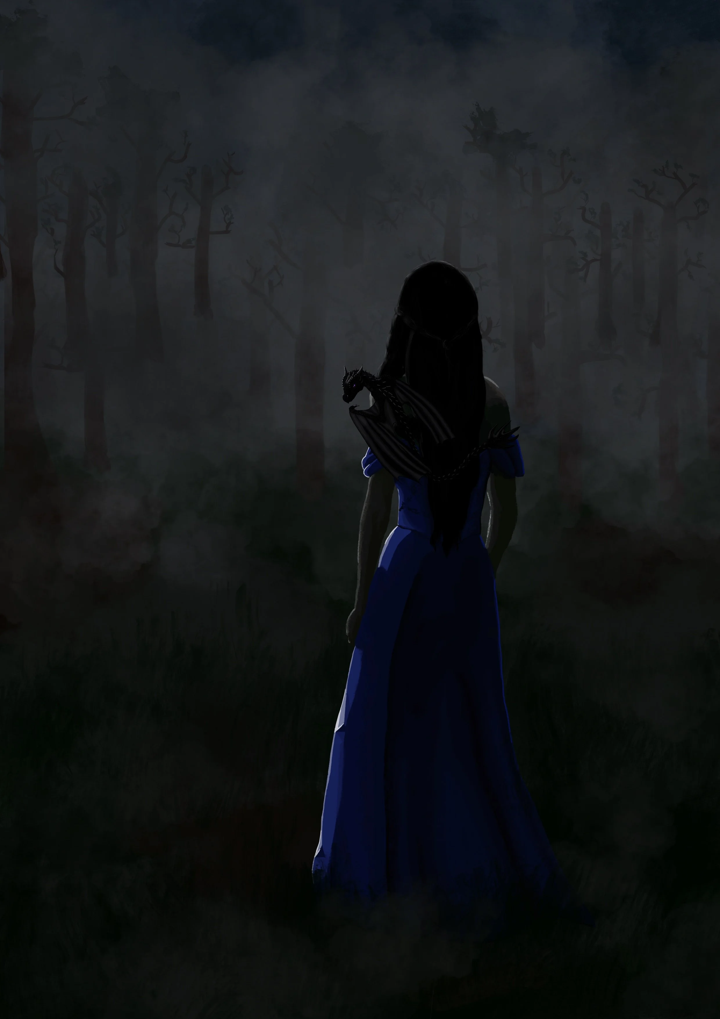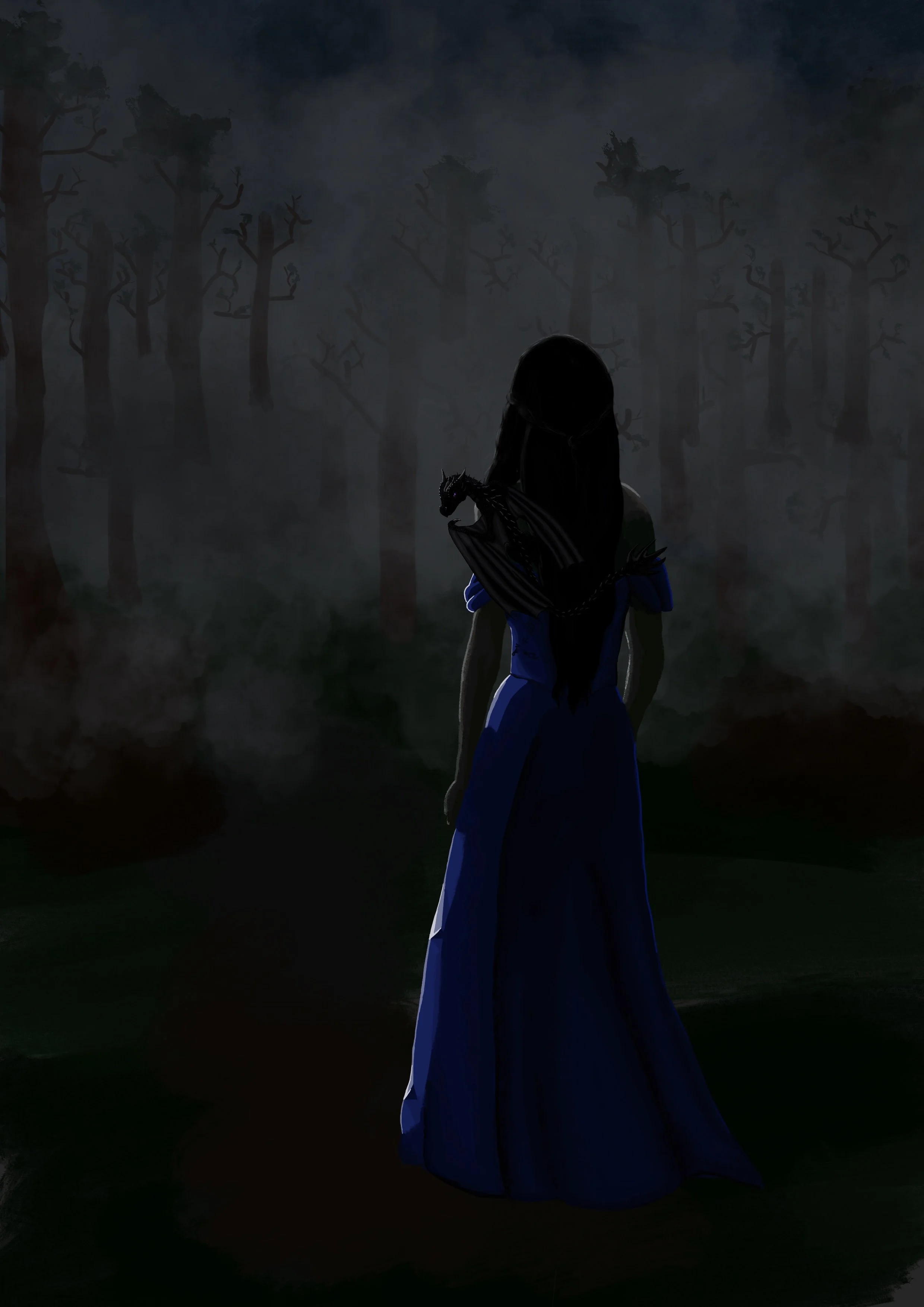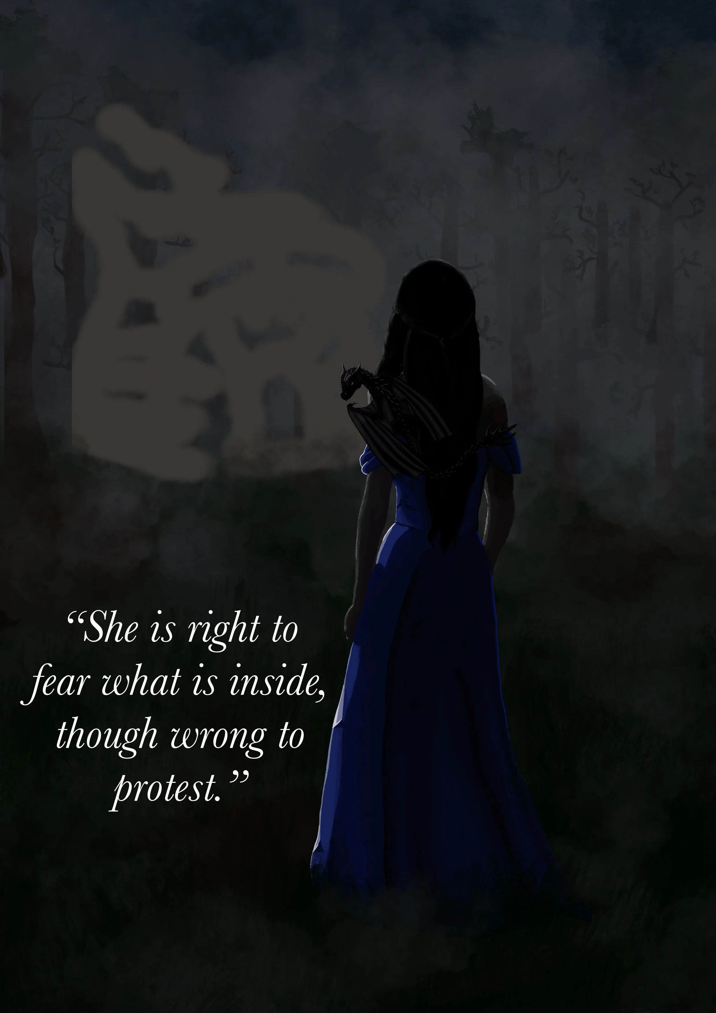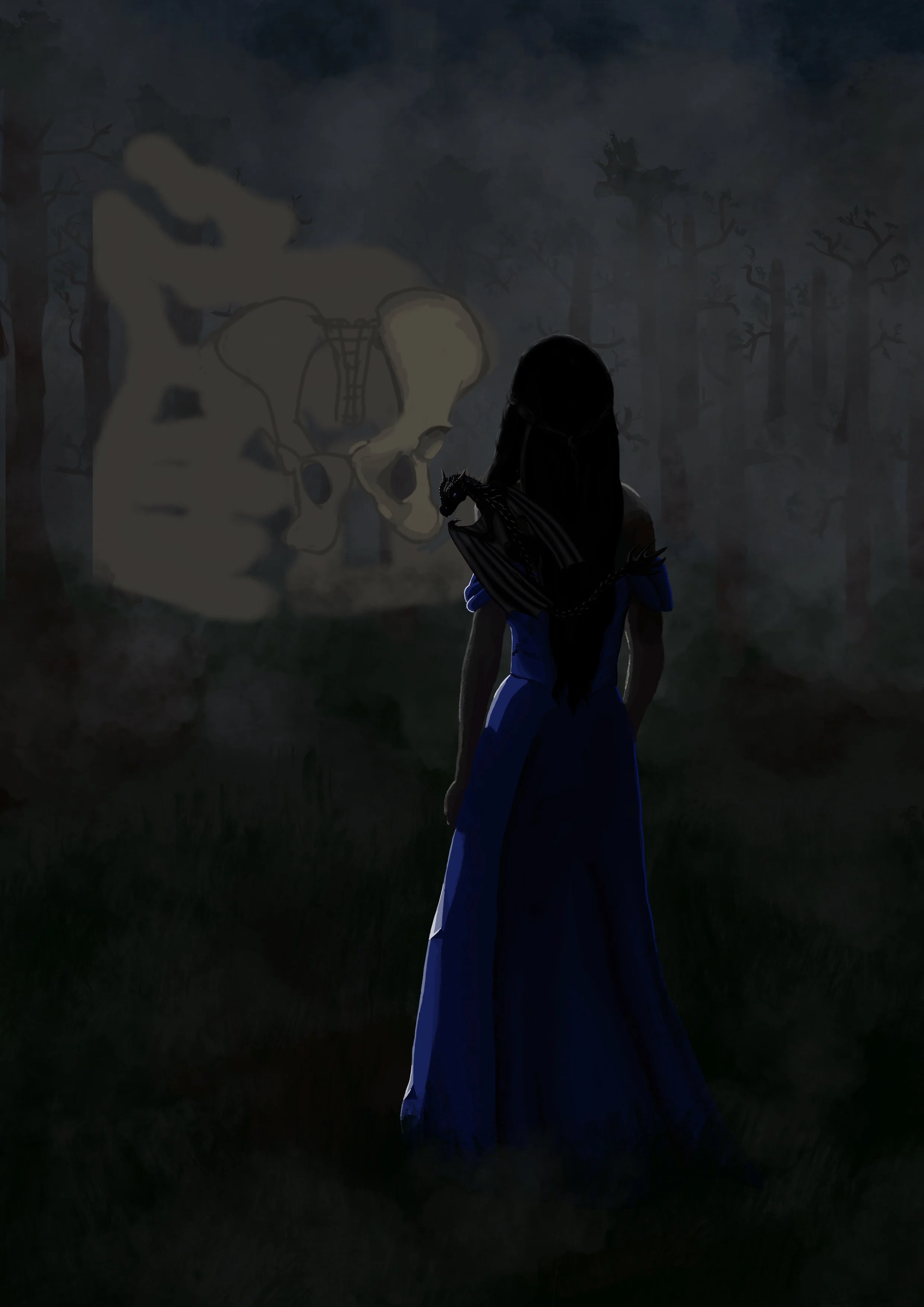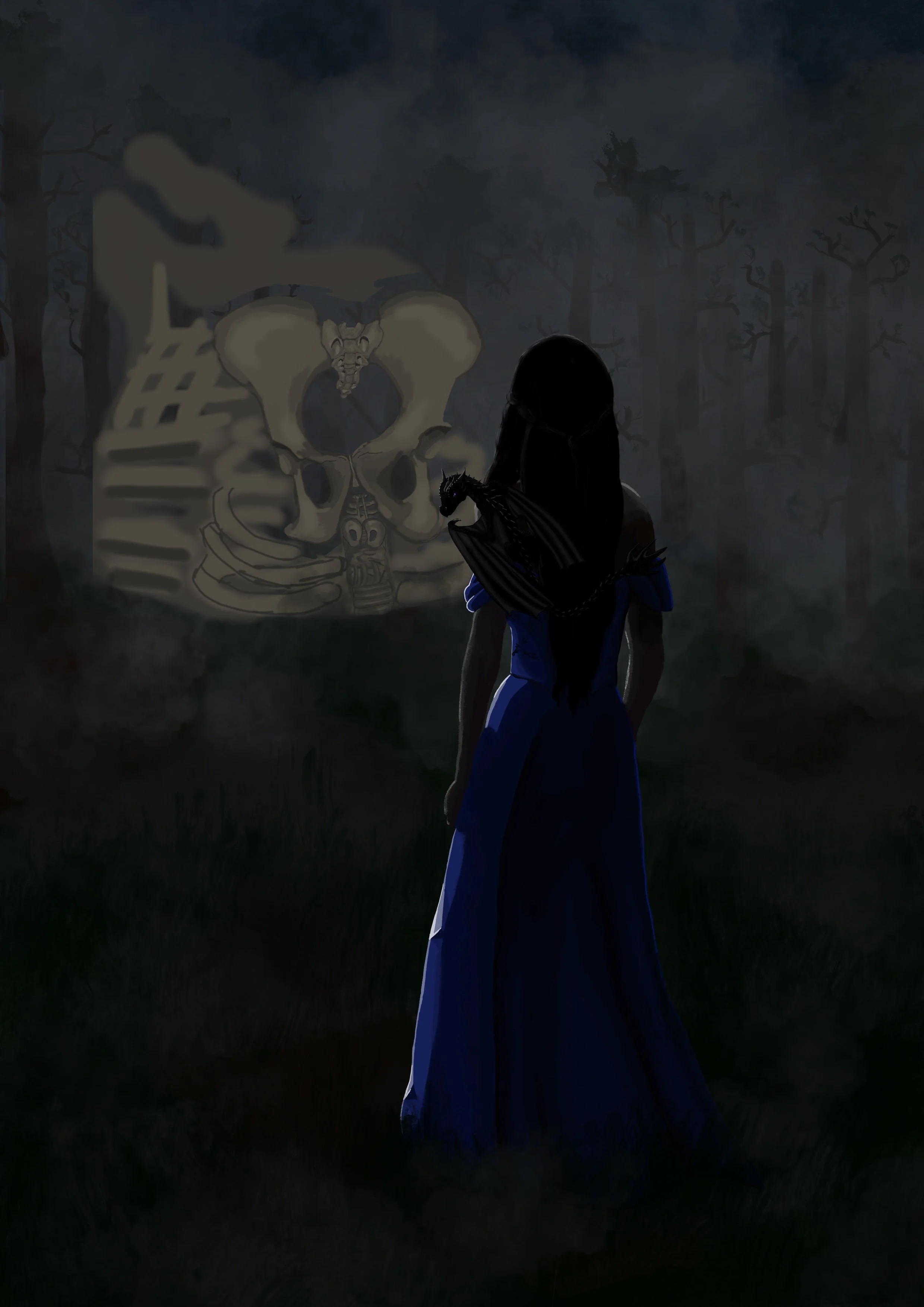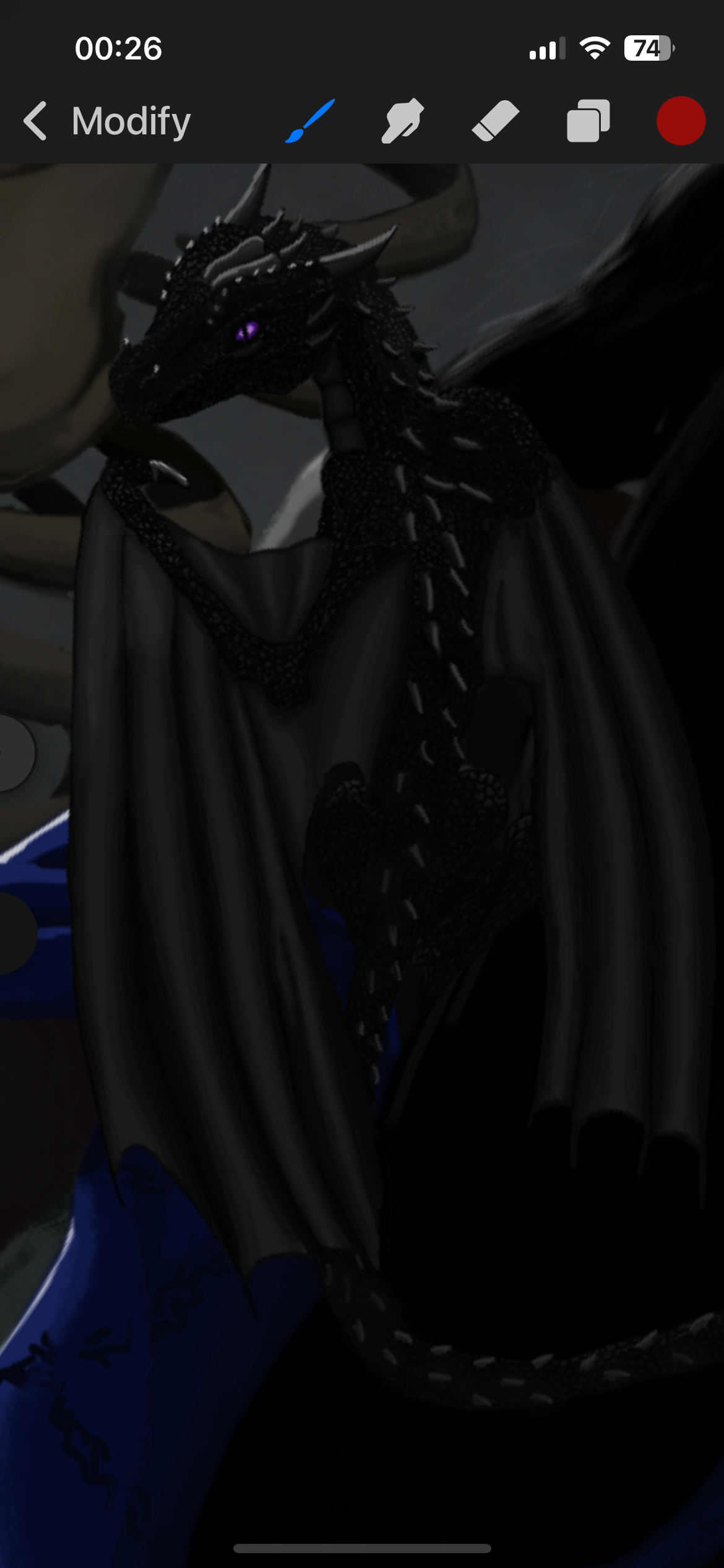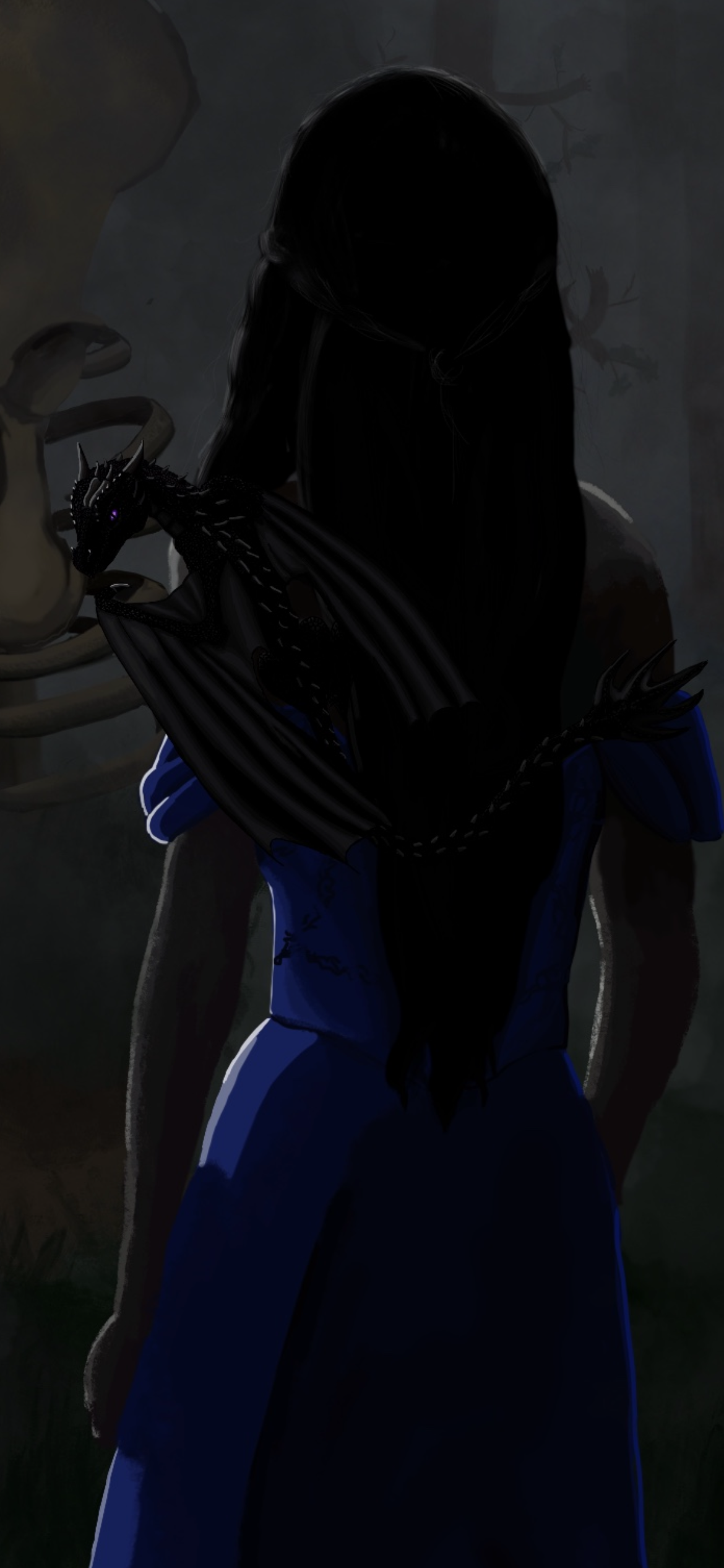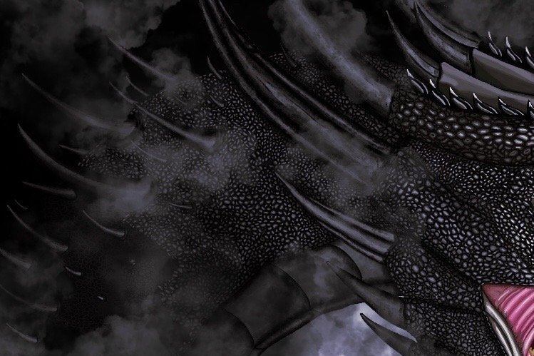
It actually upsets me that I can’t show the full thing yet because it looks sooooo good! I’m so excited to share this!
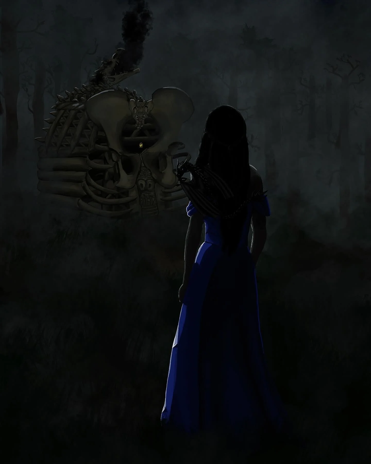
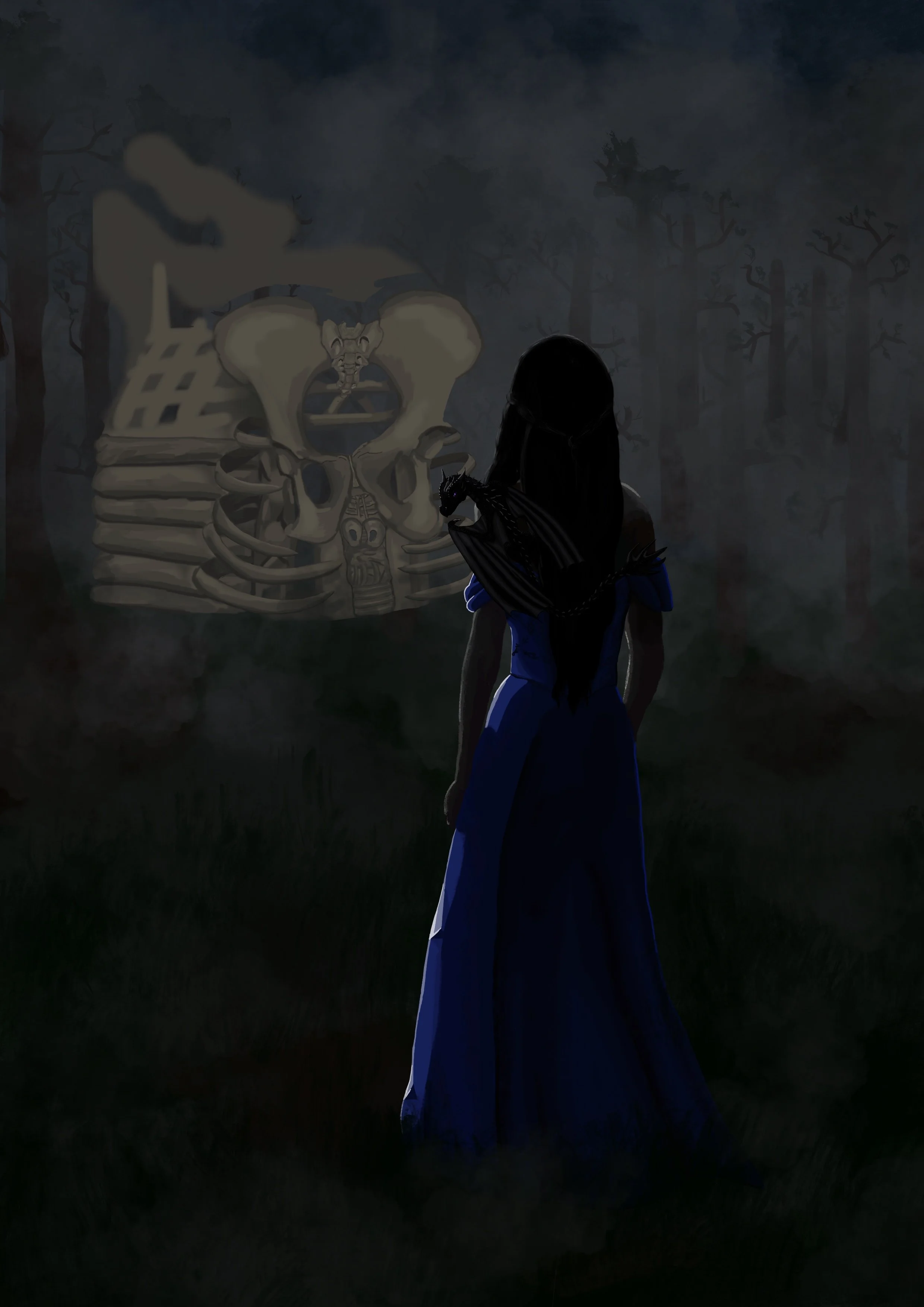
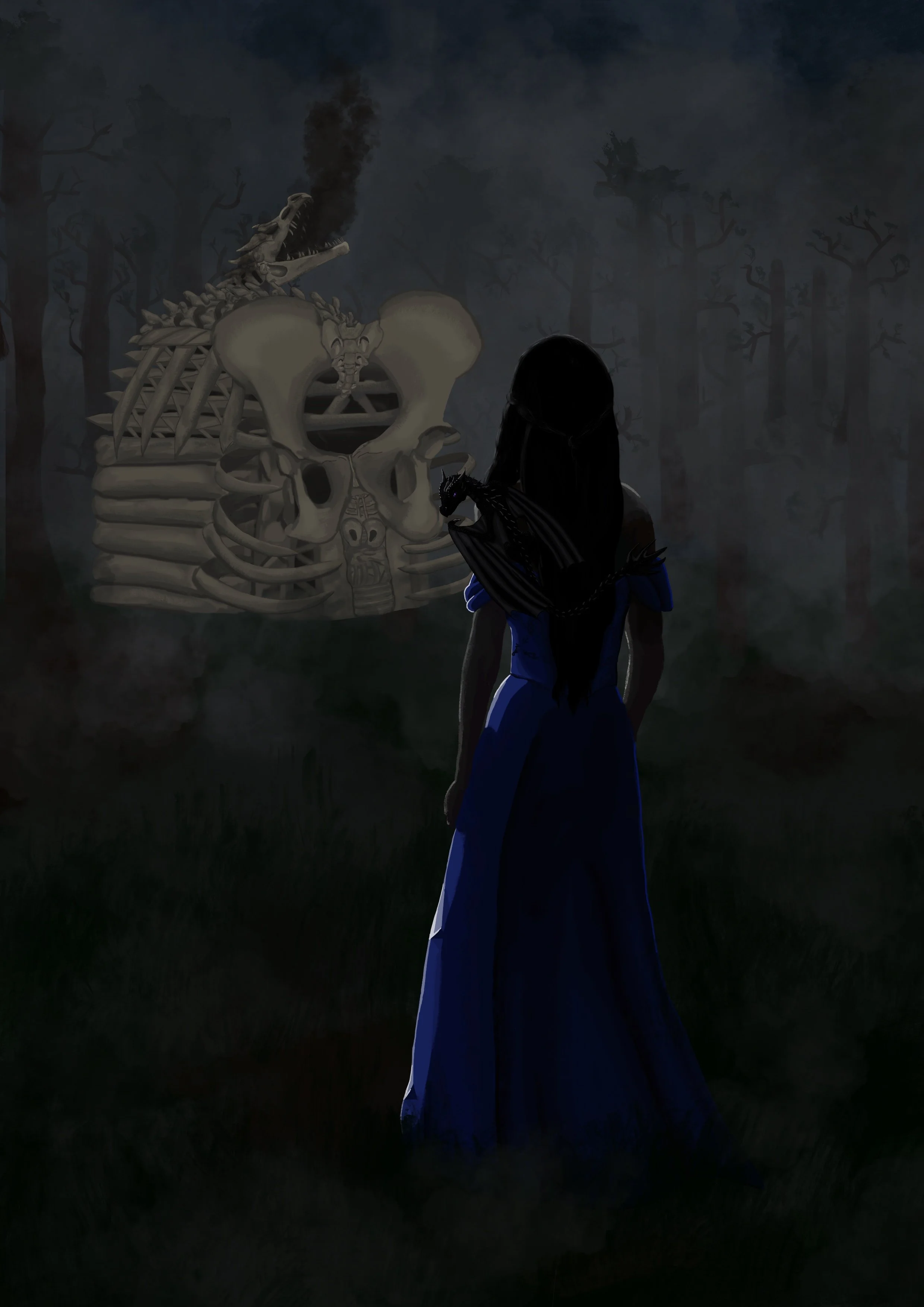
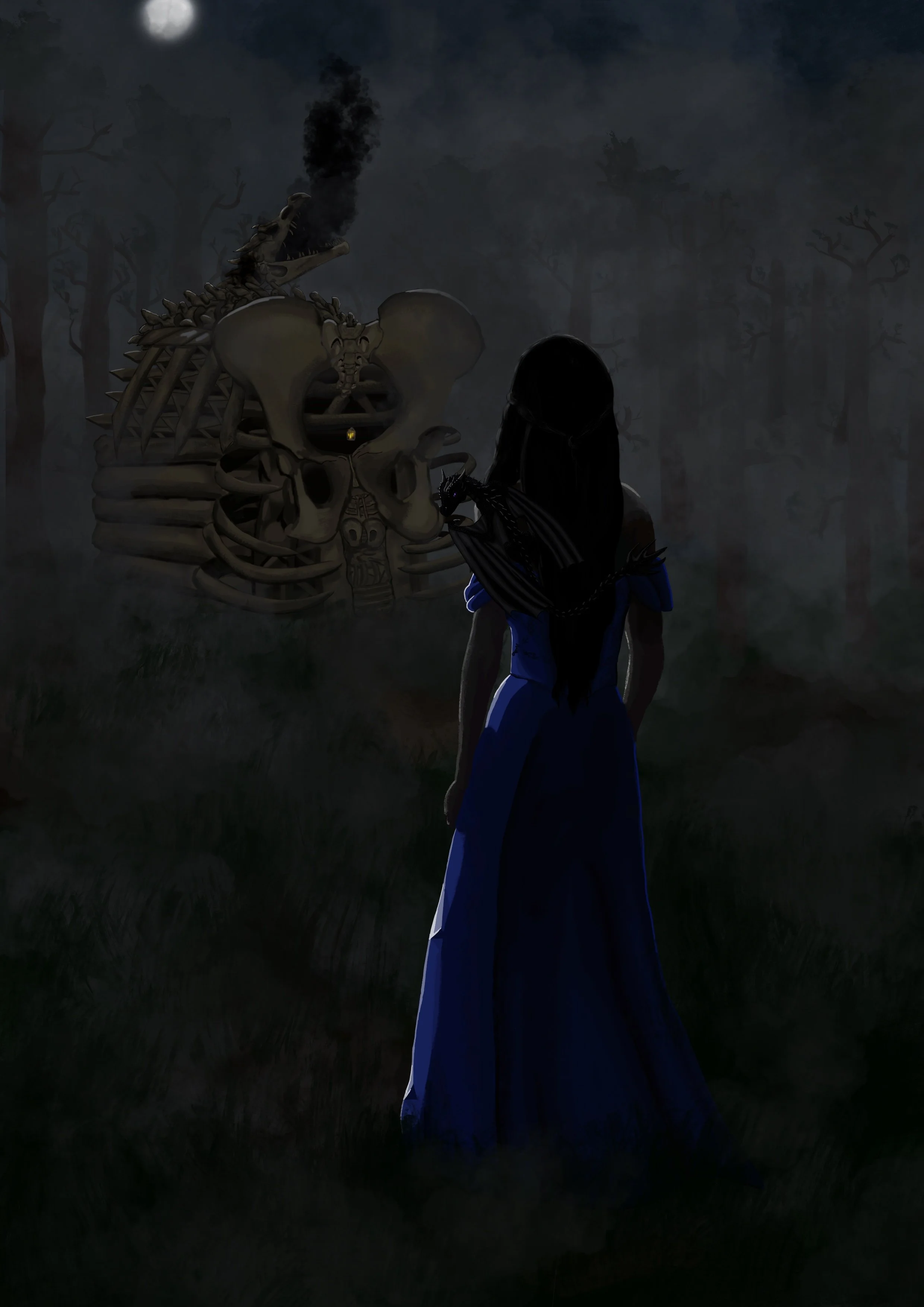
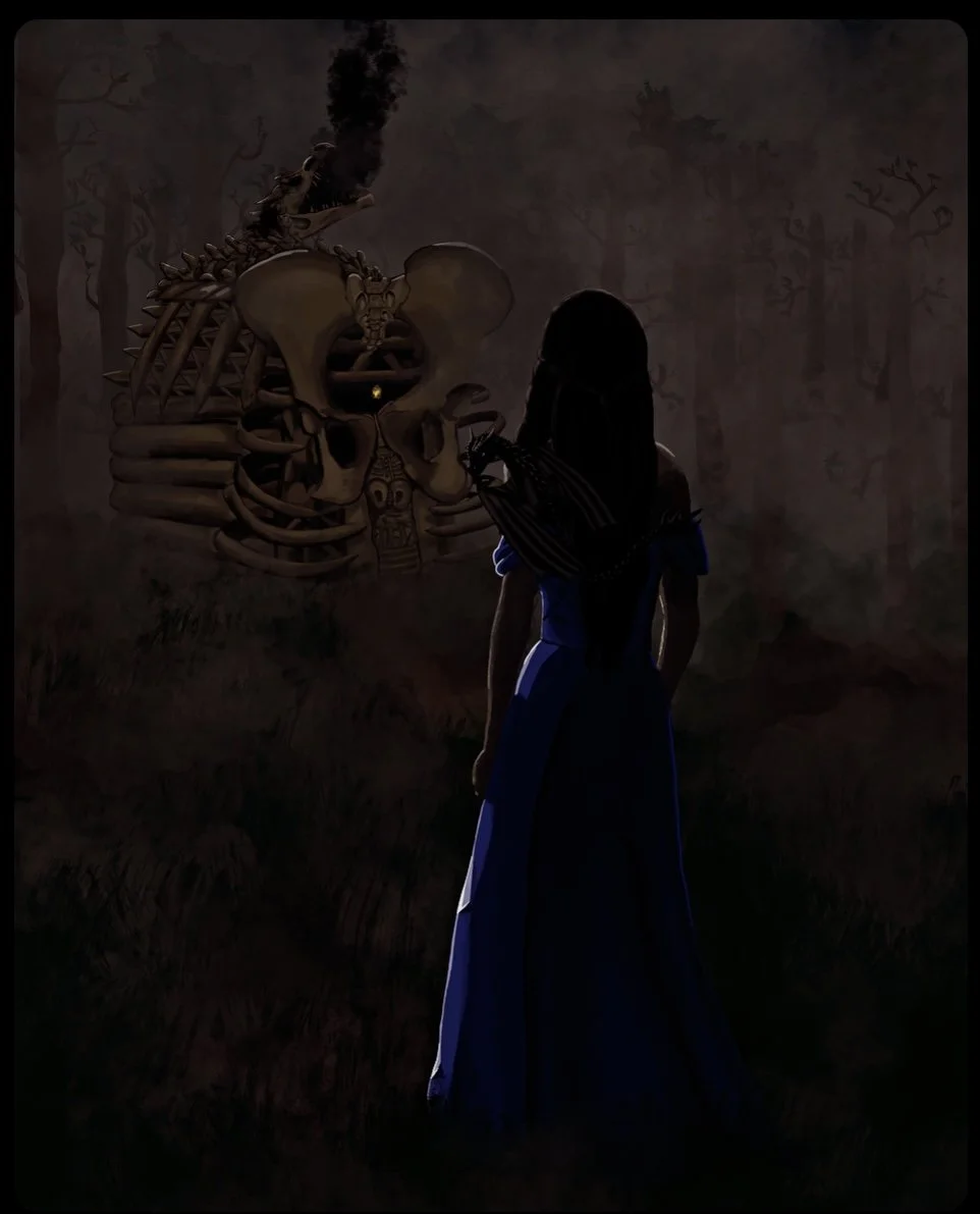
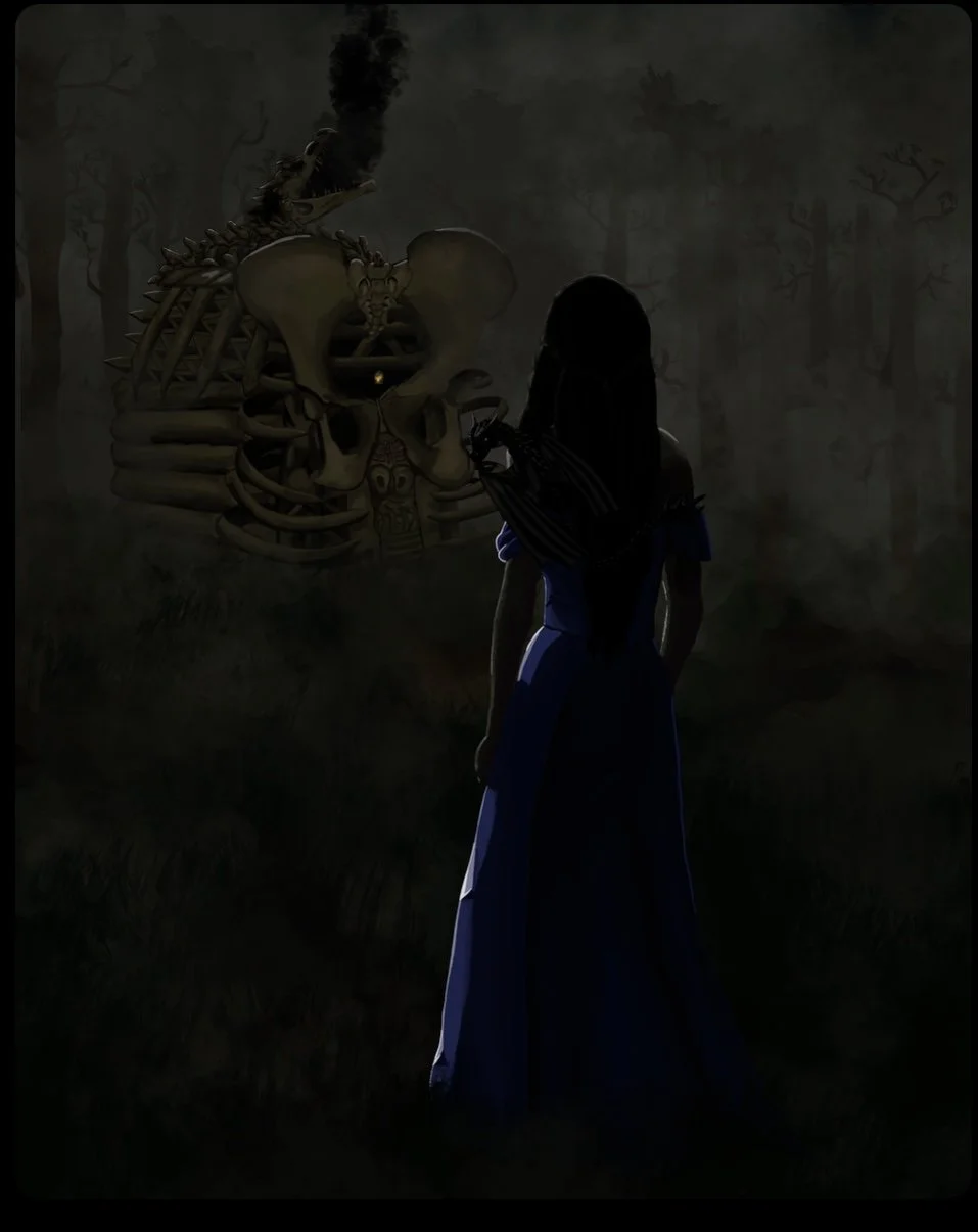
Staring out to the House of Bones
But what does this mean?
If only I had a simple answer to give … unfortunately, I cannot spoil the context within this piece, but I will update this once the story is out.
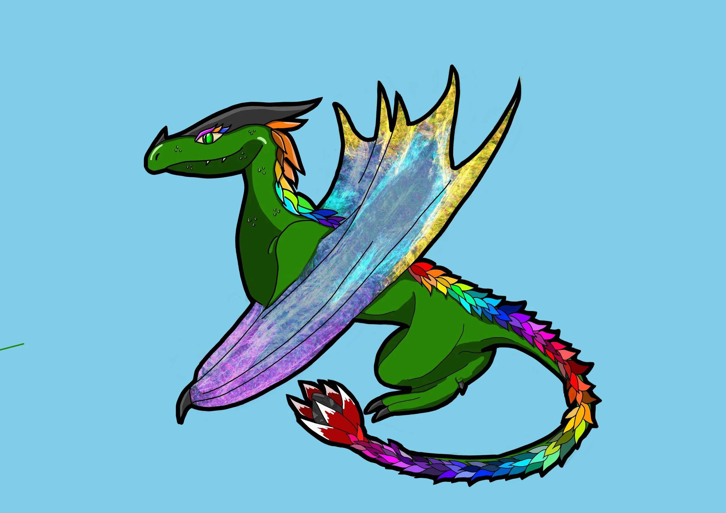
But for now, I shall tell you that the main protagonist (and her dragon) went on a search for ‘the House of Bones’. What that means, I cannot say. But let’s delve into the art behind it.
Who are they?
What I will tell you is the young woman in the piece is called Cynthia. She is a princess in hope to find out the truth of her father’s mysterious death. On her shoulder, is her pet dragon called Caliban, but how the two are connected is a mystery.
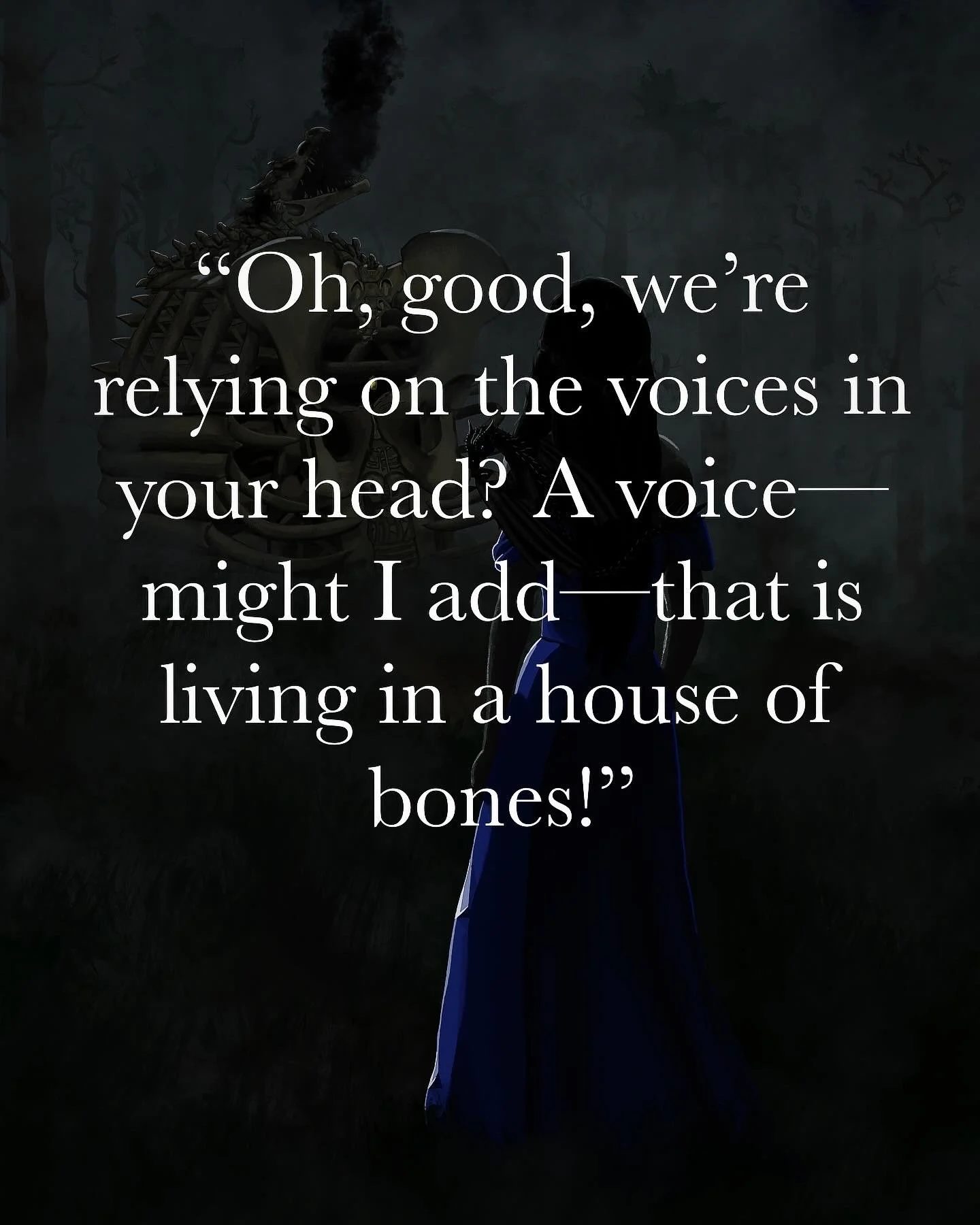
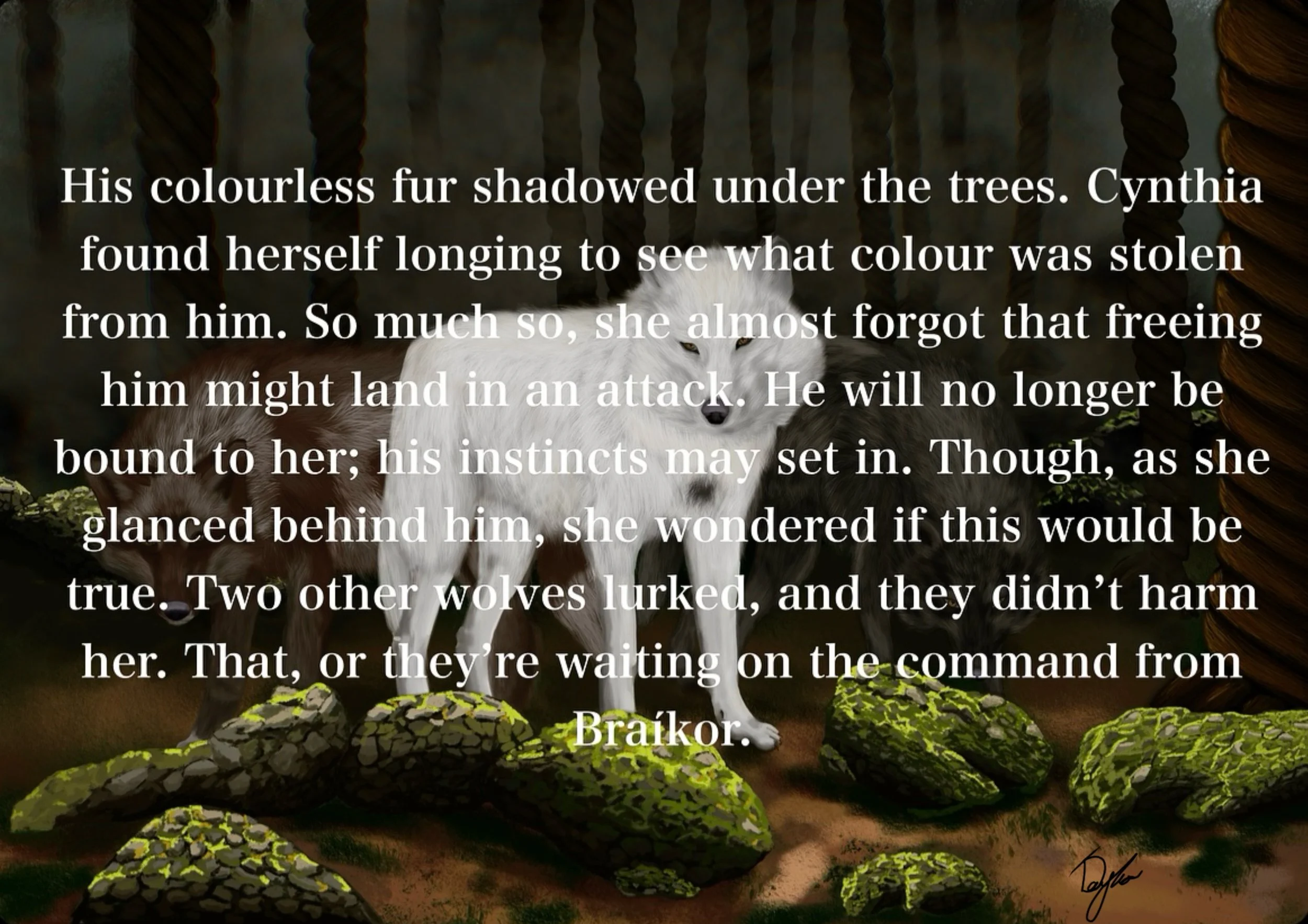
The first text is the words of the creature that lives within the House of Bones and the second text is from Cynthia’s maid, Rosalie. Unfortunately for her, she is often dragged along into Cynthia’s dangerous ideas.
The Beginning Idea
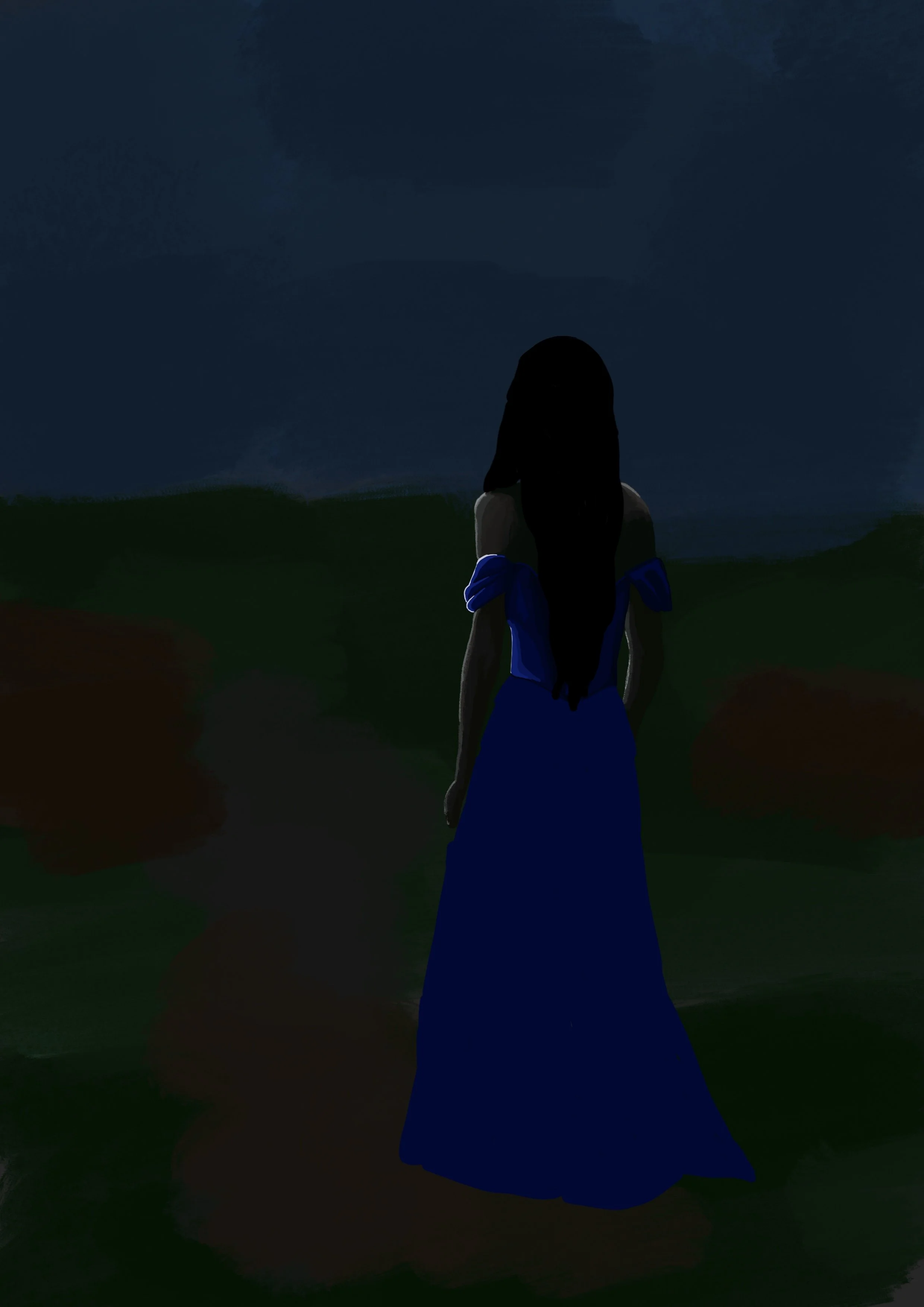
I wasn’t really sure what I was aiming for when I started this. I am not keen on doing character faces, I prefer to leave those details for the readers to imagine, so I knew I wanted Cynthia to look out to the House of Bones, but before I did that, I had to figure out the tone.
I couldn’t remember if I had a specific description of what dress Cynthia was wearing at this point, so I decided to put her in the blue dress she wears within the chapter ‘Corpses in the Battlefield’.
And of course, within this point, Caliban would be close by her side. I picture a lot of his appearances within the book to be of him lurking on her shoulders.
The Forest
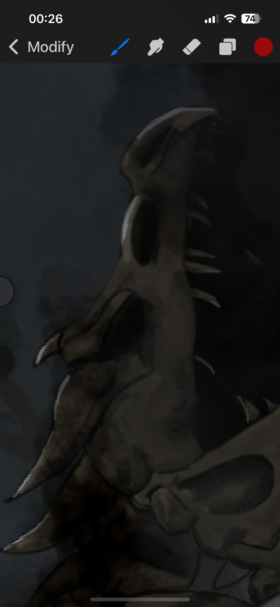
First of all, apologies, I forgot to save the process of Caliban … forgive me.
The House of Bones lives within a forest, but not the forest with spiralling trees you will see in many more art pieces from this book.
It takes place within a darker forest, a more dangerous one. I know I haven’t portrayed it to its fullest potential, but as much as I love trees … I HATE drawing clusters of them in the background. So I figured I’d get away with it with this as it is not the main central focus.
The Process of Bones
I hope you know, I started this having zero clue on how I was going to draw this. I don’t draw bones in my spare time to absolutely everyone’s surprise.
I used the ‘airbrush’ tool the entire time while creating this and started by creating a general shape. I didn’t have an overly strict description except for the large pelvic bone. Make of that what you will.
I decided to add the giant ribcage to make the house seem more threatening. The overall translation: ‘Don’t enter this house or you will become a part of the structure. Enter at your own will <3’
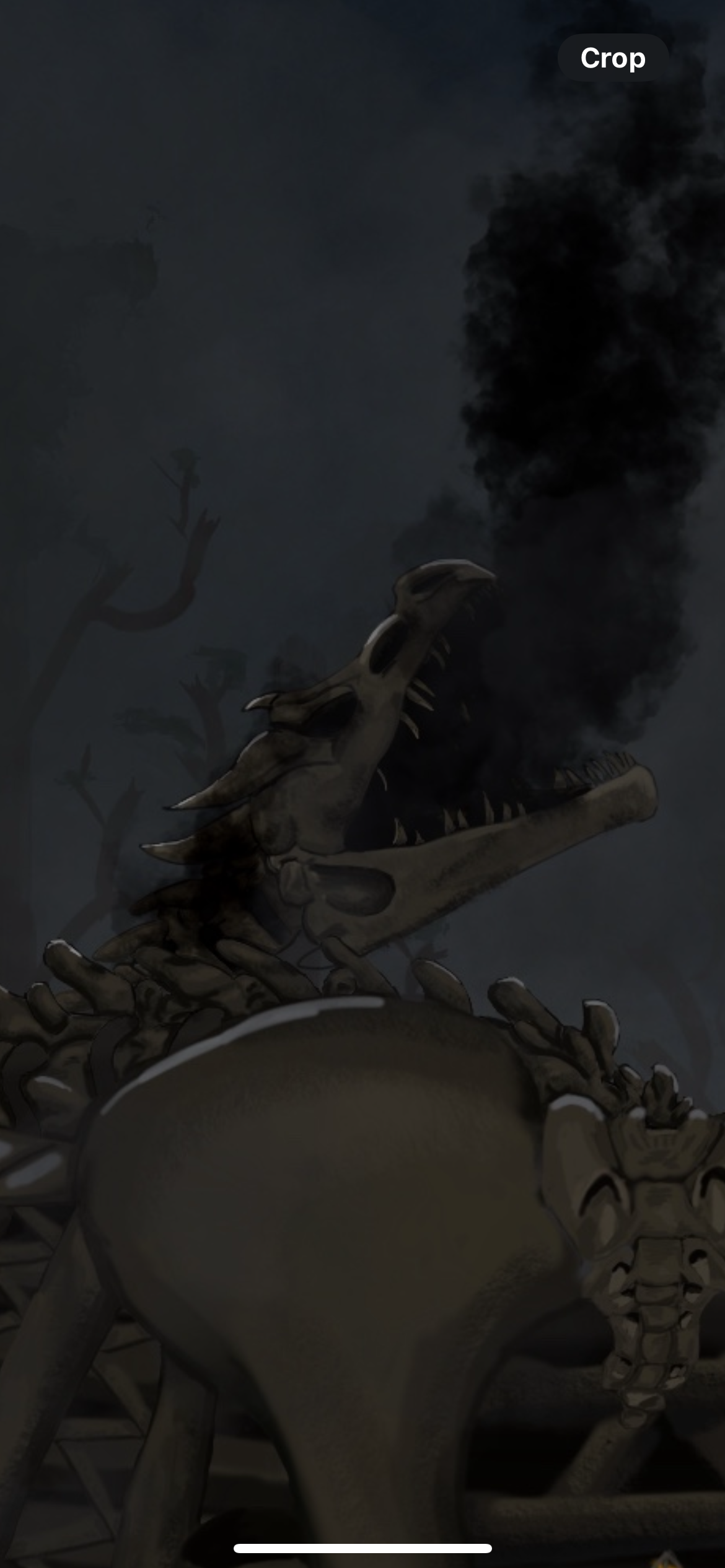
I’m hoping you noticed the dragon head chimney before I pointed it out, but I thought that was a really fun feature to add. It was the last thing I needed before fixing the tone to match the dark brooding forest behind.
Little Dragon
Little as he may be, Caliban isn’t all he appears to be. Keep that in mind.
He is, of course, the dragon that I have yet to show the full portrait of above, but I tried to replicate some of his features condensed into a smaller form.
Which was hard. He really is a little guy in this drawing. I also wanted to illuminate his purple eyes. I see now that he does look like the ender dragon from Minecraft … but my real intent for the purple eyes was birthed from Cynthia’s iconic purple dress. You won’t have seen much of this, but I had this Cynthia concept I made yeaaaars ago.
To me, tone is a very important part of creating the atmosphere within my ideas. I don’t always see things clearly, but tone is how I connect my thoughts to my art. I know how the tone makes me feel, so I know when what I have created is wrong.
Tone
That being said, I am so indecisive when it comes to using a final overlaying filter. I like seeing it from all its different possibilities.
Cold and haunting like how Cynthia feels, misty like her knowledge of what she’s trying to uncover, angry from her betrayals, evil like the land she walks amongst, and finally, sadness, from her loneliness.
All match but I can’t choose them all. Nevertheless, I hope my decision will match your thoughts once you read it within the book.
The Direwolves
Who is Braíkor?
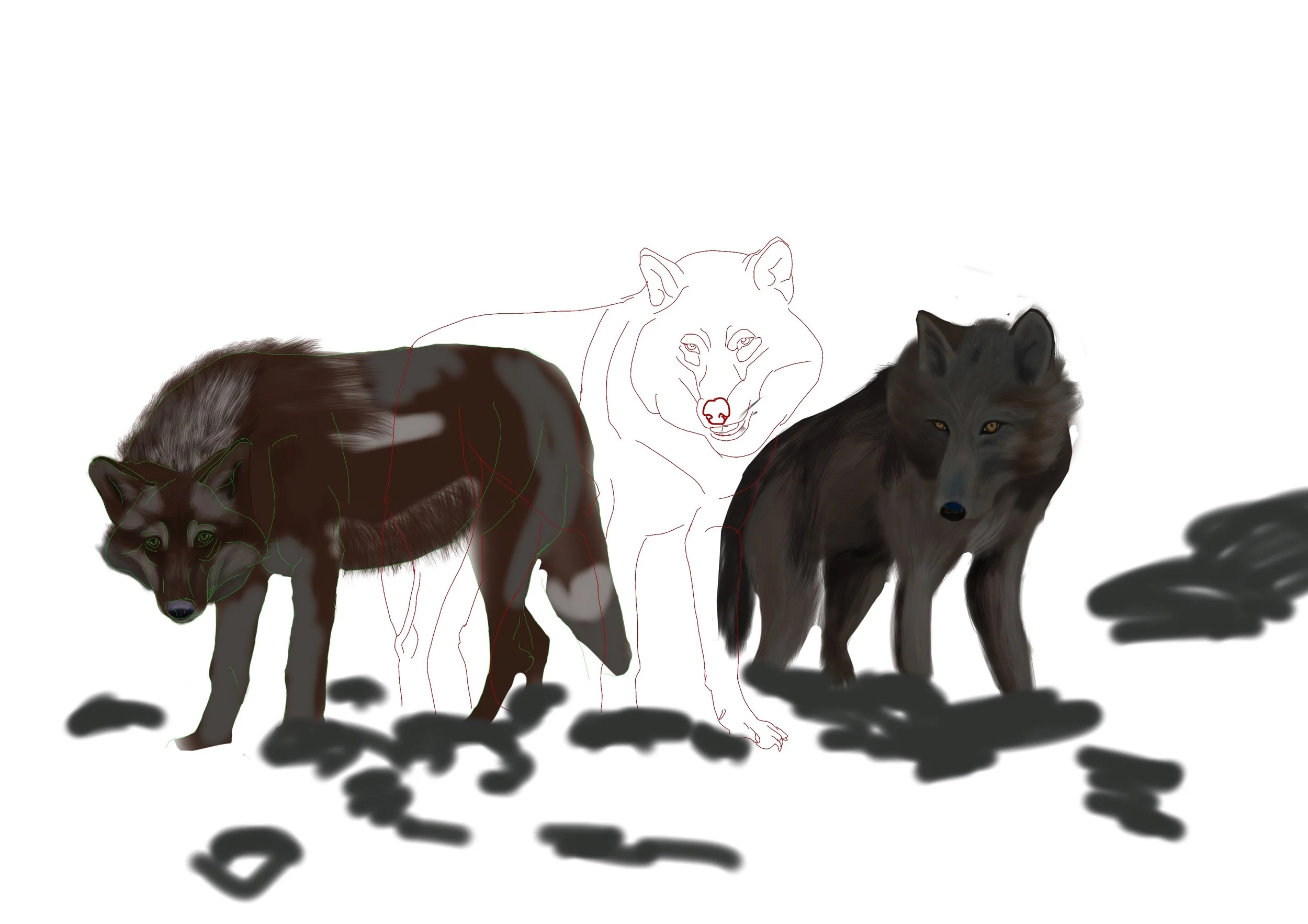
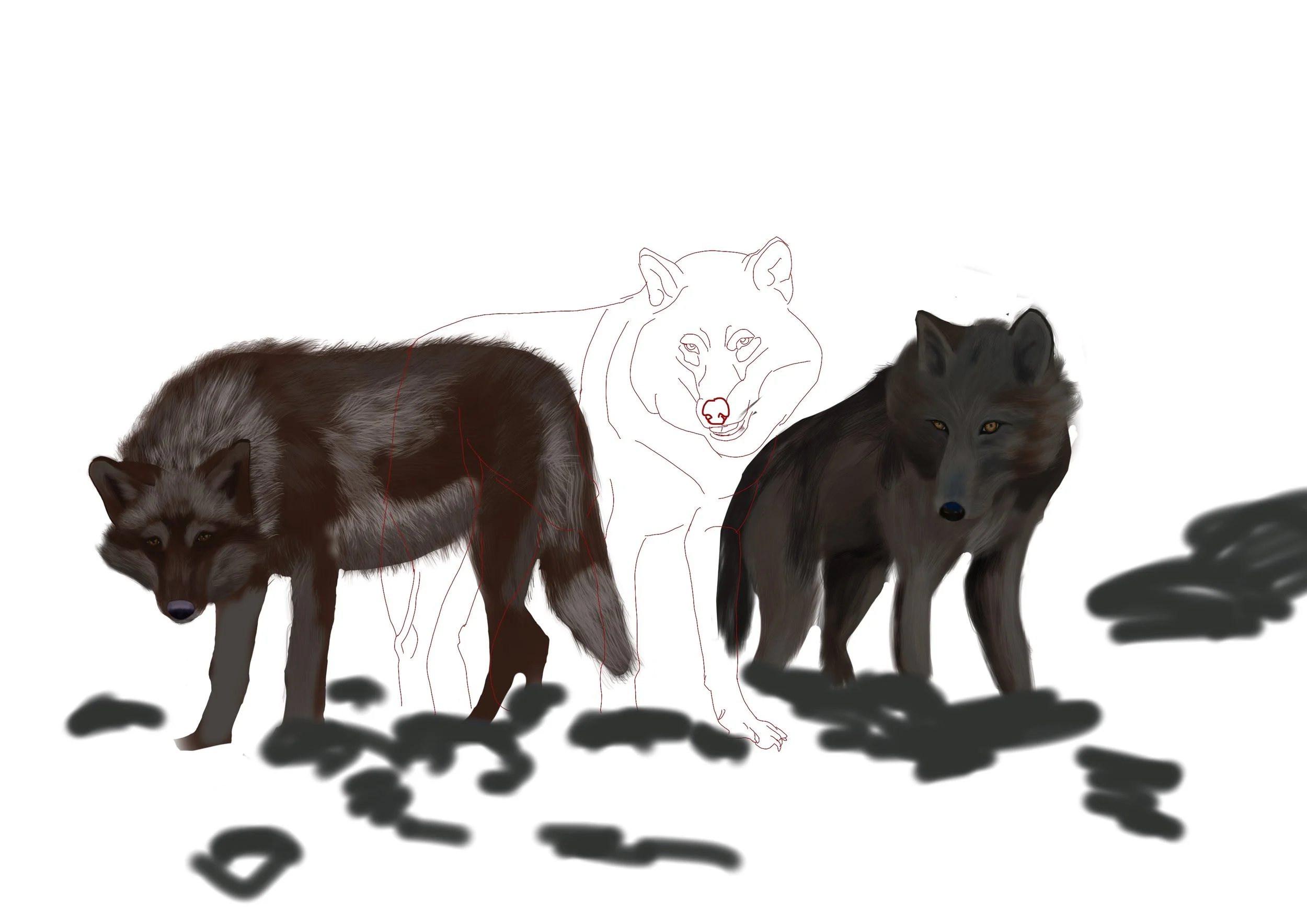
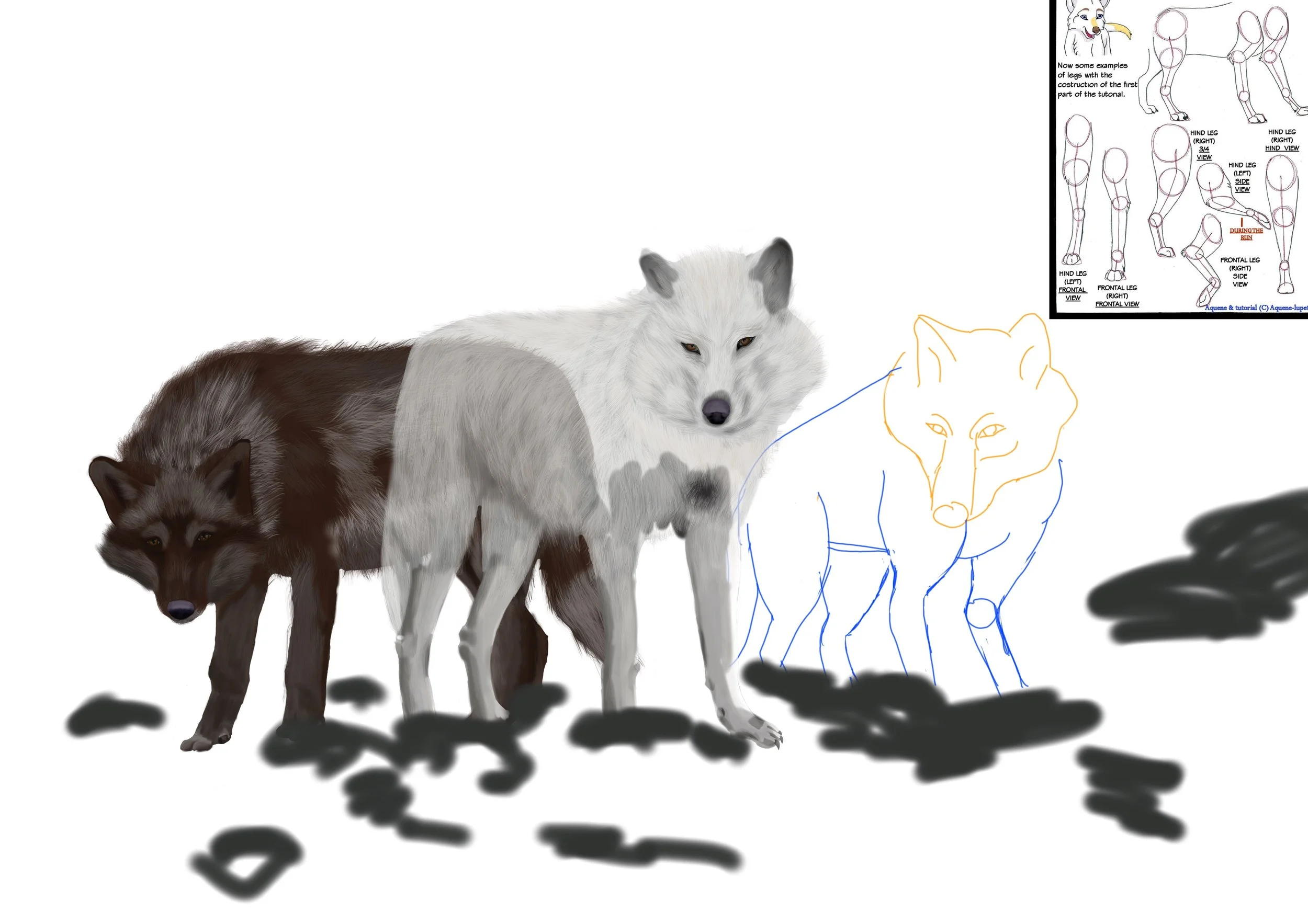
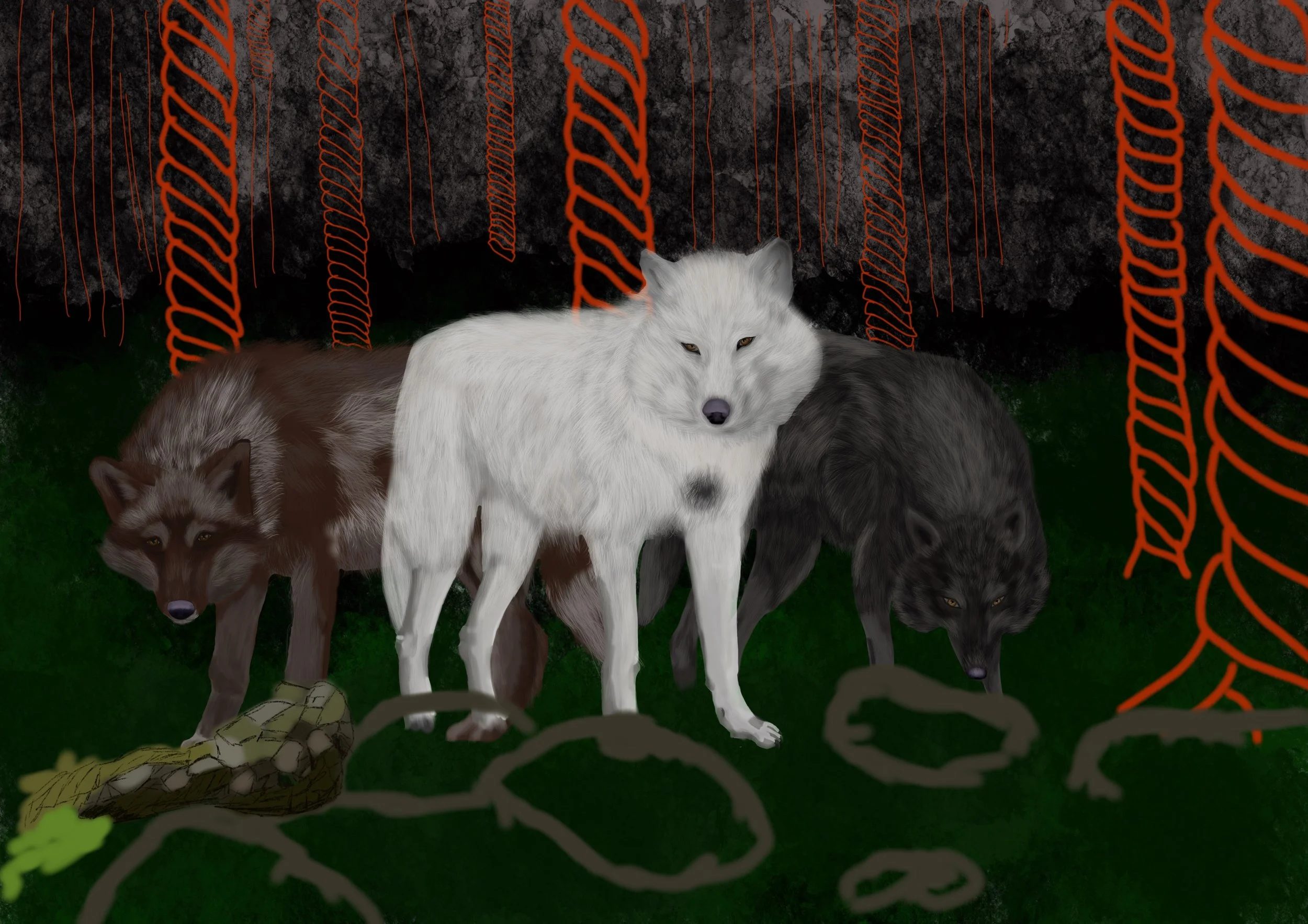
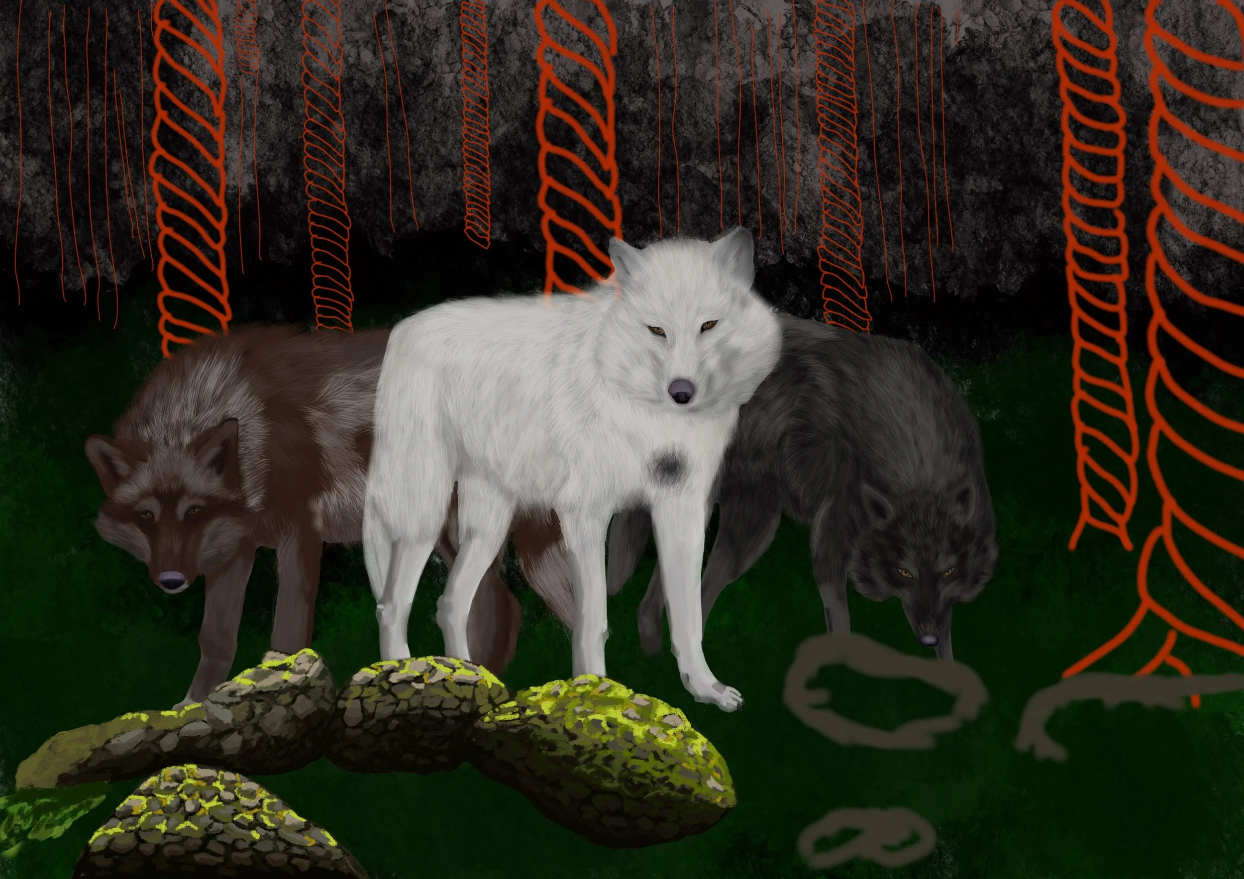
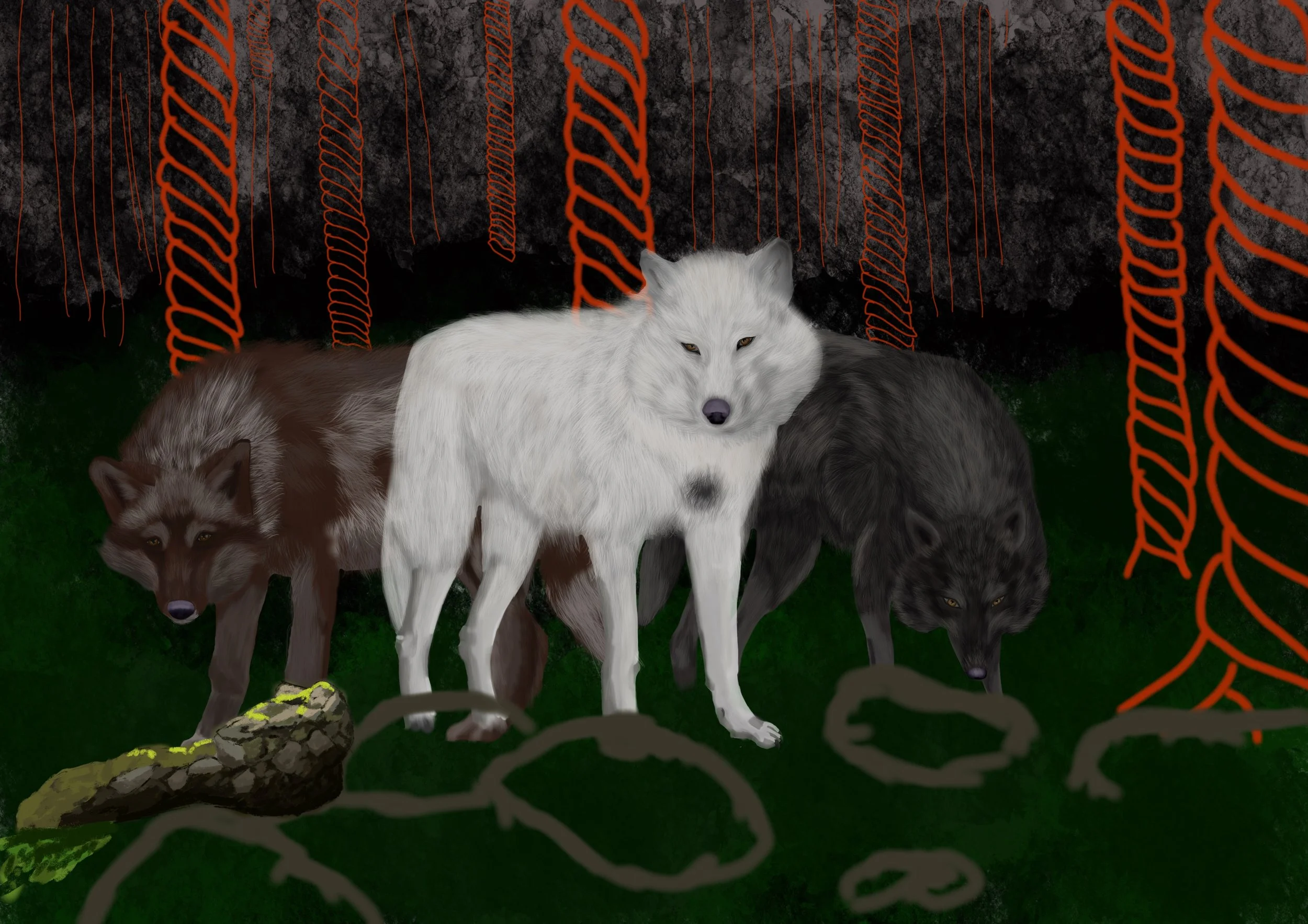
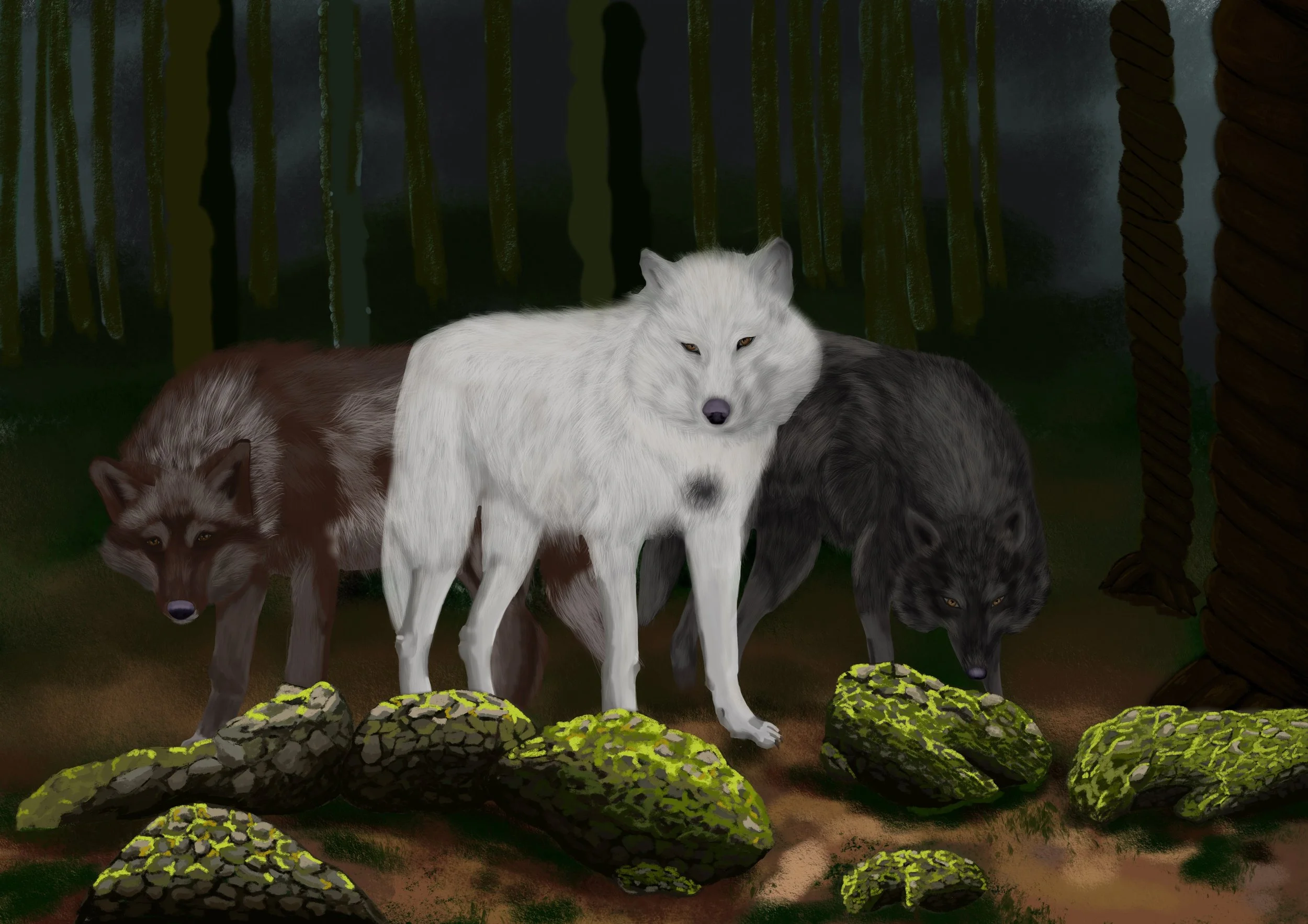
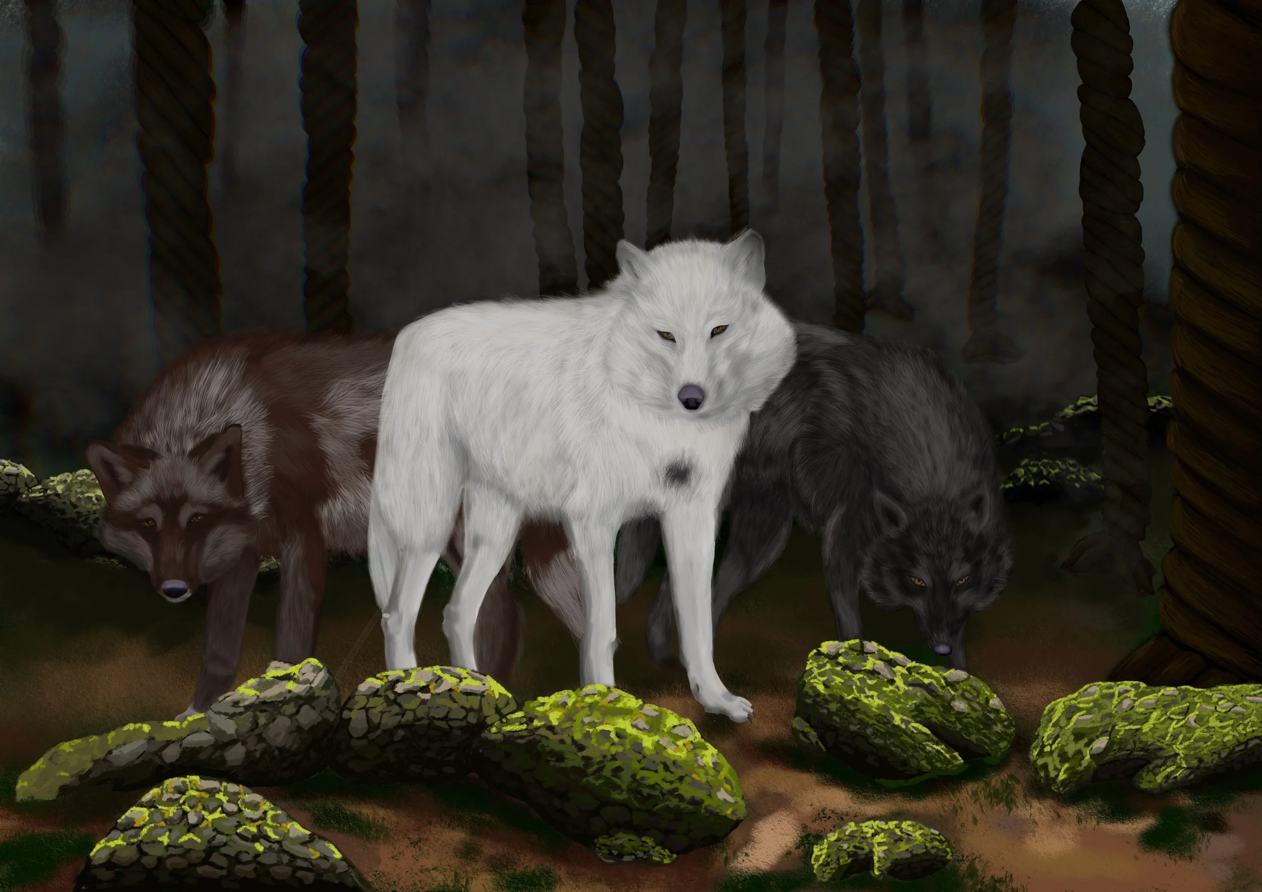
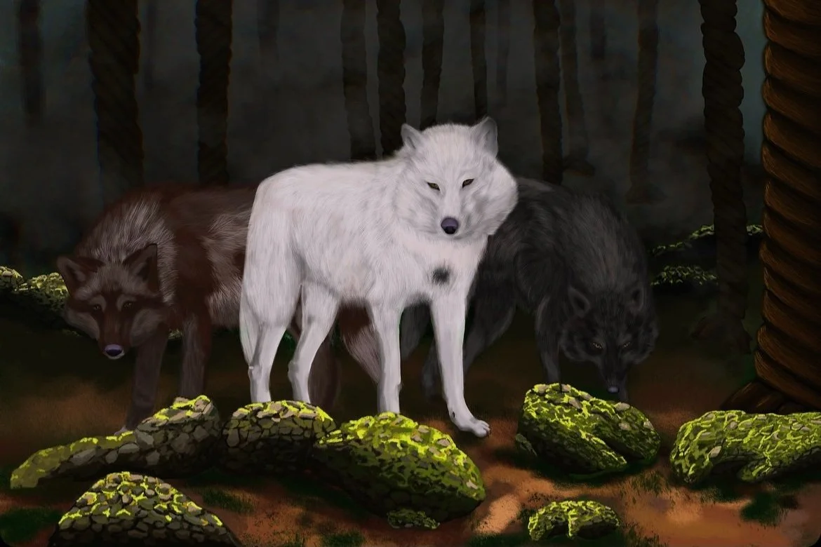
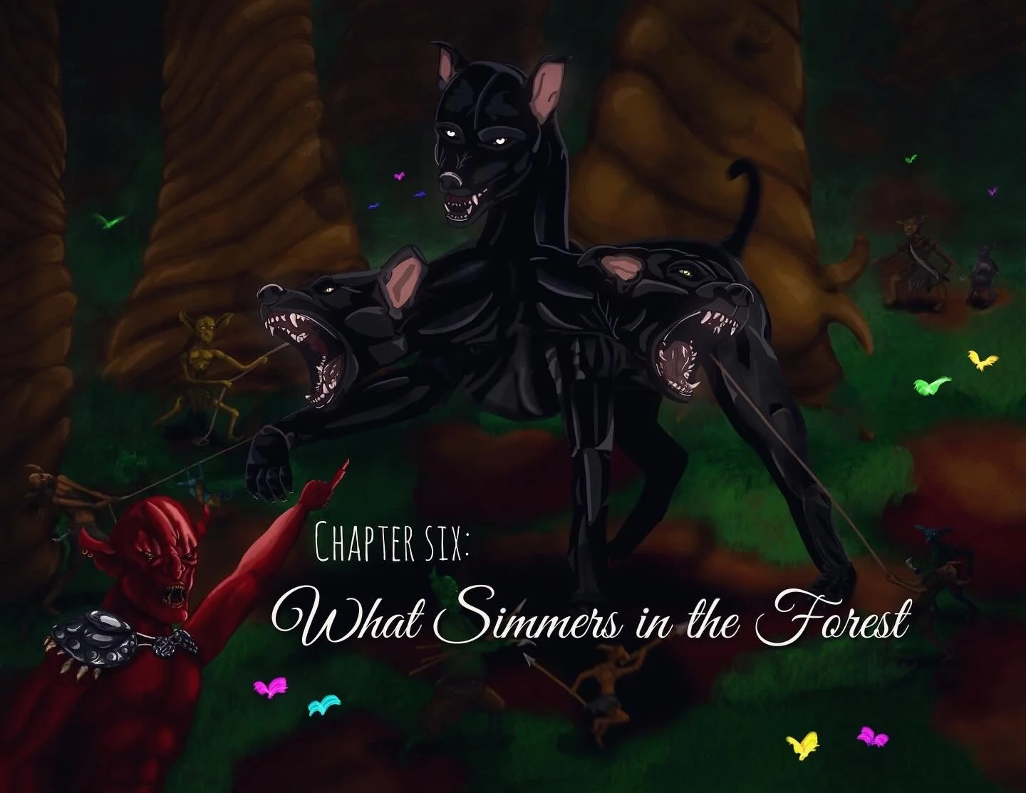
Three wolves, nothing too mysterious. Not until you understand that the white wolf has been robbed of his colour.
I cannot explain the context behind this but like Cynthia’s dragon, this particular wolf has a similar connection to her. Connection, or something else?
Starting Foundations
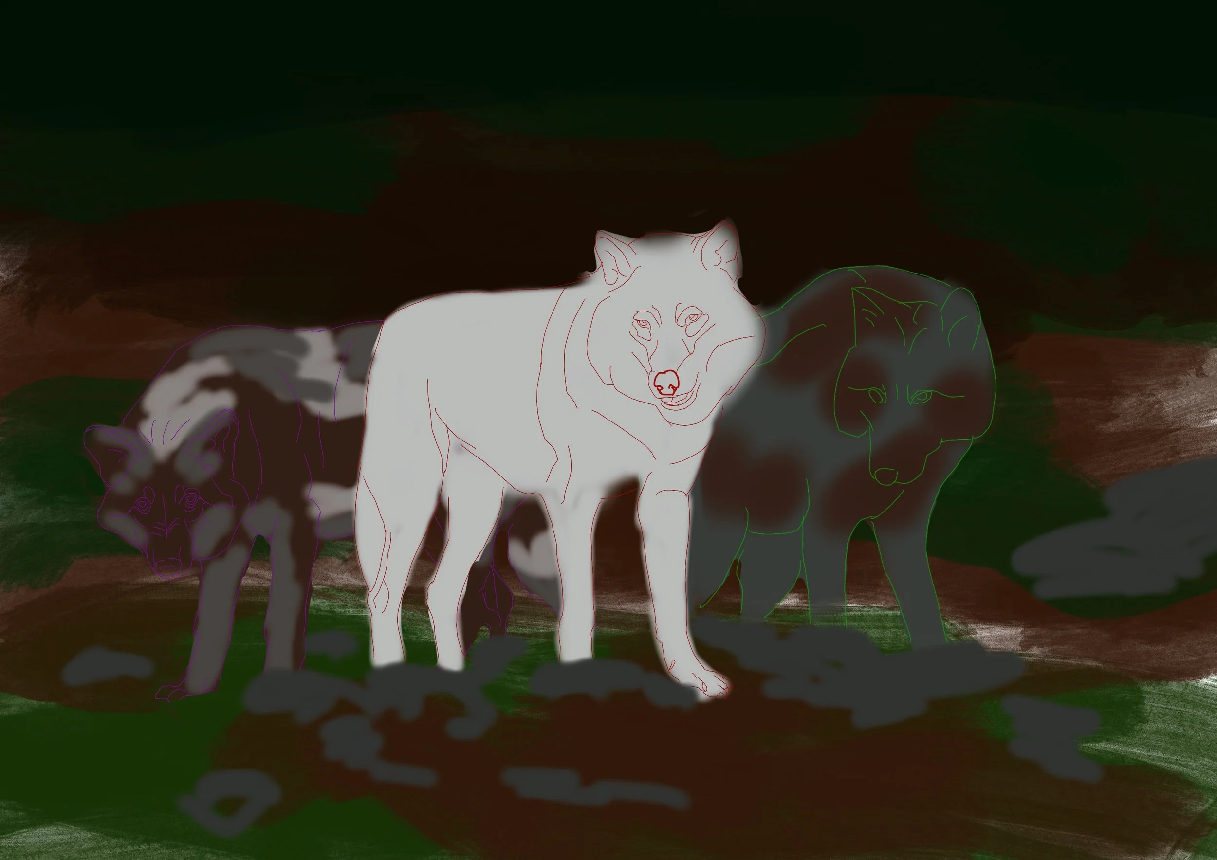
Yeah … so drawing wolves isn’t something I’ve ever done through digital art. I have never been good at it by hand, so I wasn’t totally confident, but I started with vague outlines and airbrushed my colour ideas.
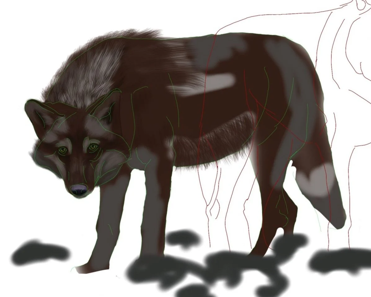
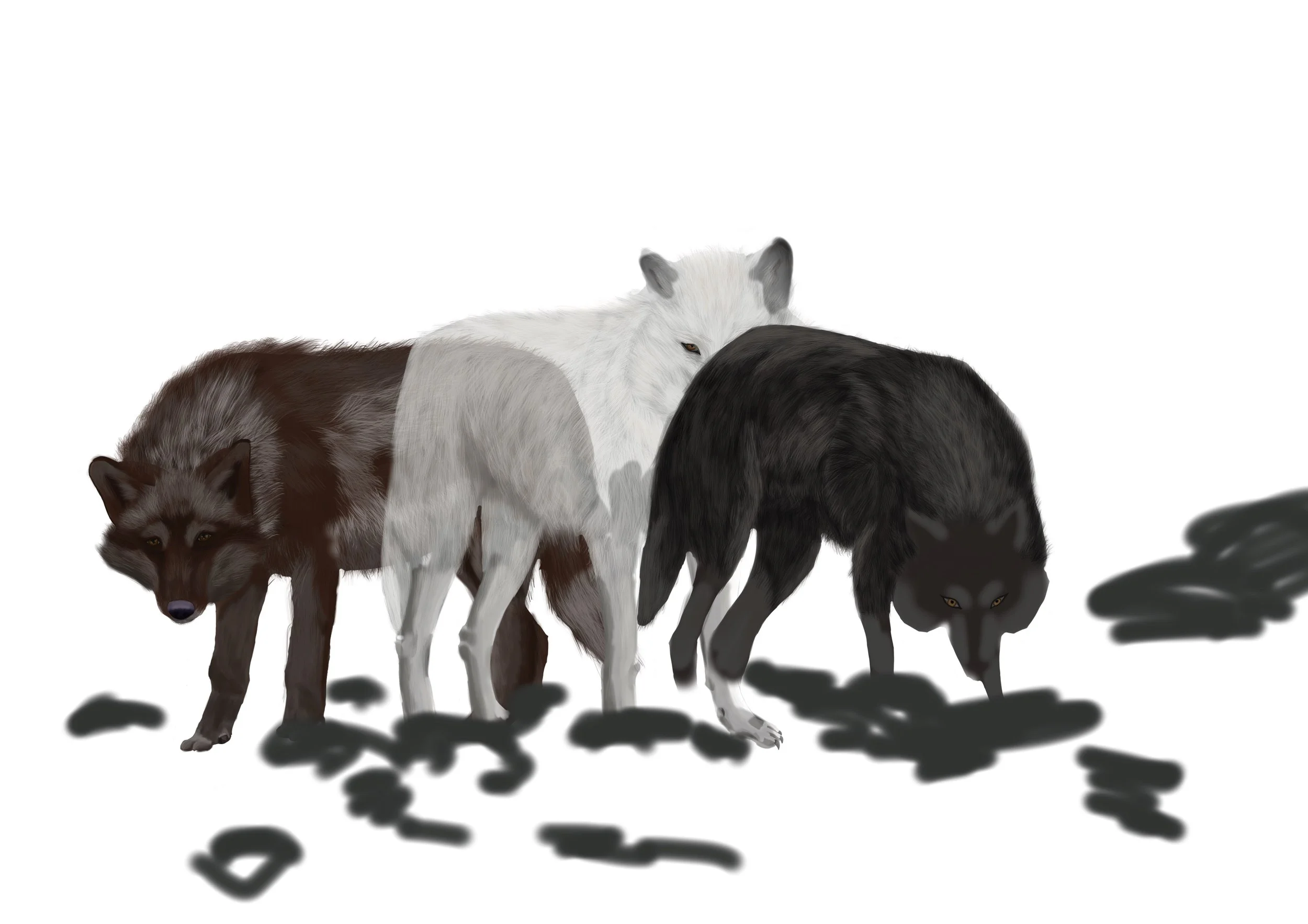
The grey wolf was a bit of a disaster. It was looking worse and worse with every attempt, so what did I do? I said, “Screw it!” and moved on to the next. But this time, I wanted to try something new. The hair wasn’t working, I needed to make it fluffier. I did use the hair tool but what I did was I made a light base layer of one colour and stroked in the tiniest flicks to create the short fluff. After that, I repeated the process with the next colour to almost make it so you can brush your fingers through it.
I came to the conclusion that they look like a fantasy tv show that just didn’t quite have the budget yet to make them super realistic.
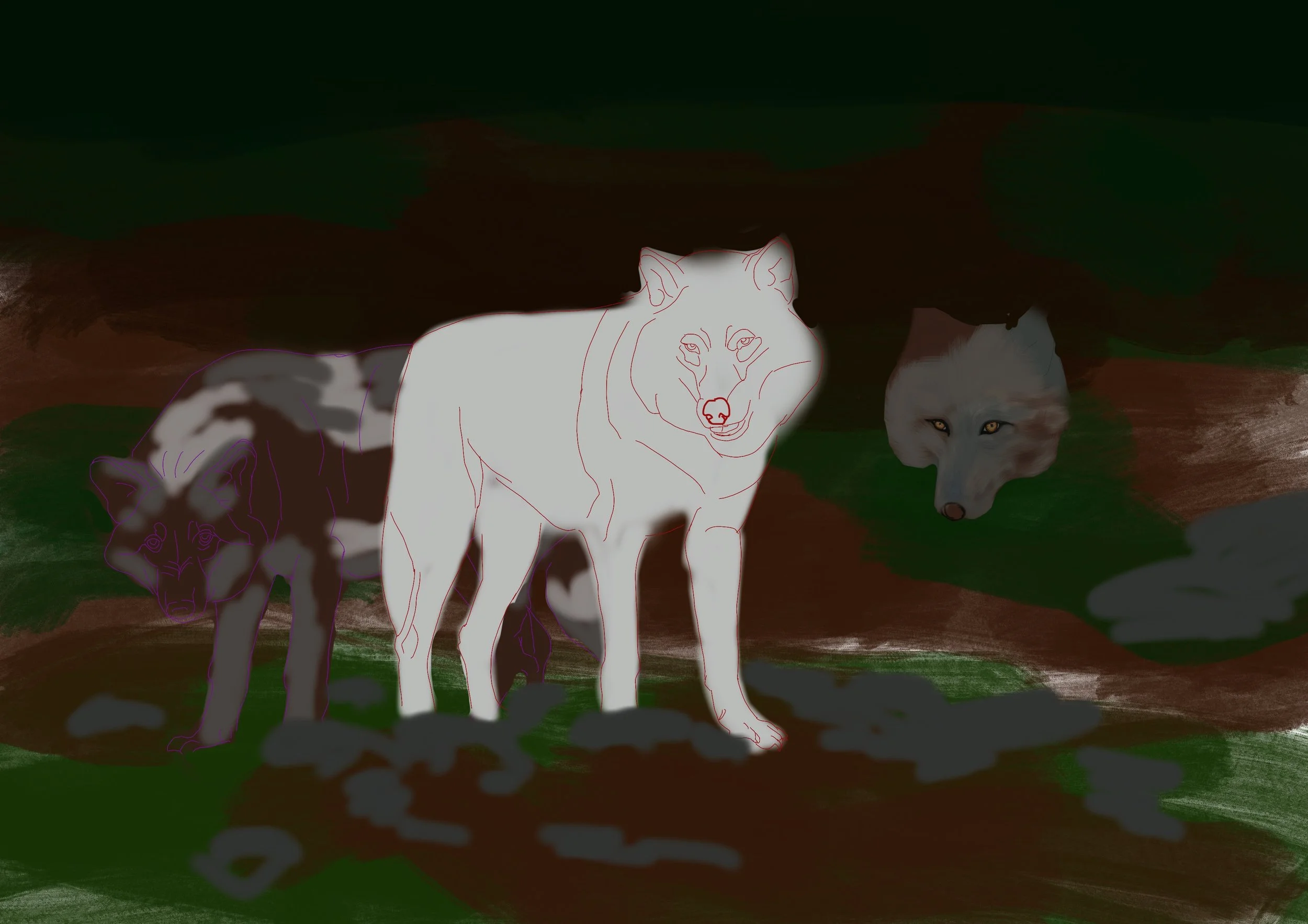
Changing the grey wolf.
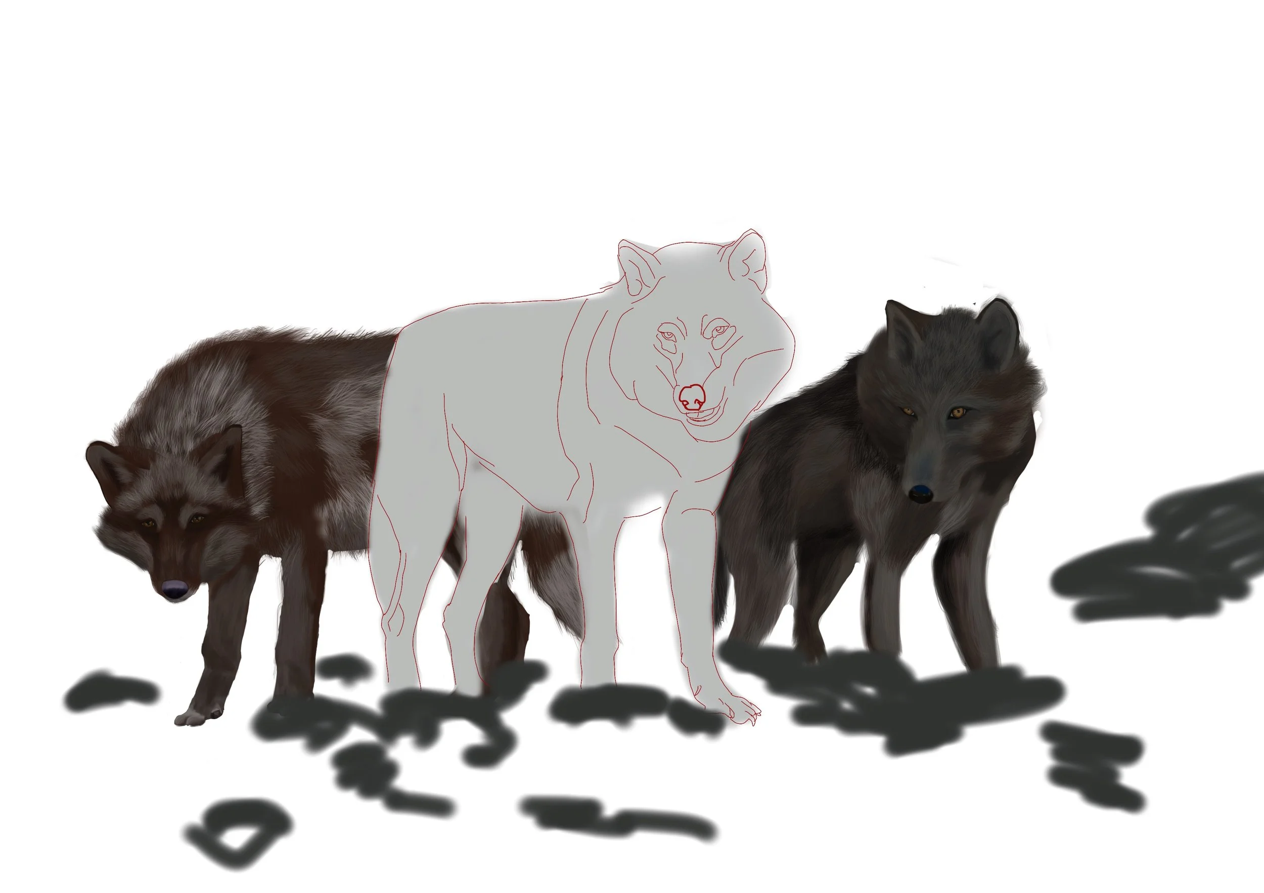
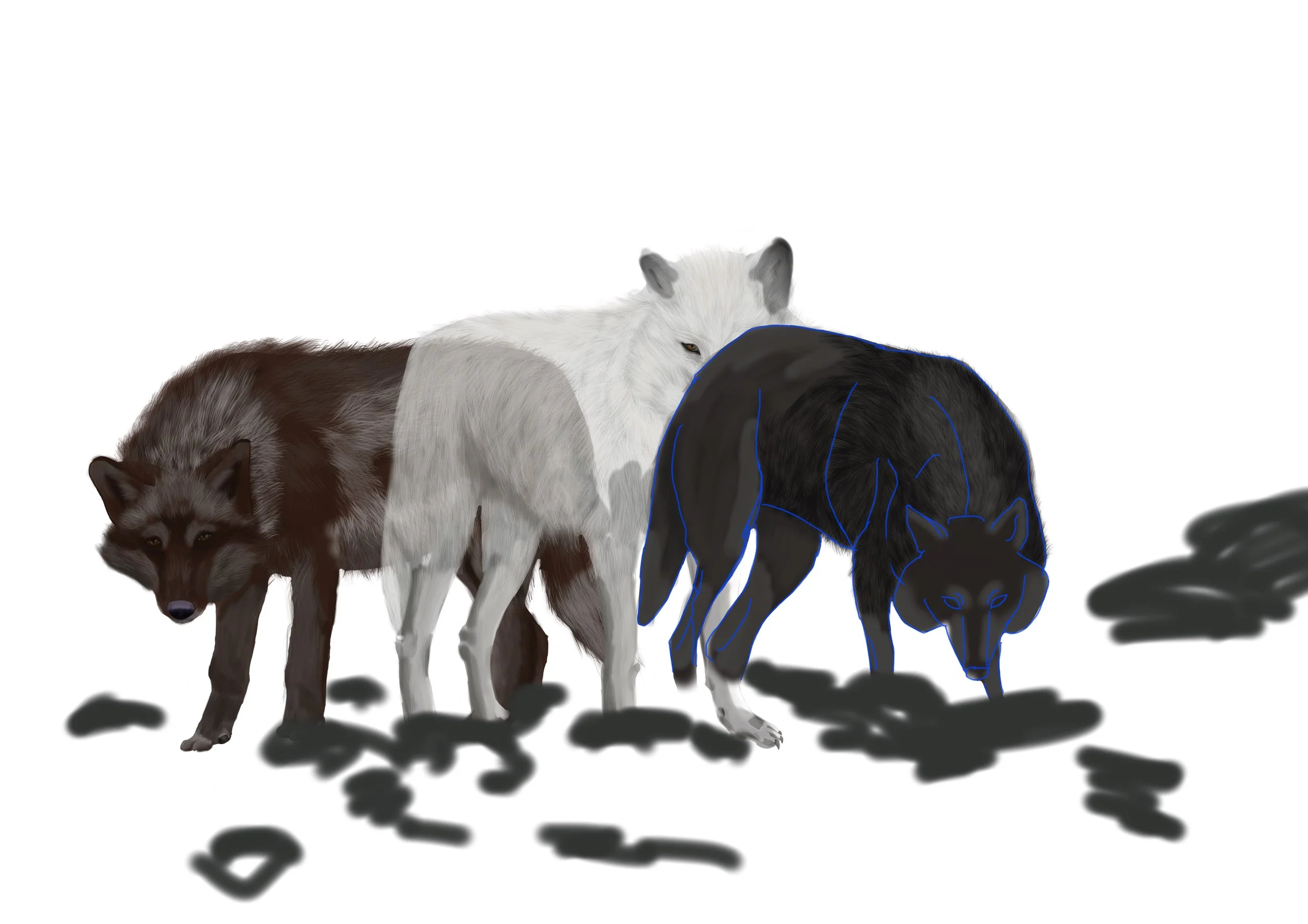
Me and this grey wolf were not getting along. No matter what I did, I couldn’t get the face size right, the body to work or the hair to sit right, so I decided to start again.
I wanted to change the head level. I originally had it so the white wolf was taller than them both, but the angle of the grey wolf wasn’t working because it was supposed to be on flat land and even if the ground wasn’t level, it would be pointing downward to the bottom of the page.
I preferred this much better, it helped centre Braíkor to stand out more and with both their heads lowered it creates the impression that the other two are waiting for a command.
Enhancing the scenery
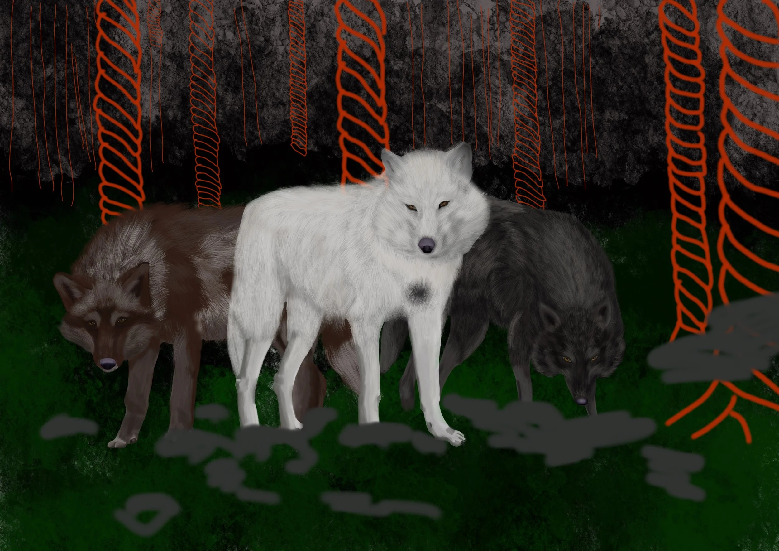
I needed to take a break from the wolves, so I moved onto the background - WHICH I LOVE DOING! I started off by figuring out where I wanted the trees.
Then I decided to take a bash at drawing rocks. This was yet another first time try, but I am happy with how they turned out. Equally as annoying, though.
And finally, the concluding tone
I tested a few, but overall, there wasn’t much option for how I wanted this to look. I wanted to make sure that the colours brighten amongst the darkening tones of the forest.
The thing about this forest is, it is not supposed to be dark and evil. I don’t entirely catch the accuracy of what I envision, but this is deliberate. The moment within this scene is Cynthia’s attempts to free the wolf that is bound to her, but with this outcome, also comes the risk of her life. He does not harm her because of this connection, but when she breaks that, he may not be so kind. So I wanted the forest to enforce that threat of the unknown.
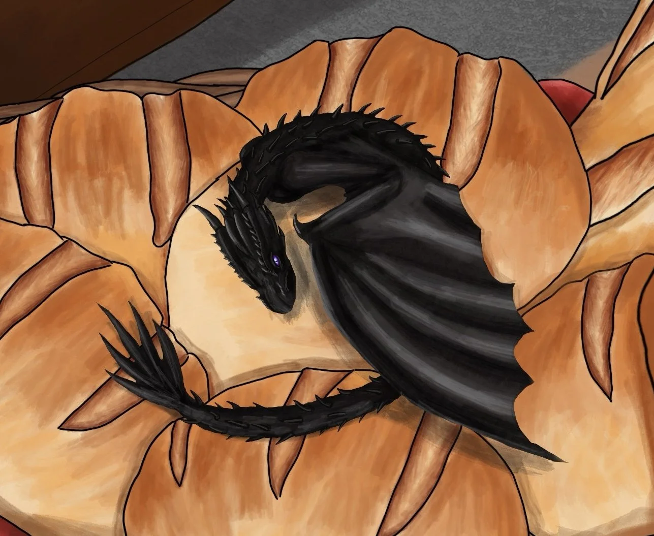
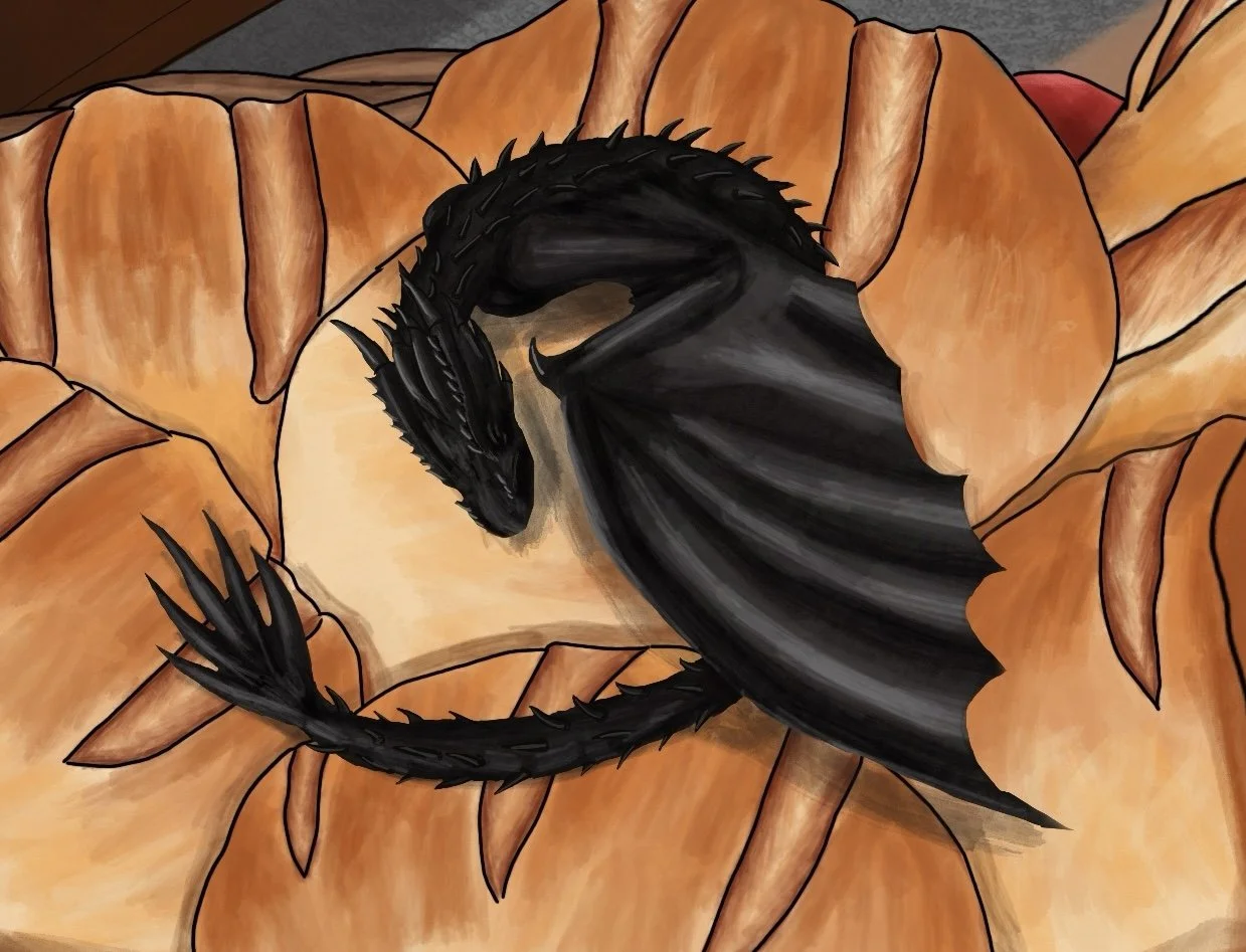
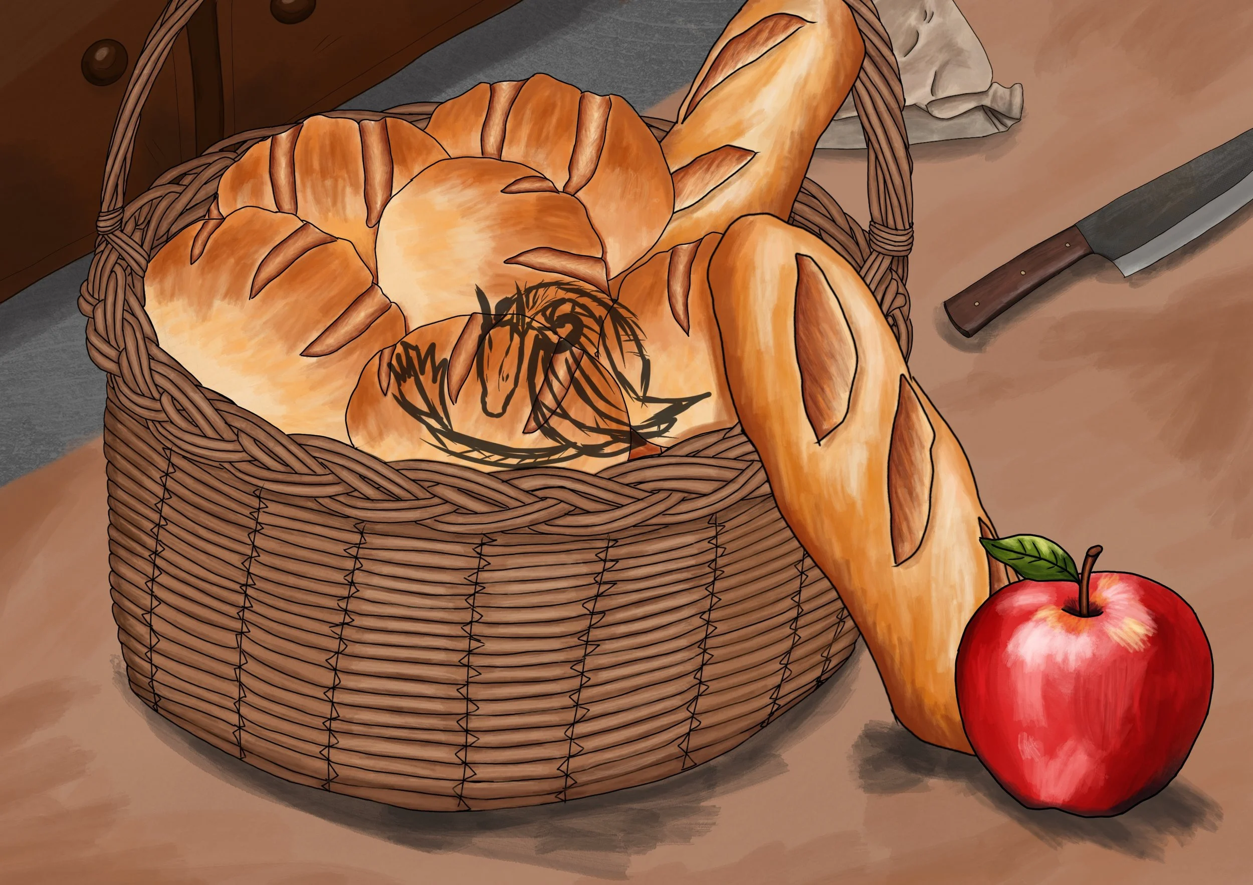
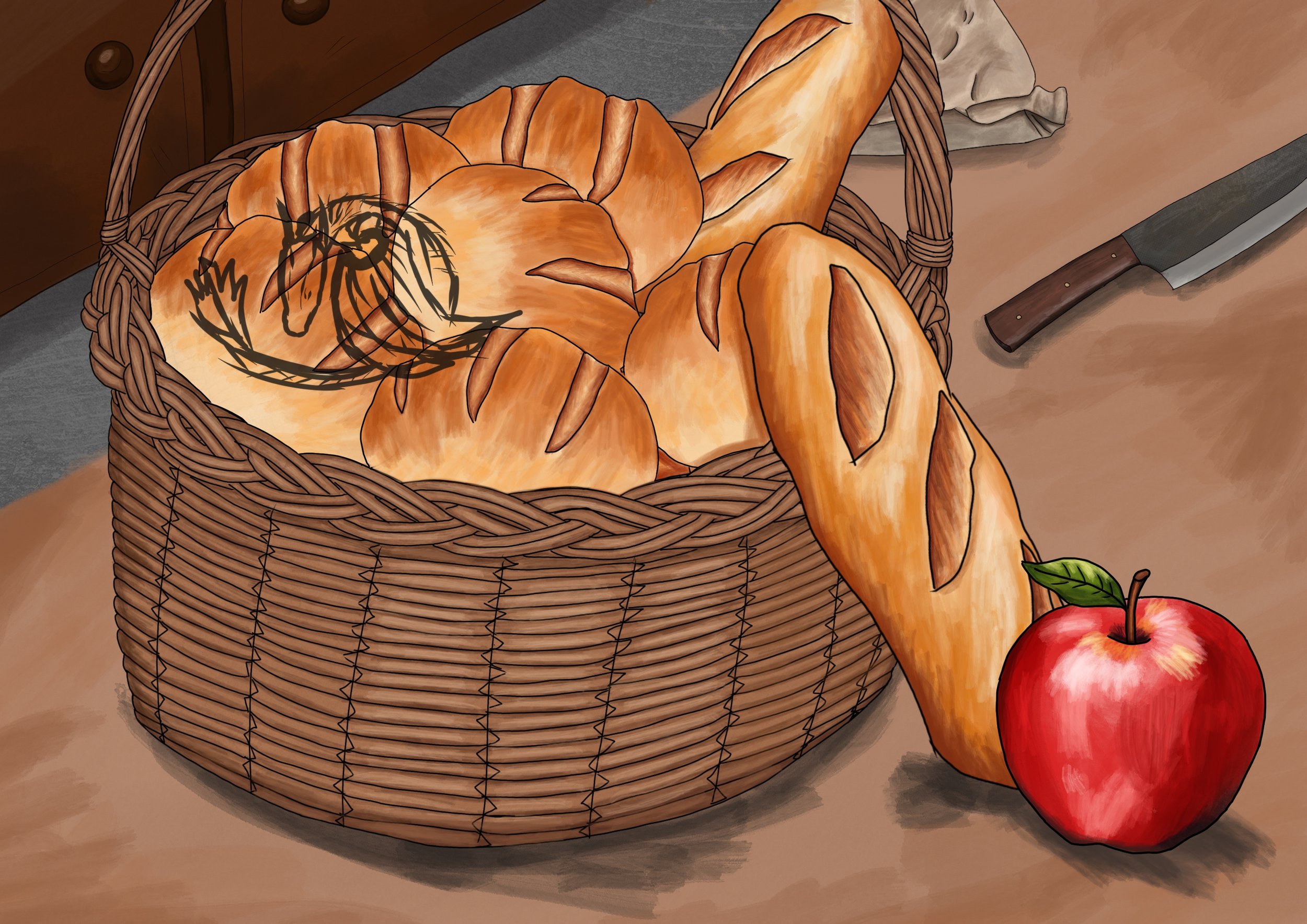
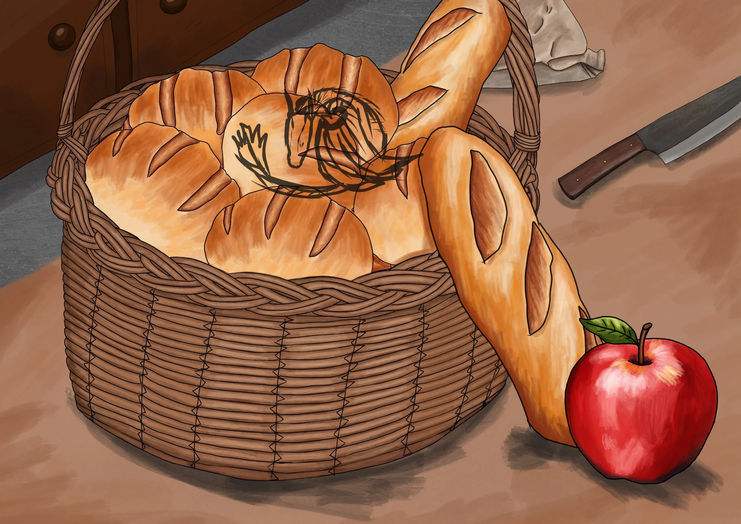
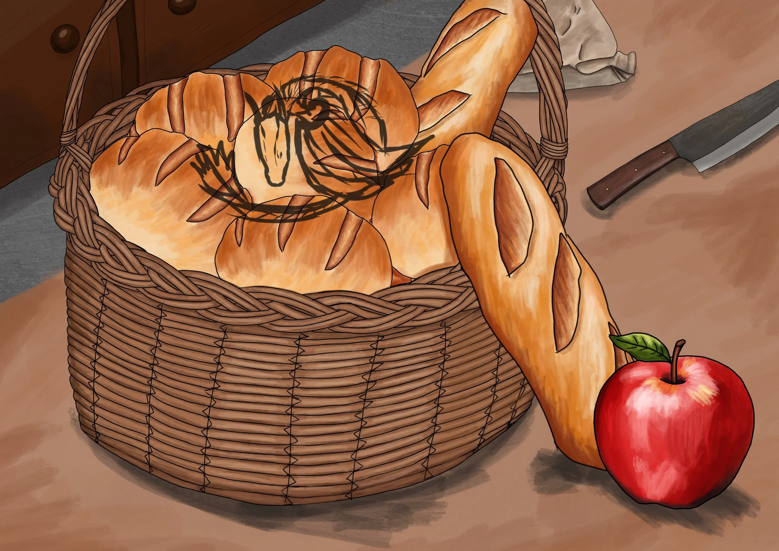
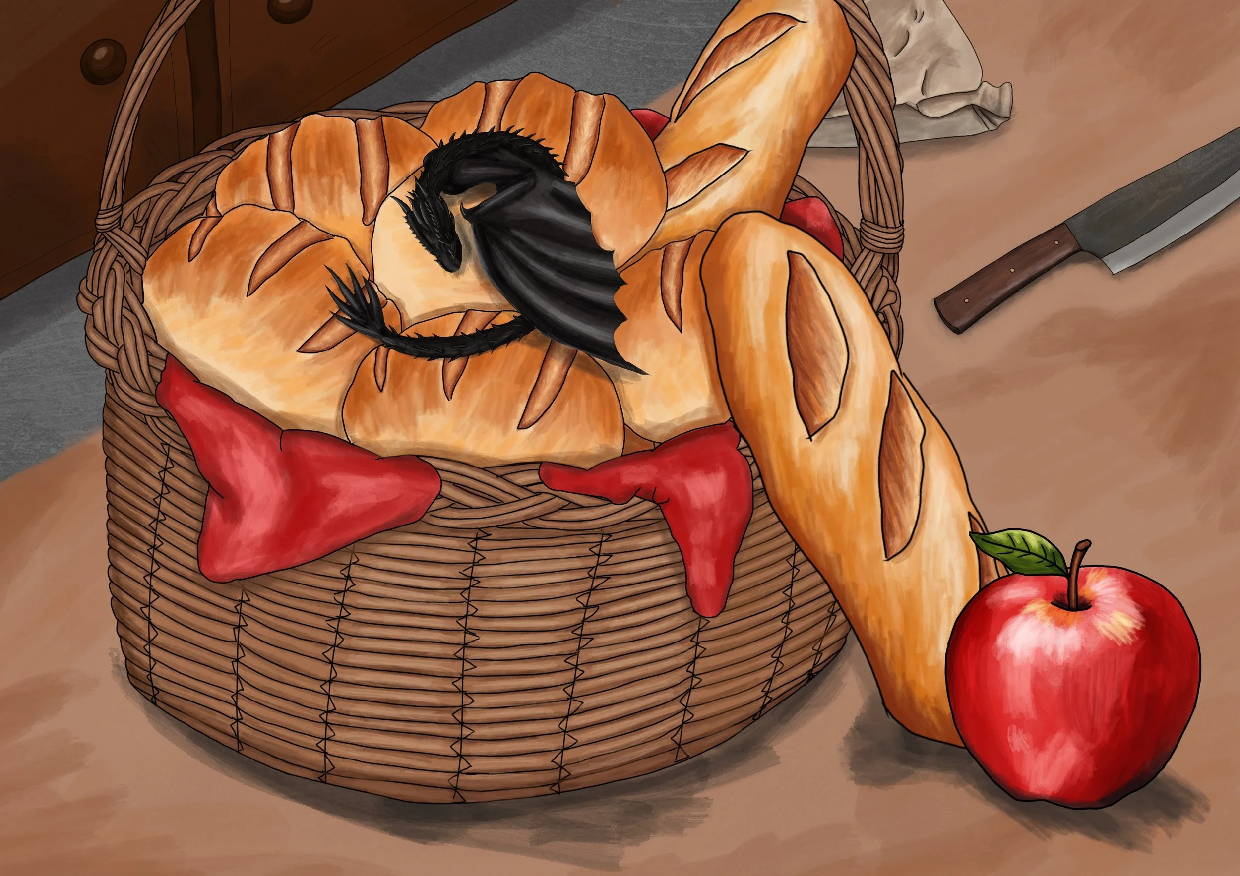
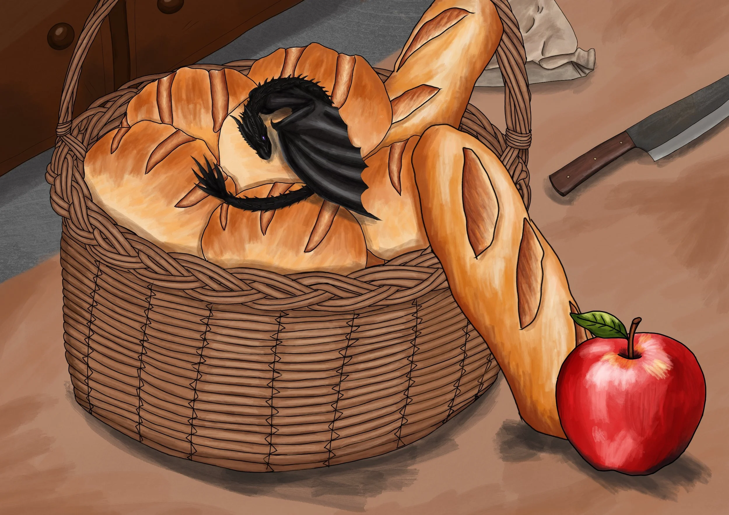
Dragon in a Basket of Bread
The Origin
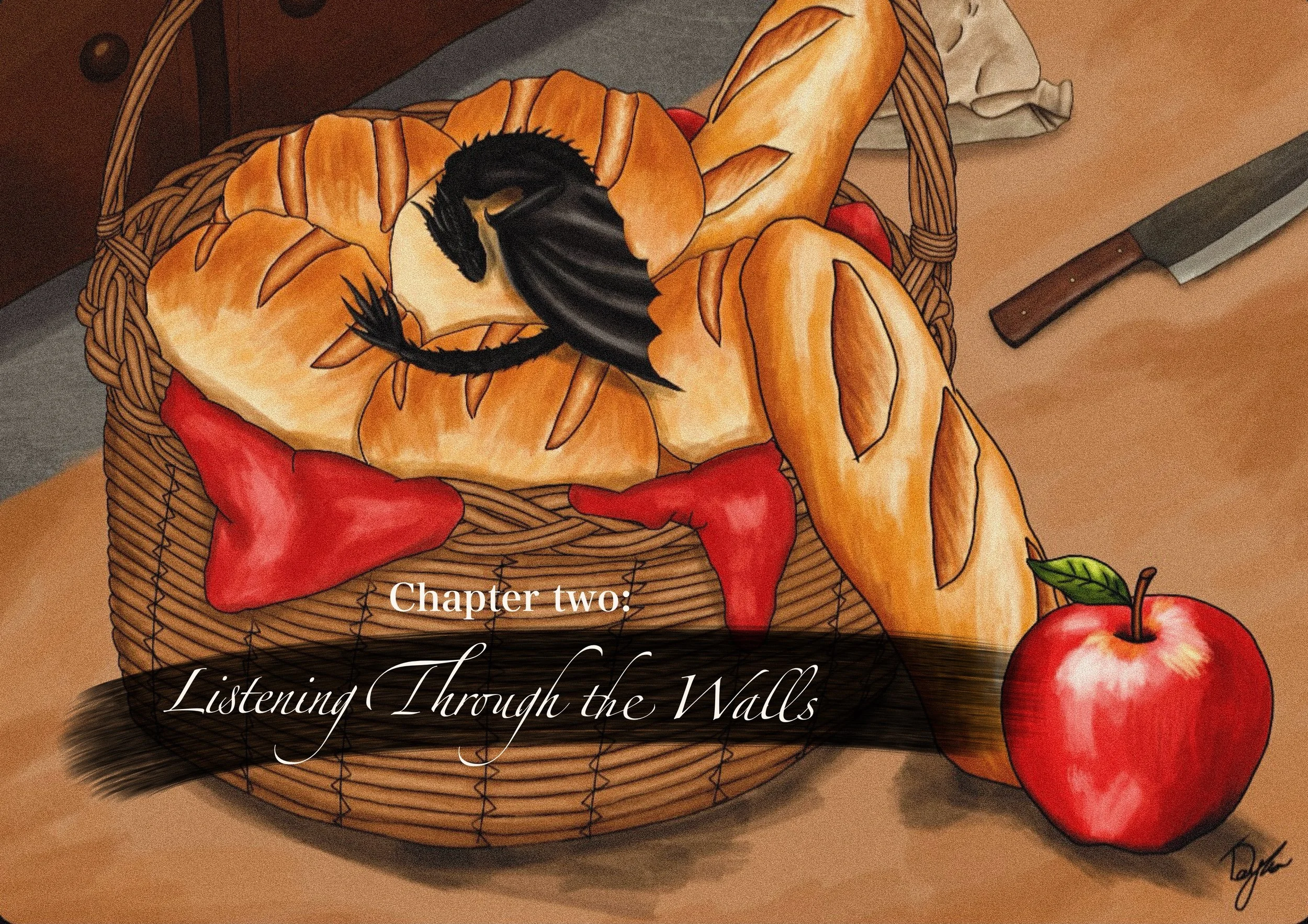
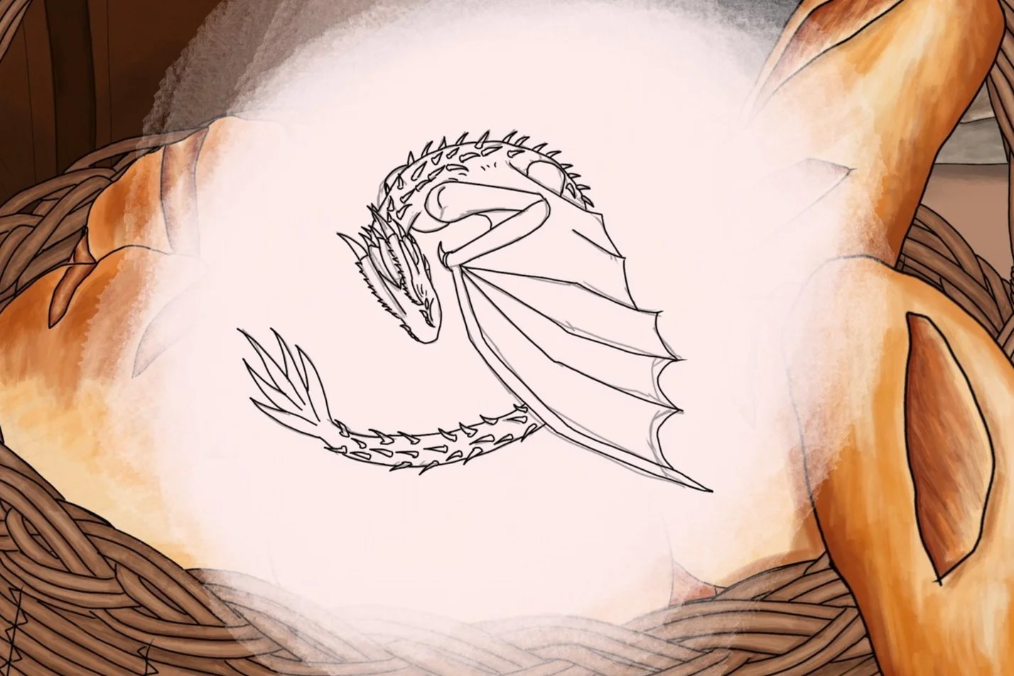
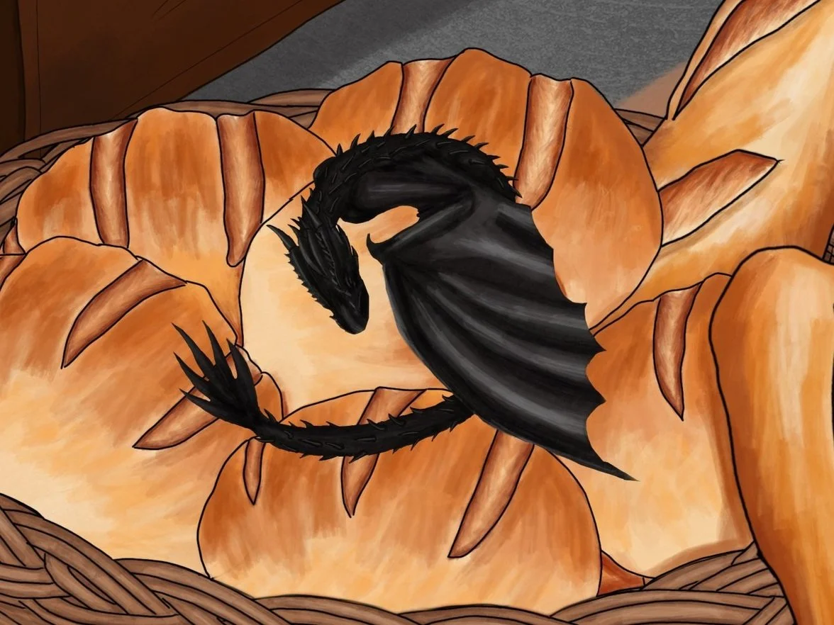
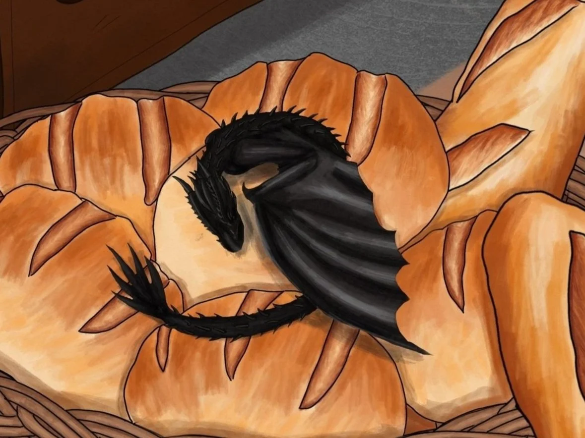
Of course, this is Caliban right at the start of the book. After his first encounter with Cynthia in chapter one, he follows her home without her knowledge.
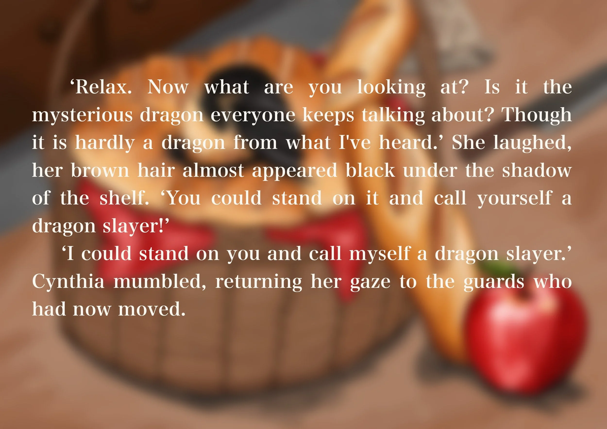
In this scene, Cynthia follows knights to one of the kitchens within the castle, where she heard whispers of a dragon. Intrigue is one thing, but she couldn’t forget her encounter the night before where she had met a little dragon in a cave.
The General Idea
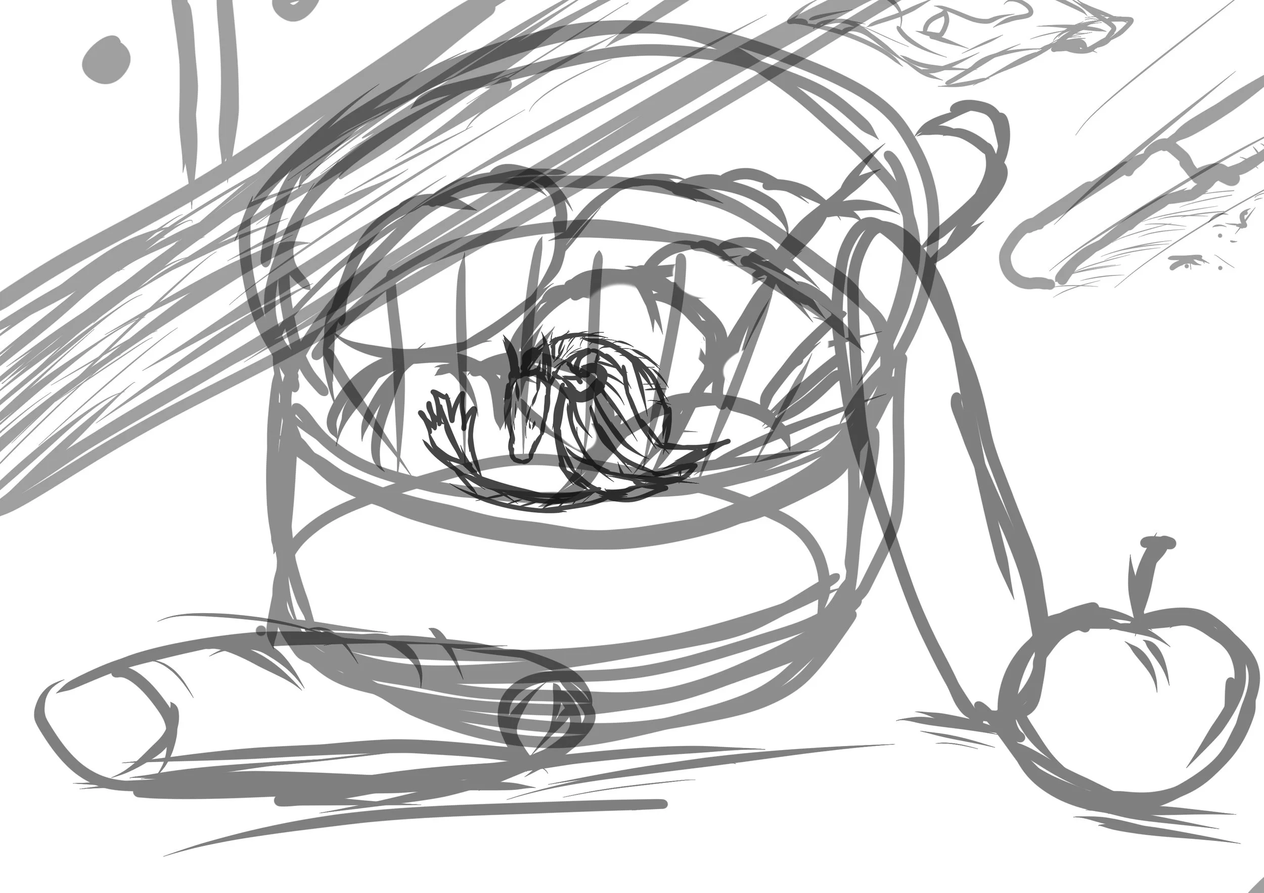
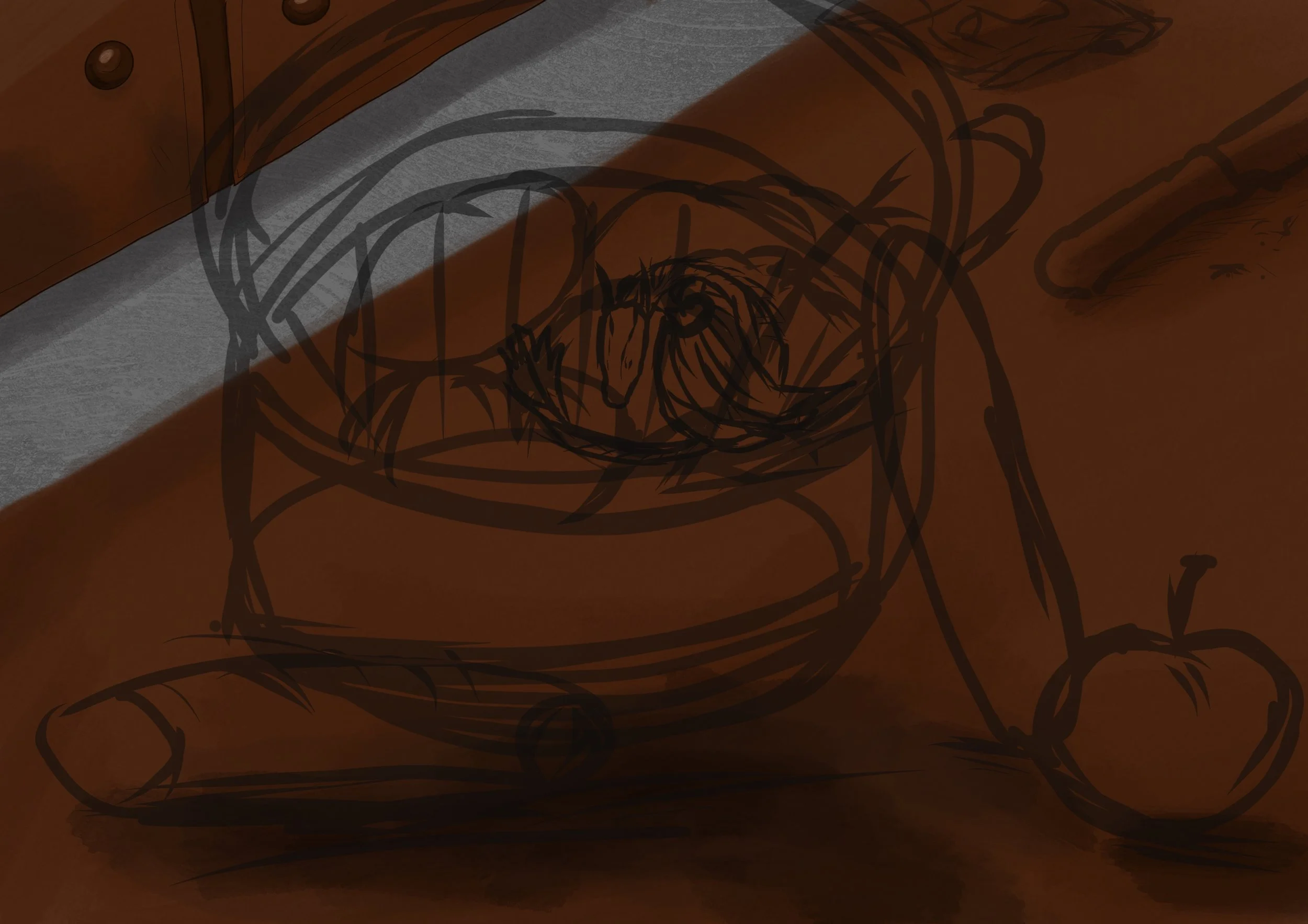
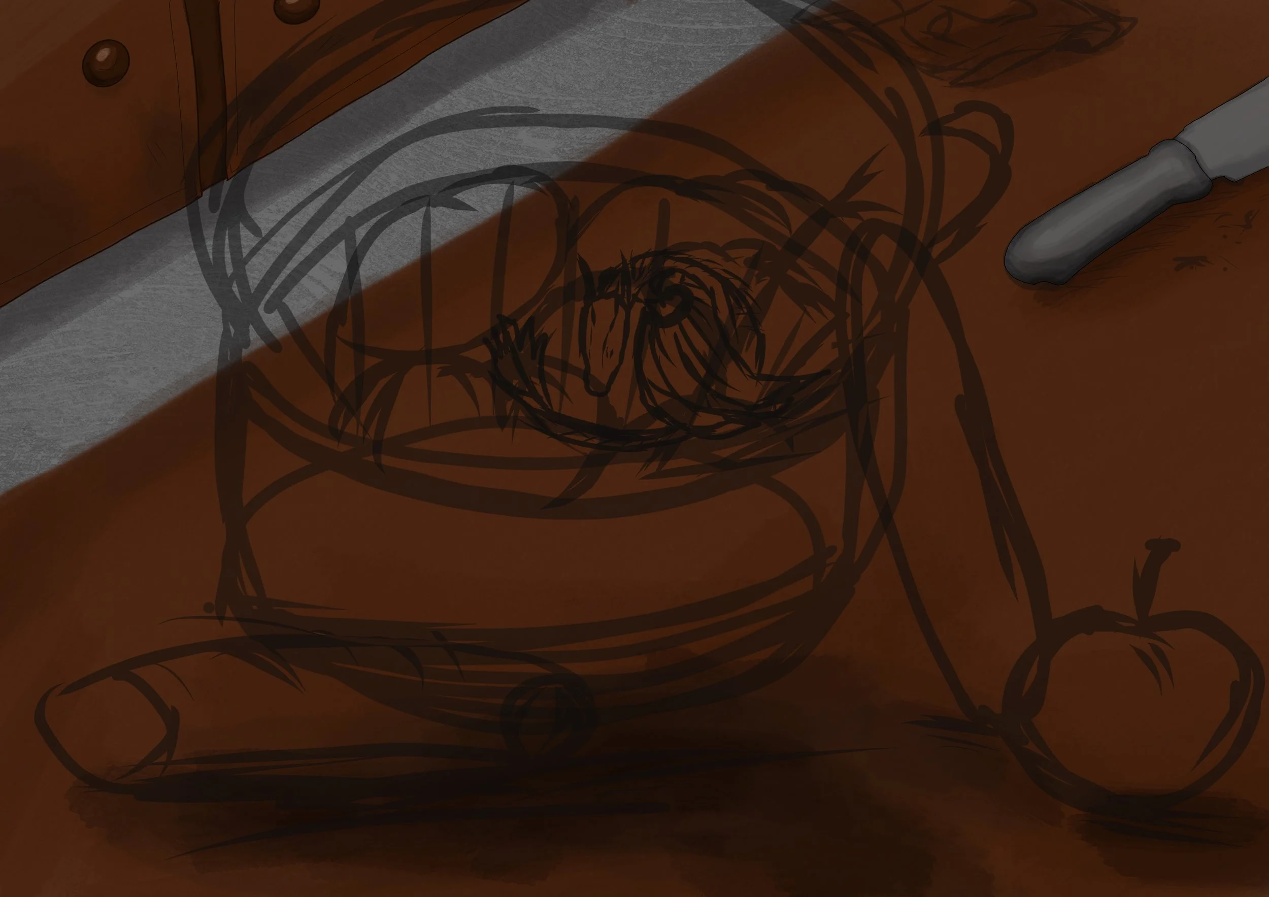
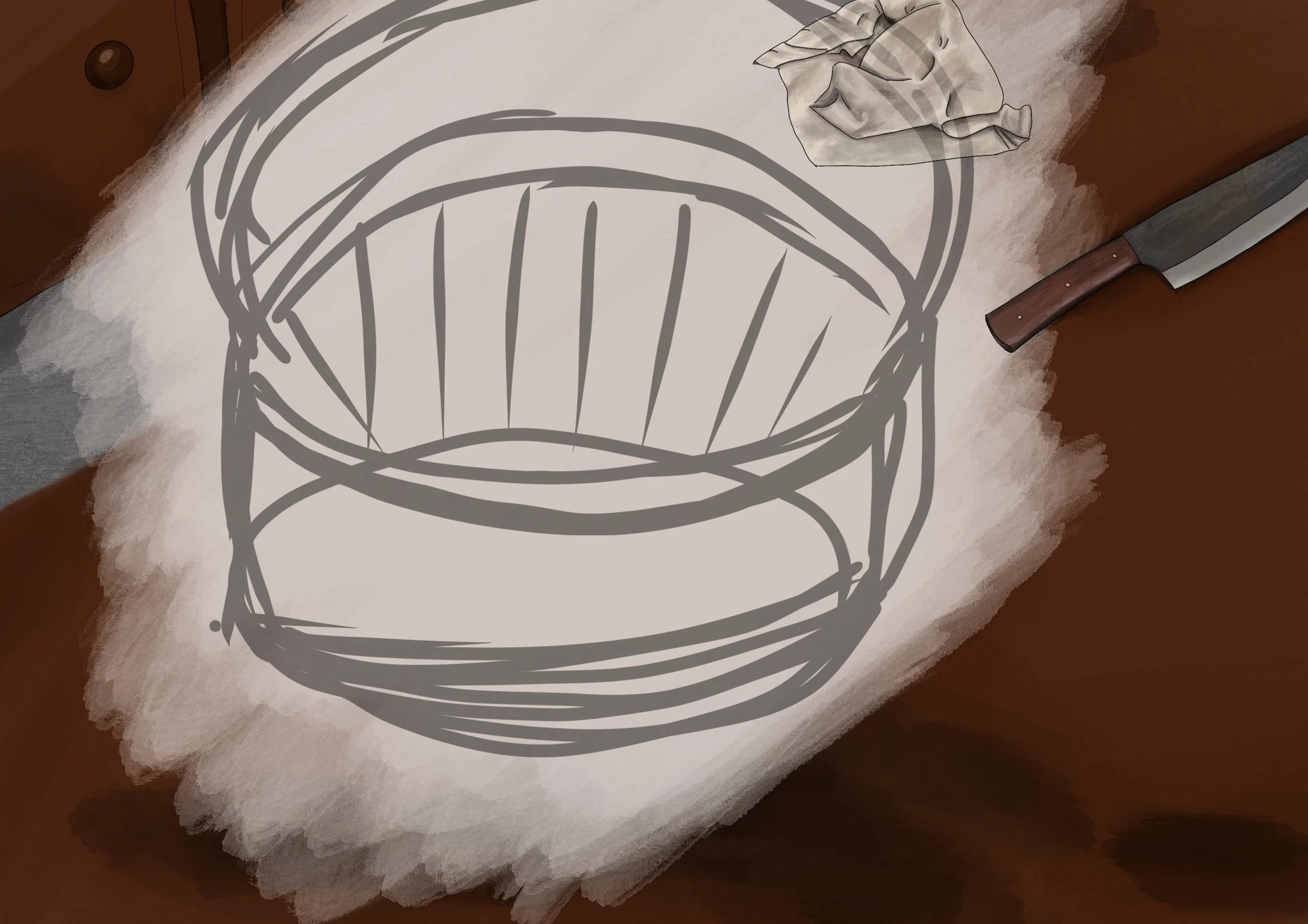
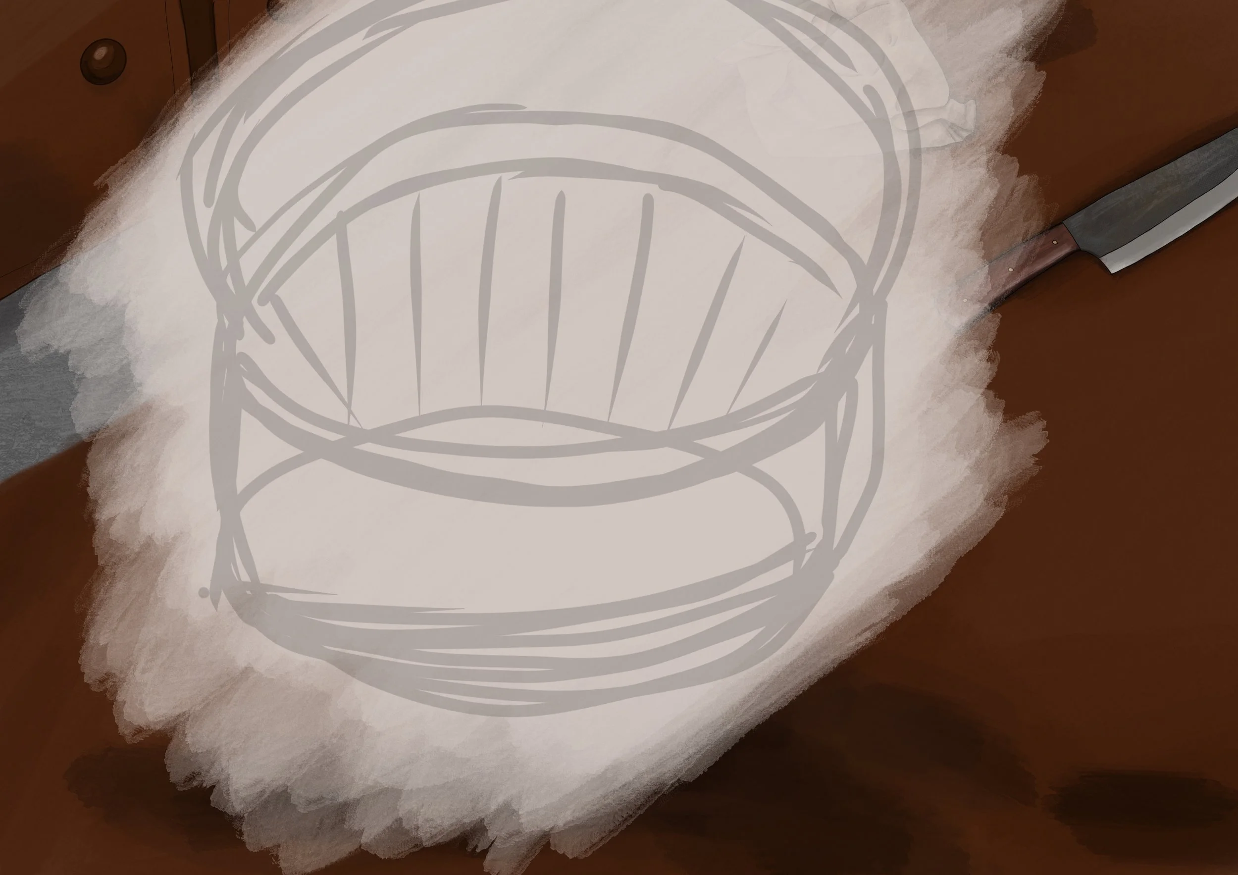
I started off by creating a sketch of the elements I wanted to include within the piece. Obviously, the basket with the dragon, but I figured for a more artistic flair I’d need to add external elements to create dimension. It’s a part of the kitchen which does play as a key role within the book, so I wanted to create life and a story from the state of it.
I figured there should be a knife because … well … it’s a kitchen. But also, a knife is symbolic for danger and threat, which is a key part of this story. Murders have taken place within this castle, it is not as wholesome as a cute little dragon in a basket of bread. It’s supposed to remind us that there are threats that lurk behind the scenes.
The background is something I often do first. One, because I can get a bit lazy by the end of it … so after doing all the fun elements, the background (as you all know) can grate on me a little bit. So I opted to do that first. It also helps me map out tones for the other parts. However, I don’t necessarily stick with the dark oak colour that I originally chose to use. But I’ll explain that later.
The Knife and the Cloth
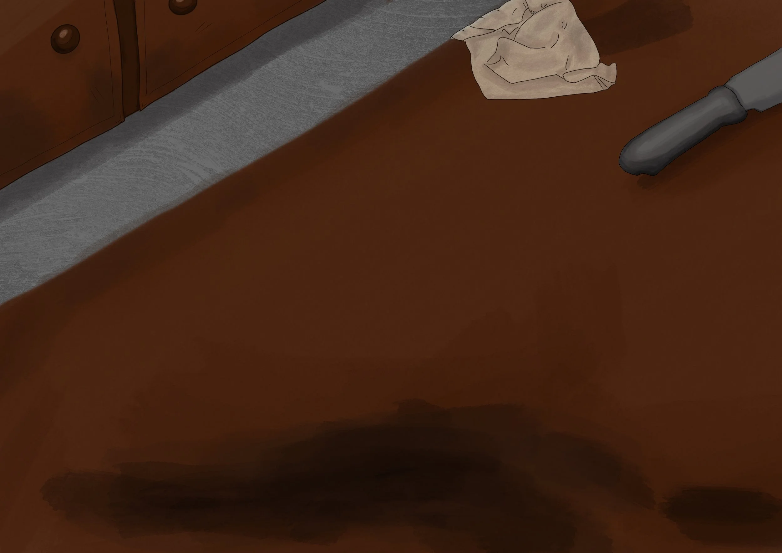
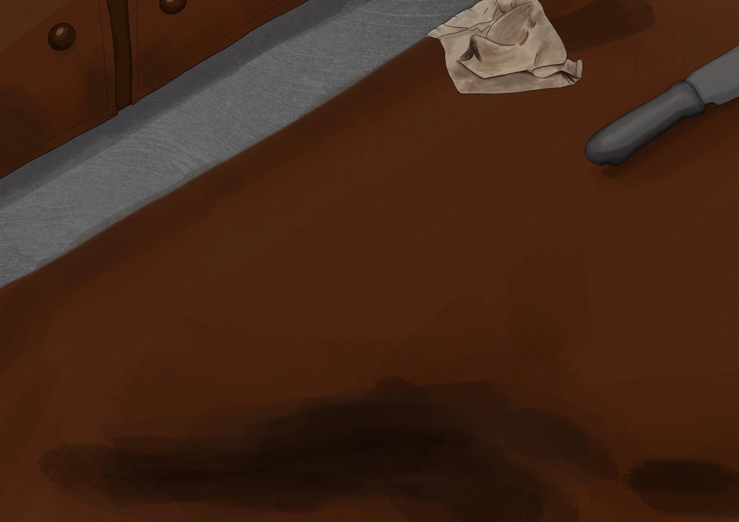
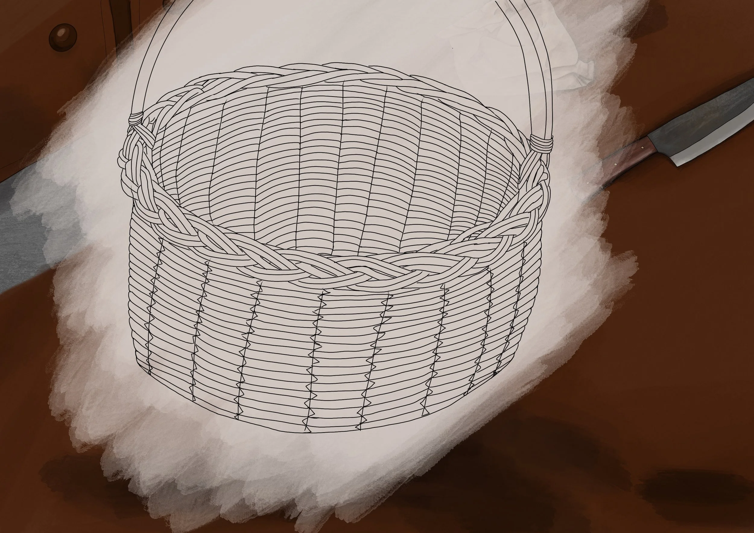
I should have mentioned this earlier, but I only used two different brush types for this. Watercolour for all the toning/colour and a fine pen for the black outer borders. I’m not sure why I wanted the black borders, but I figured it would be a nice touch against the soft layering tones of watercolour.
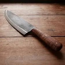
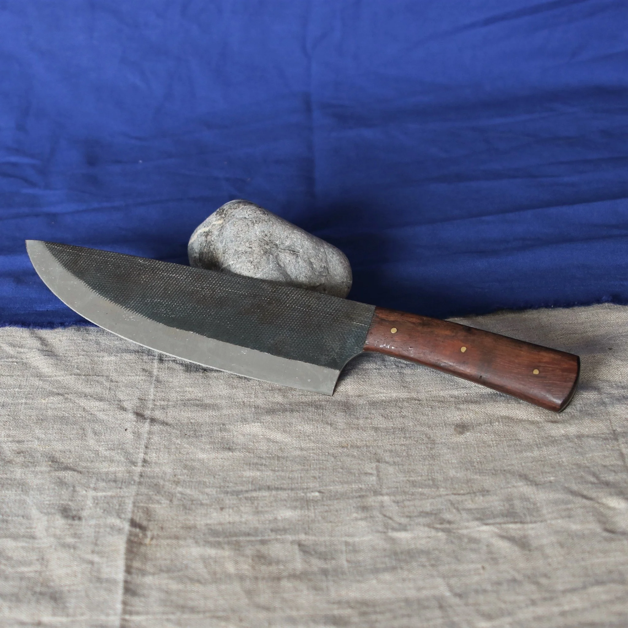
It started off strong, I finished the handle of the knife and I was like “Yes, this is looking cool!” then it hit me. I was just creating my own kitchen knife … not a medieval, time accurate knife. So then I felt stupid and was like, “Okay … I give up.” and abandoned the knife until a later date. Which is why I then started on the cloth.
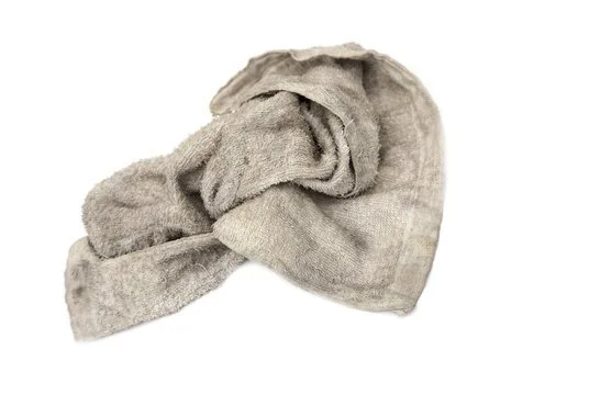
When creating the cloth, I knew I wanted it to be ‘well used’ and went searching for a stock image that best matched the colours and tones I was picturing. I started by creating a cream base layer, then began to add the darker tones for the ripples and stains.
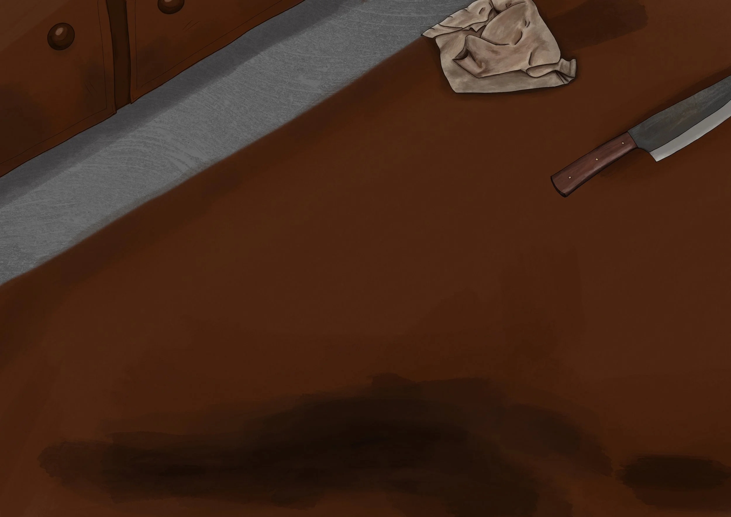
After completing the cloth to a certain extent, I decided to return to the knife and go for a more accurate style. I’m quite proud of the detailing I made. I decided to add the texture on the top part of the blade and used a light tone of white to create the idea of scrapes to enforce that it has been well used.
Basket Production
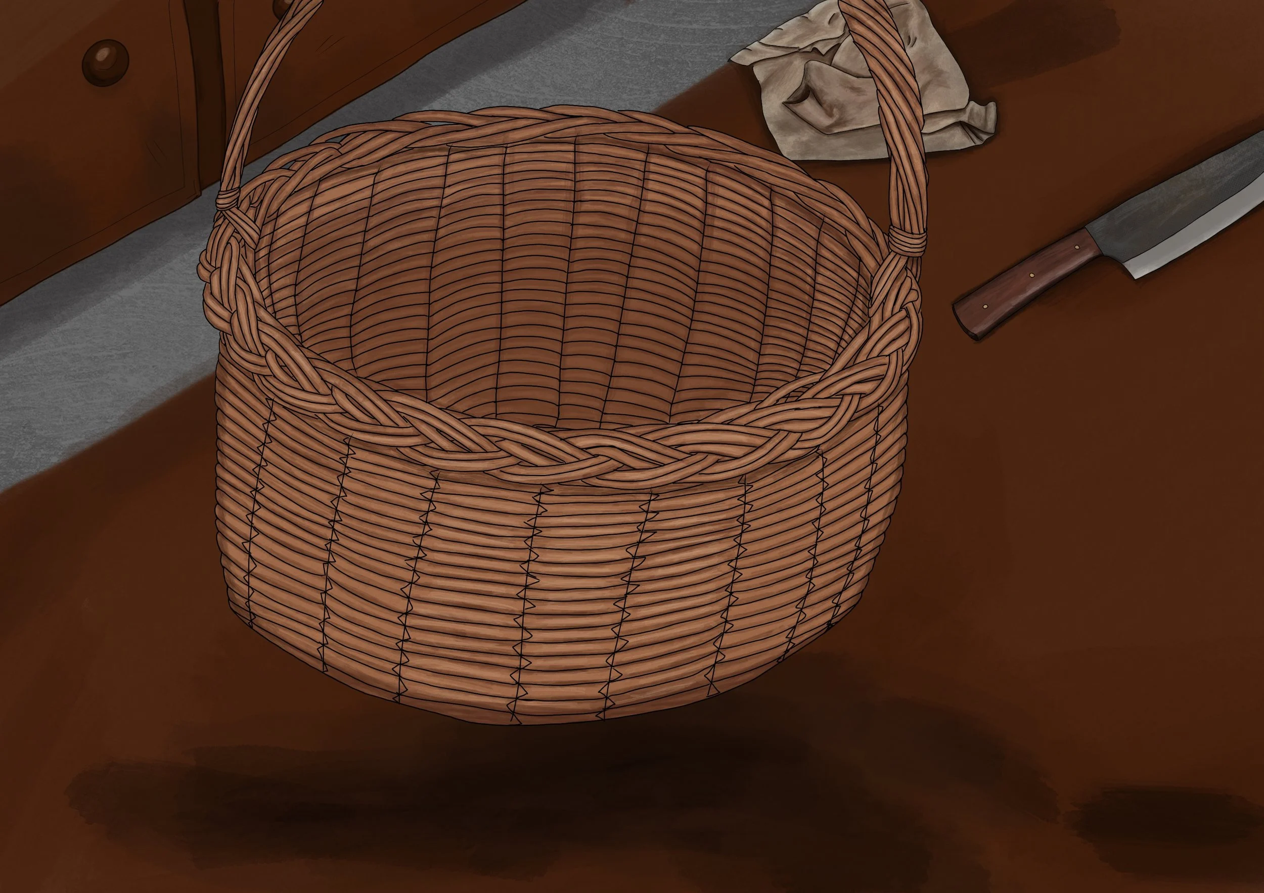
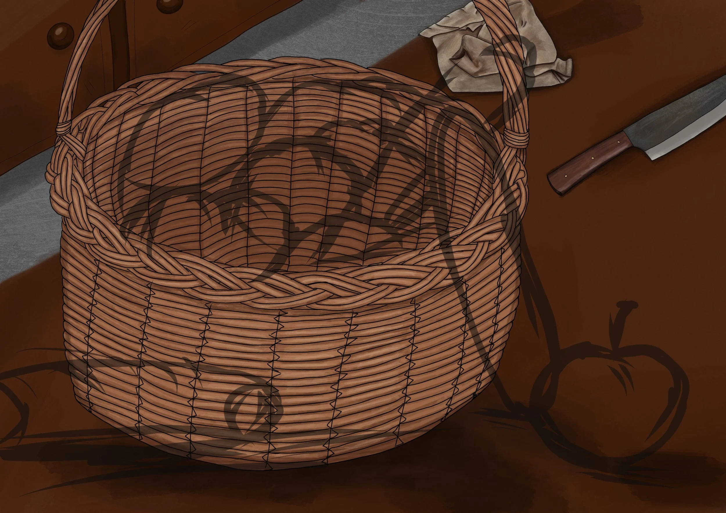
Next, I had moved onto the basket. It was a simple thought in my head, but unfortunately, I forgot that each weaved piece of wicker had to be toned … and accurately spaced. You can come at me for my inaccuracy and how I really didn’t create the spacing between, but MY wicker basket is the most tightly locked basket you have ever seen, okay? No crumb falls out of mine, so if you want to have a go at anyone, it’s your own baskets for their crumb-falling holes.
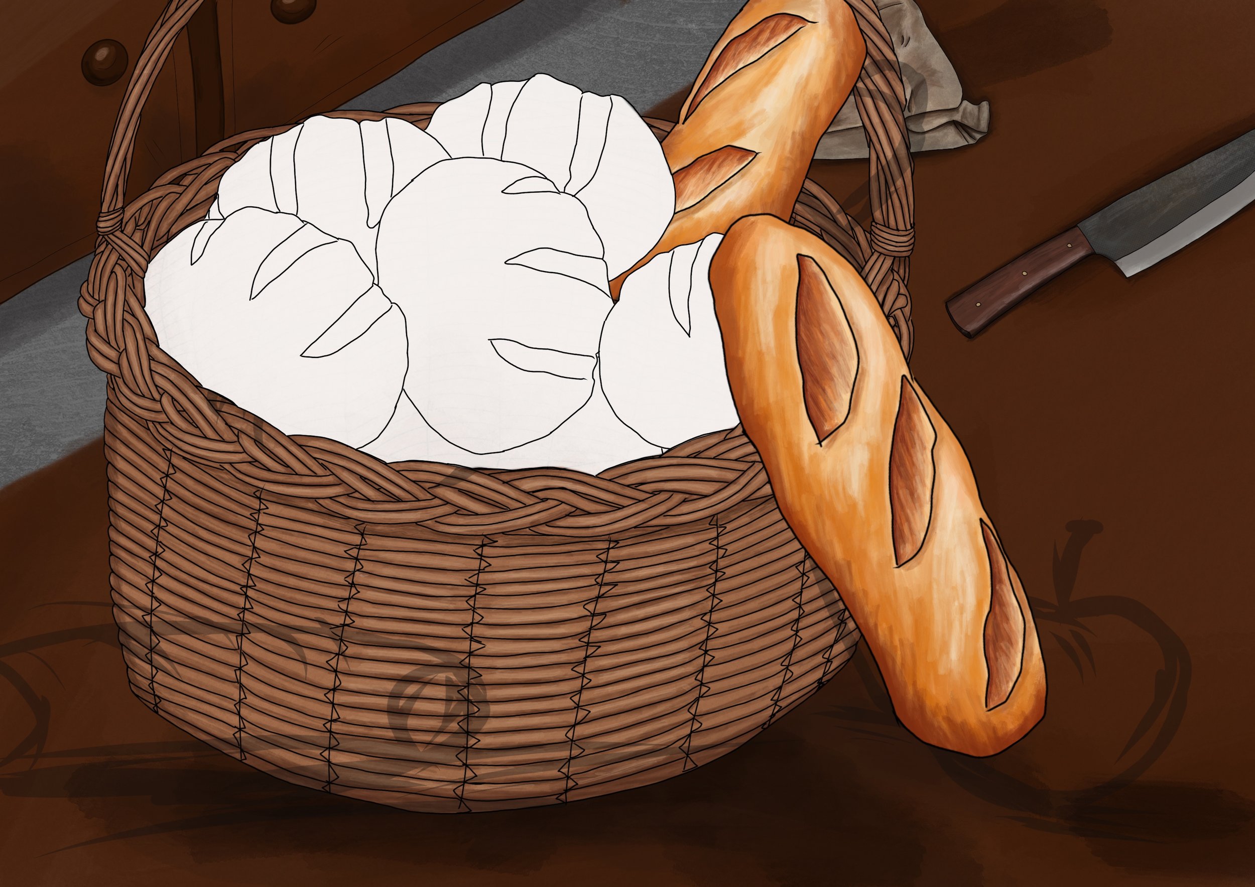
Anyway, I started by creating a white base layer as I was using water colour over an already pre-made background. So to try and avoid having to go over the same stroke a dozen times so it won’t be see-through, I made the base layer and used the ‘clipping mask’ tool to stay within the white layer once I had finished with the sketch.
I did have a stock image of a basket I was using for colour but I have no idea where that image has gone. But to get the idea, it’s pretty much the same colour and tones as this one.
Originally, I had planned to create the basket in layers so it would be easier to create the rolls without having to make sure I wasn’t going over any of the basket … but that would be sensible and I forget sense sometimes. So instead, I did it all as one. Oopsie.
Bread Time!
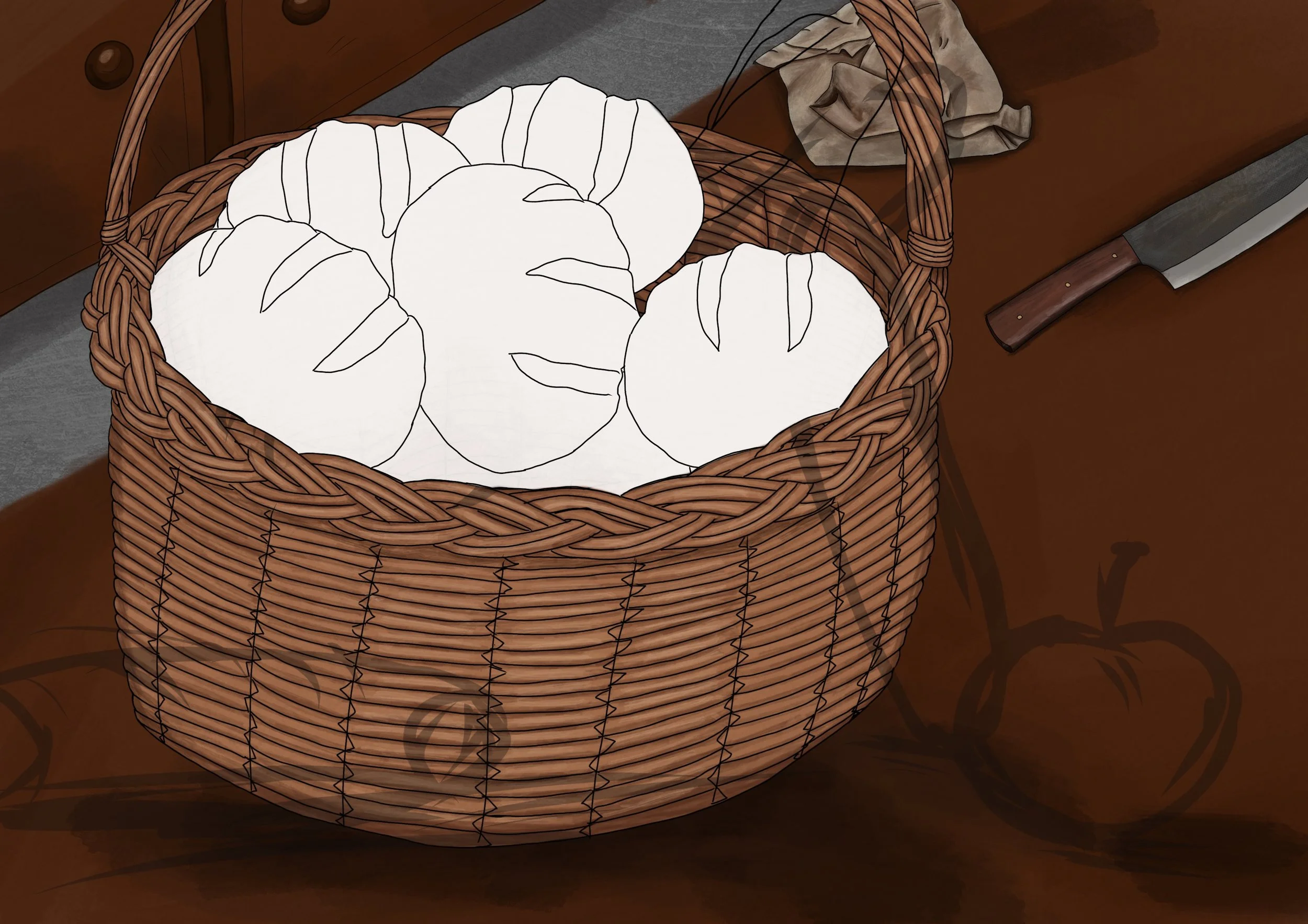
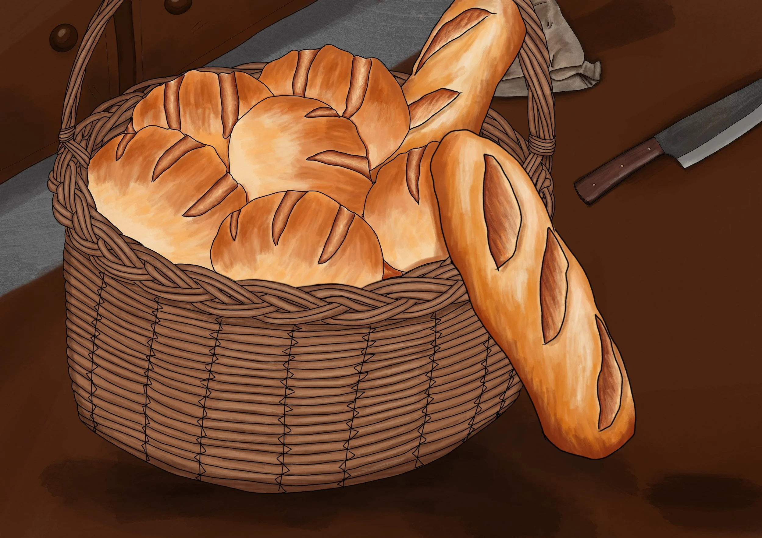
In order to begin, I added the original sketch back to see how they would fill out. I then created the sketch line of one of the smaller breads and duplicated it in different positions so it would look like they are from the same batch.
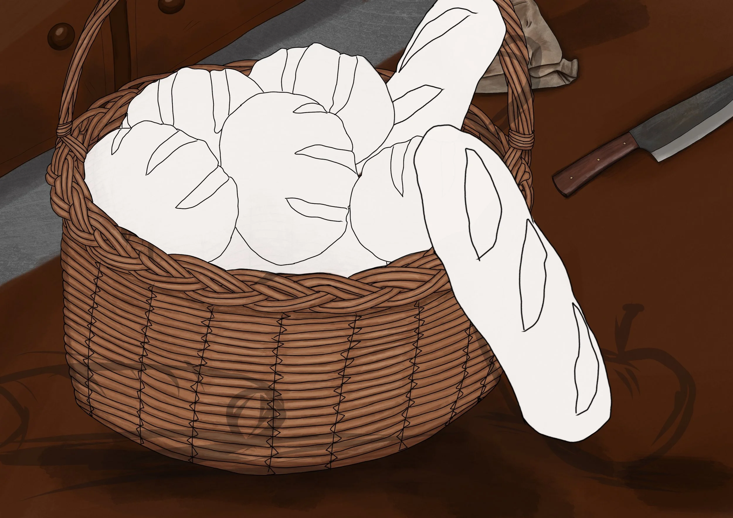
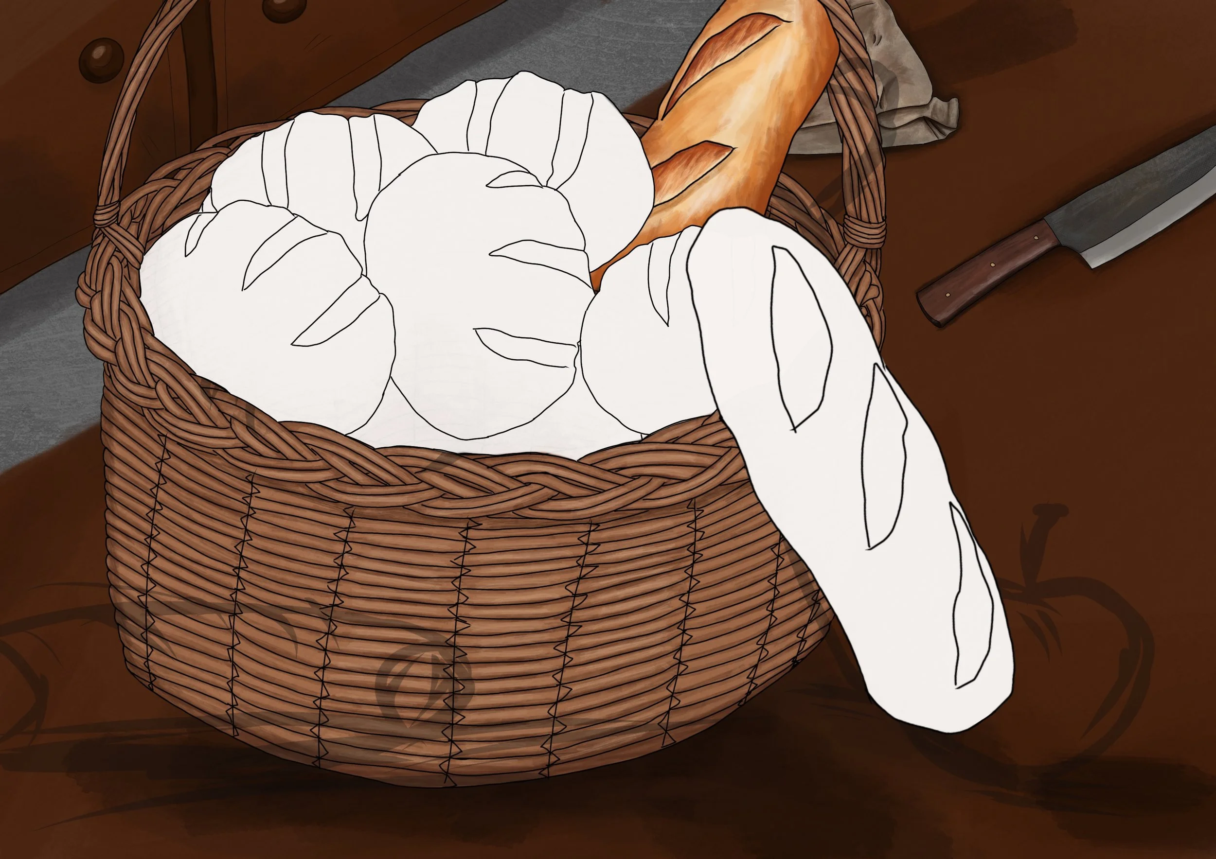
Once that was done, I replicated my previous process and created the white canvas base layer and worked on adding tone from there. I started with the baguettes first as they were separate from the rest, then I completed the smaller batch.
In the sketch, I thought I would get away with having the bread revealing one underneath, but perhaps I should have made it darker to get away with it. It didn’t look right to me, so I simply added another roll to the mix. Problem solved. I did add a light dusting of flower but decided that it made the bread look mouldy, so I got rid of it. No one wants mouldy bread.
The Apple and the Dragon
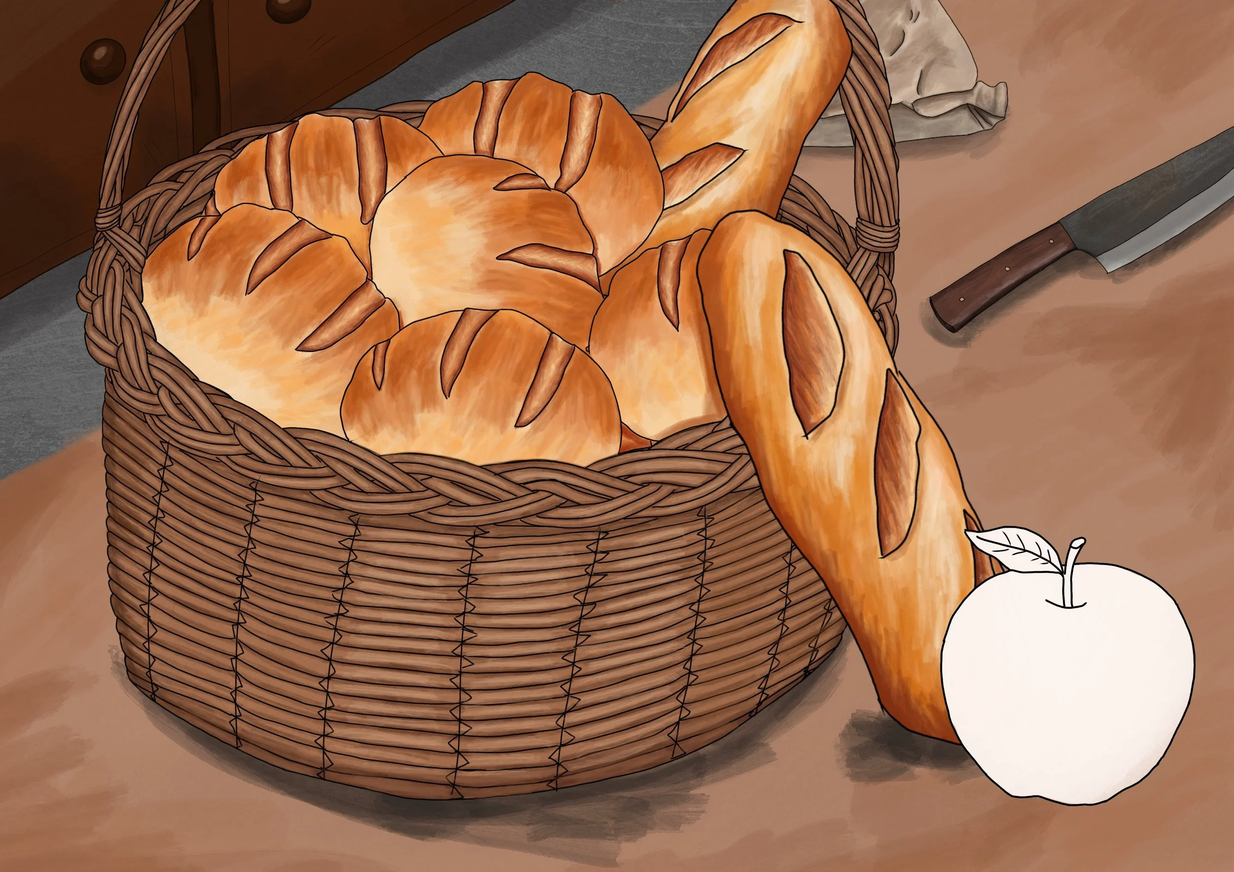
I then made an apple. Nothing too exciting to report about that because it’s an apple. And no, there’s no dark, alluring story behind the apple with being poisonous because arghh this story is about murder and betrayal!!!! But I did add it to draw the eye all around the piece. My hope is that Caliban is the focal point, then you follow the baguettes to the other aspects. The apple also adds some colour to the bland, beige tones. Obviously it is red so that means MURDER AND BETRAYAL!
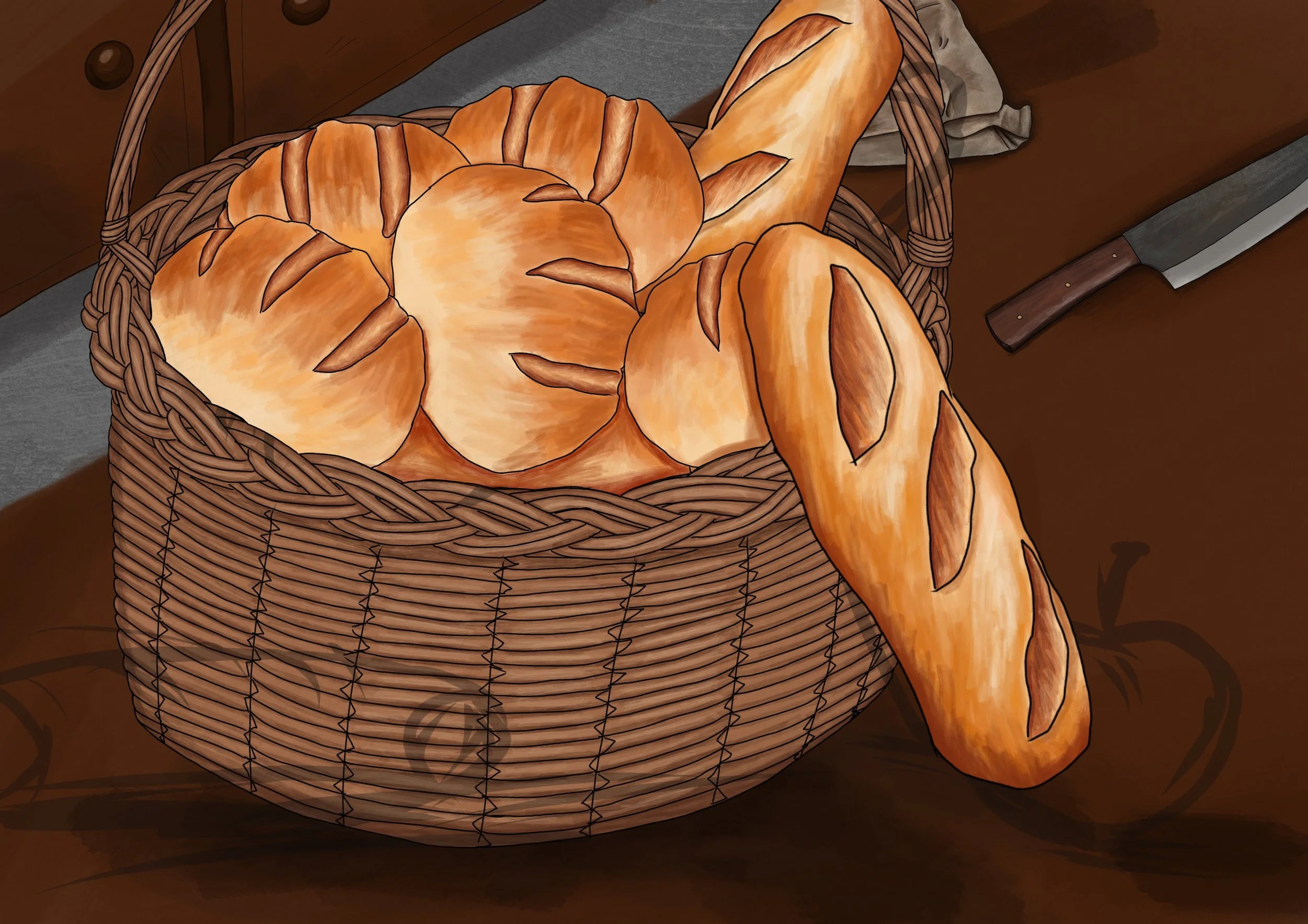
Also by this point, I had decided to change the colour of the table. The dark oak wasn’t working in my eyes. I’m not entirely sure why, the tones weren’t matching in my head. I think it’s because I never really made a direction of light, but by doing that, it would mean that the room is darker, which I didn’t want. I was looking to make it a warmer piece in contrast to the darker ones I had made. This isn’t a bad scene, this is where things begin.
Now, I needed to figure out where Caliban was meant to go. I wanted him to be in the centre *cough, focal point* and luckily for that desire, he looked better in the middle.
So I repeated the same process; sketch, white under layer, clipping-mask, then I started to tone it, but as I did this, I discovered a problem. I was wanting the dark lines like the rest of them, but you cannot see black lines on a black dragon. So I changed it to white, which did not work at all. From that, I reverted back and worked through toning Caliban so we could see his features without them.
Caliban’s Seeing Eye
I thought it would make a fun little touch to have Caliban’s eye open. He’s intelligent, so he’s aware when people are surrounding him, but the question is, will he need to protect himself, or is someone already on the job?
Final Touches
All should have been completed. The dragon was done, the basket was done, everything was finished, but something wasn’t right. It was still too plain. I knew I was going to add writing, but it still didn’t seem finished. Then I remembered that bread baskets tend to have a cloth inside to capture the crumbs … but as we know, my basket is superior to that problem. Nevertheless, to solve one problem, I figured adding the red cloth would do the job. Red for MURDER AND BETRAYAL!!! No, I really did it to match the tones of the apple.
Thus concludes the piece. I made the tone warmer and added grain to match the visual rustic idea I had. The writing alone still didn’t settle in my mind, so I used an acrylic black stroke to bolden the words.
Thank you for sticking with me to read my weird analysis for the Dragon in the Bread. I appreciate your patience and I hope you enjoyed your time reading about them :)
The Corpsed Battlefield
What Does it Mean?
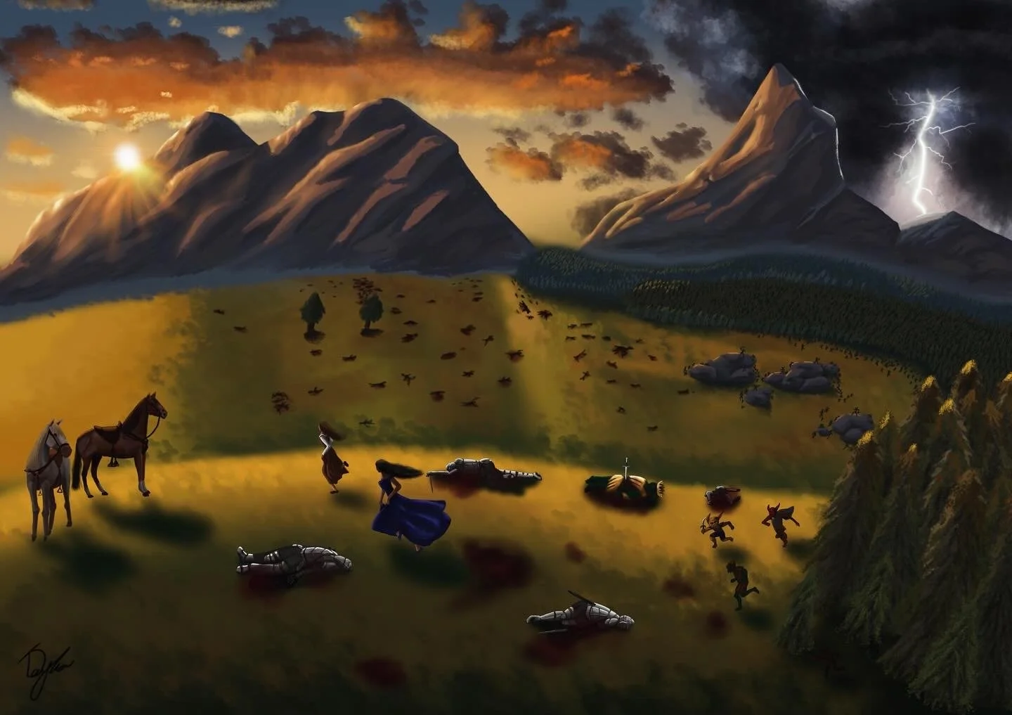
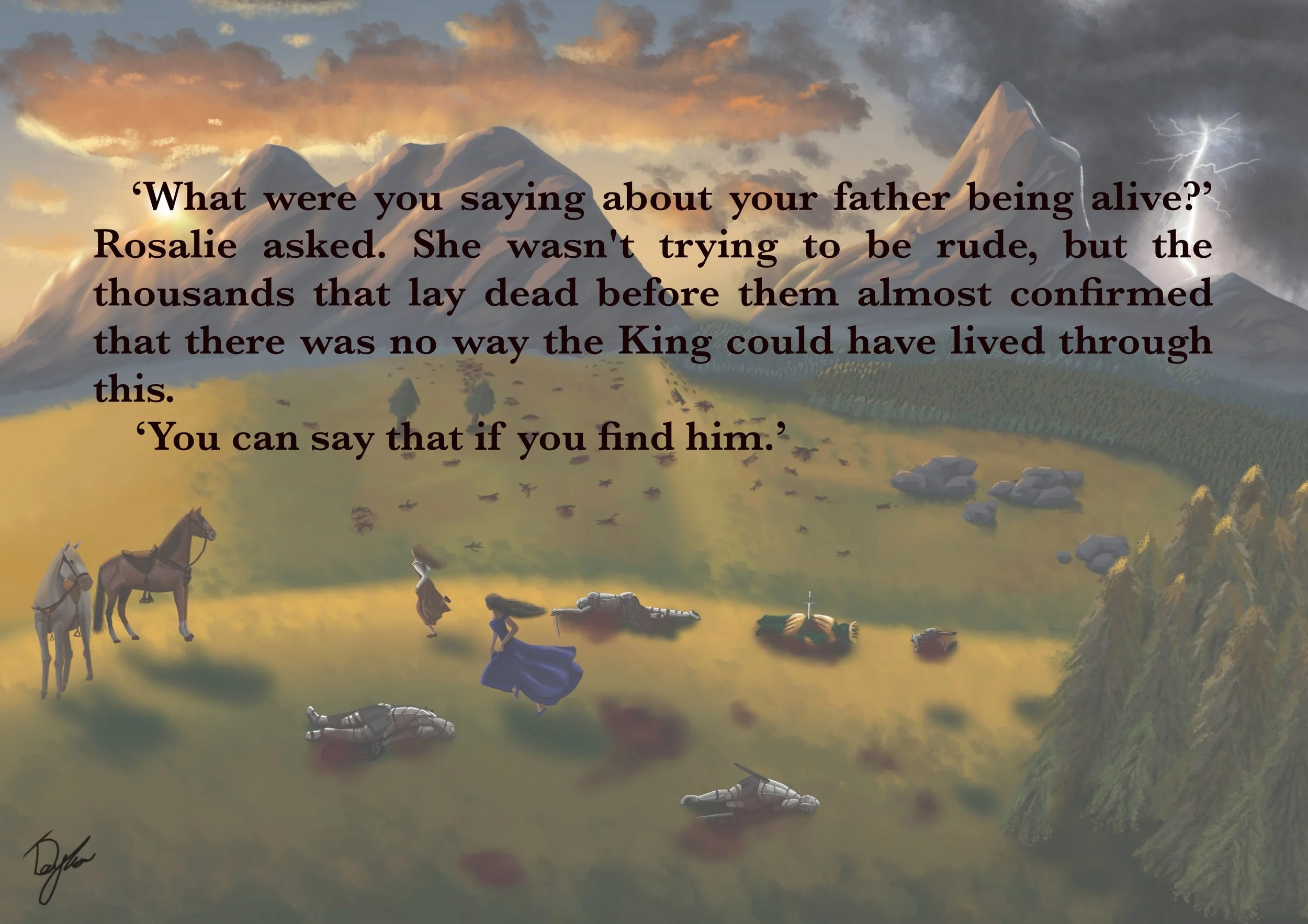
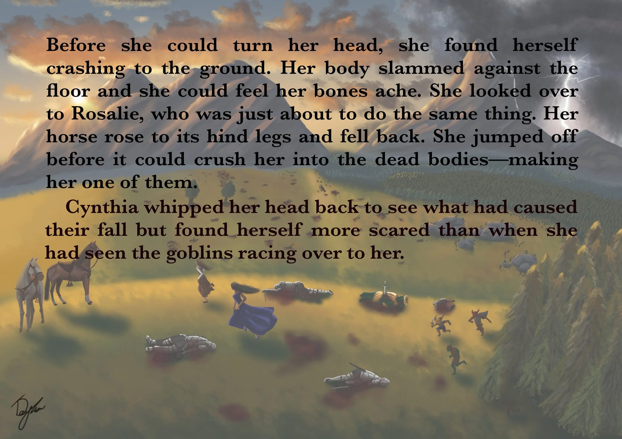
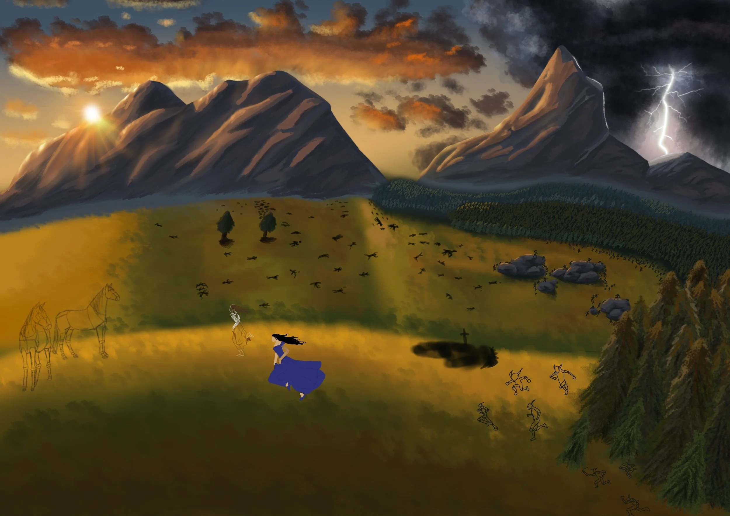
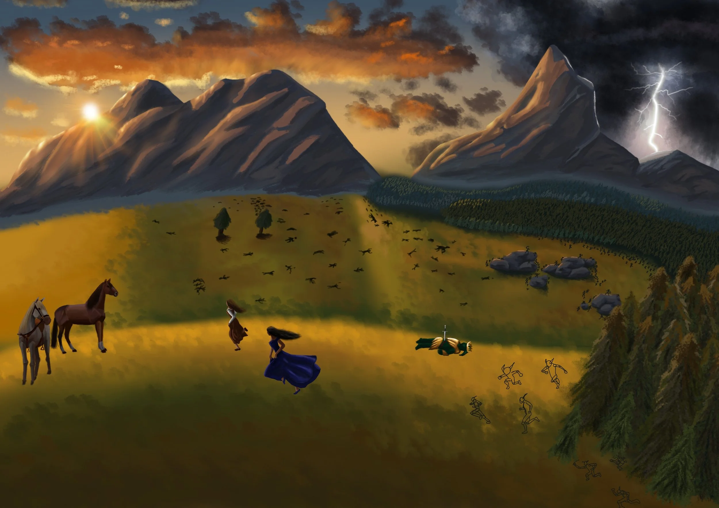
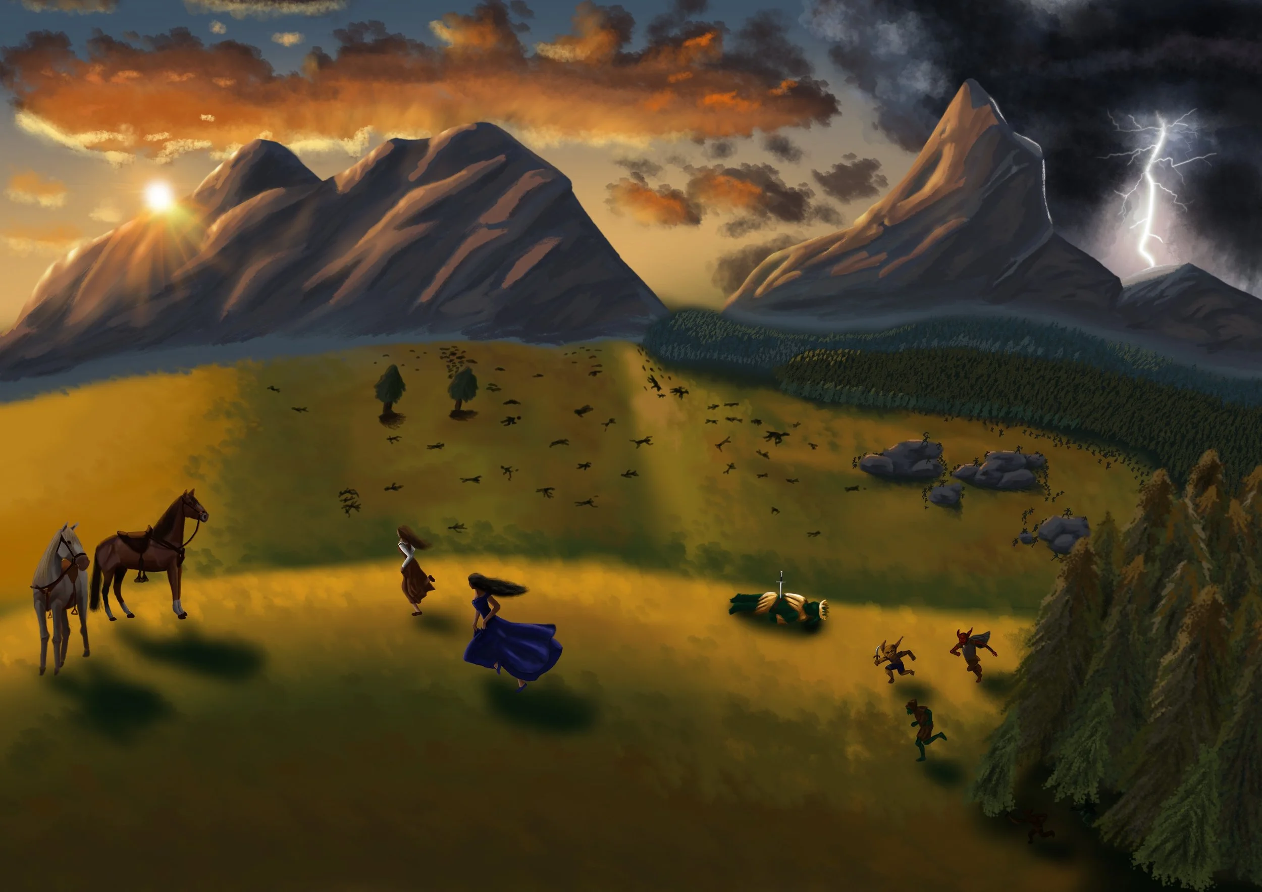
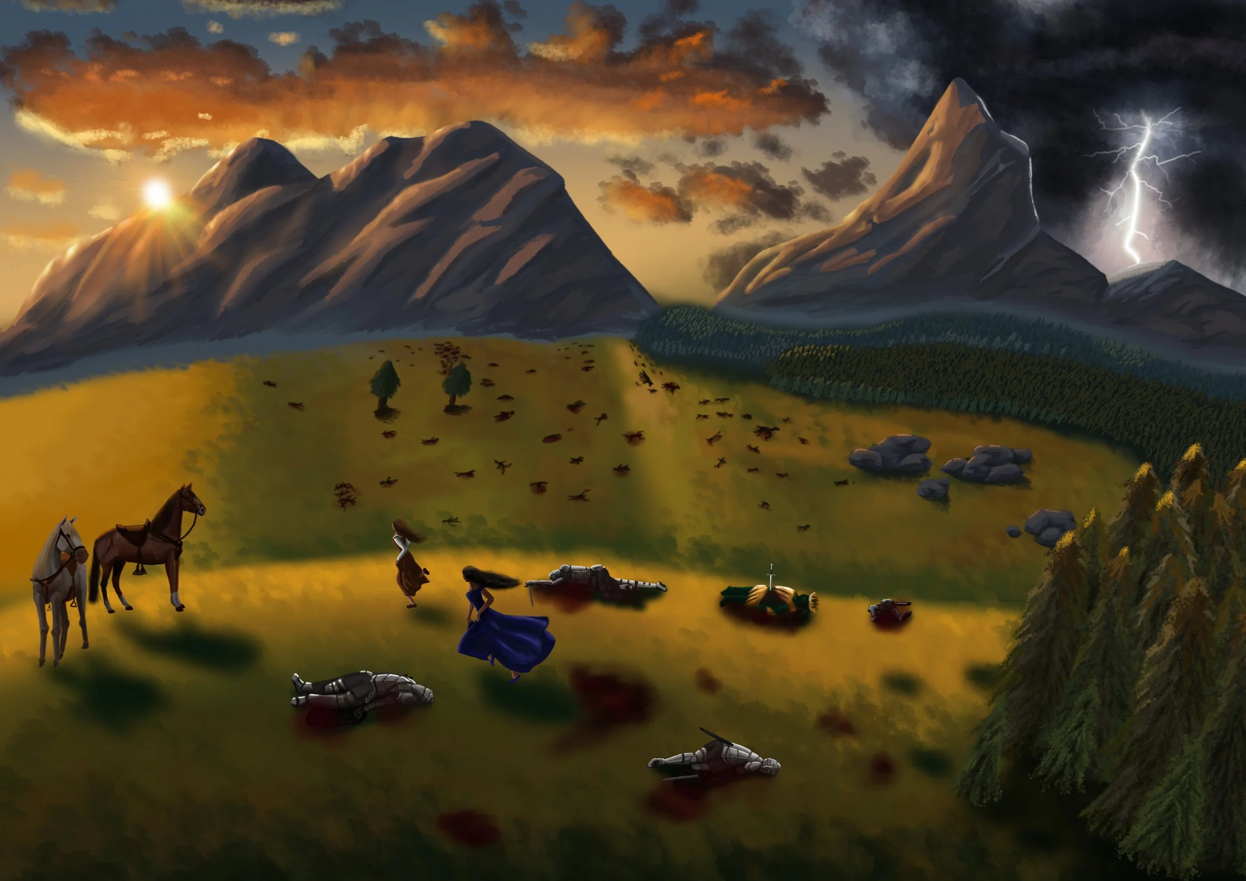
It’s battlefield filled with corpses, for starts. In this moment, Cynthia forces her poor maid, Rosalie, to the remnants of a battlefield in search for evidence of her father’s body. However, what she finds is not the answer she expected, but rather an ambush of goblins. (Chapter three: Corpses in the Battlefield)
Inspiration Behind the Setting
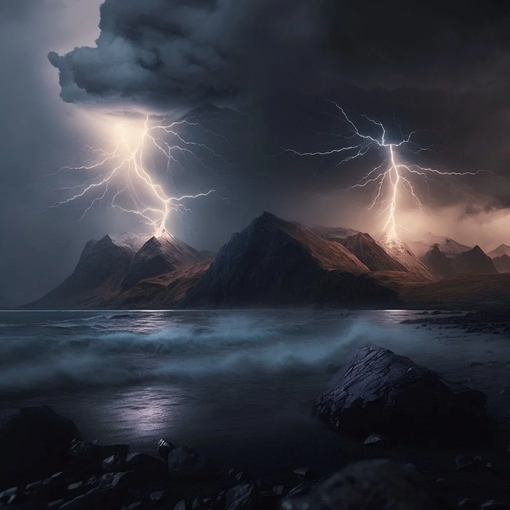
In relation to the scene, it doesn’t specify that there is a lightning strike beyond, but I added this in reference to the storms that keep suddenly appearing, which does follow shortly after this chapter. As for the sunsetting beyond the mountains, well … they’re just pretty, aren’t they?
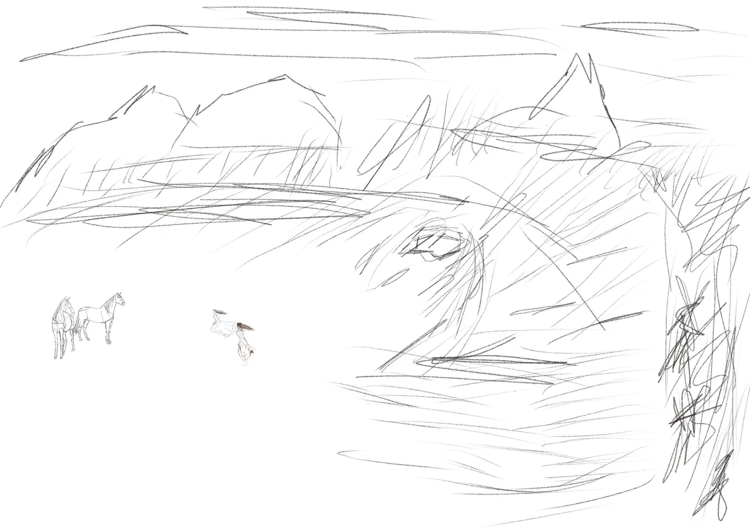
Sketchy Sketches
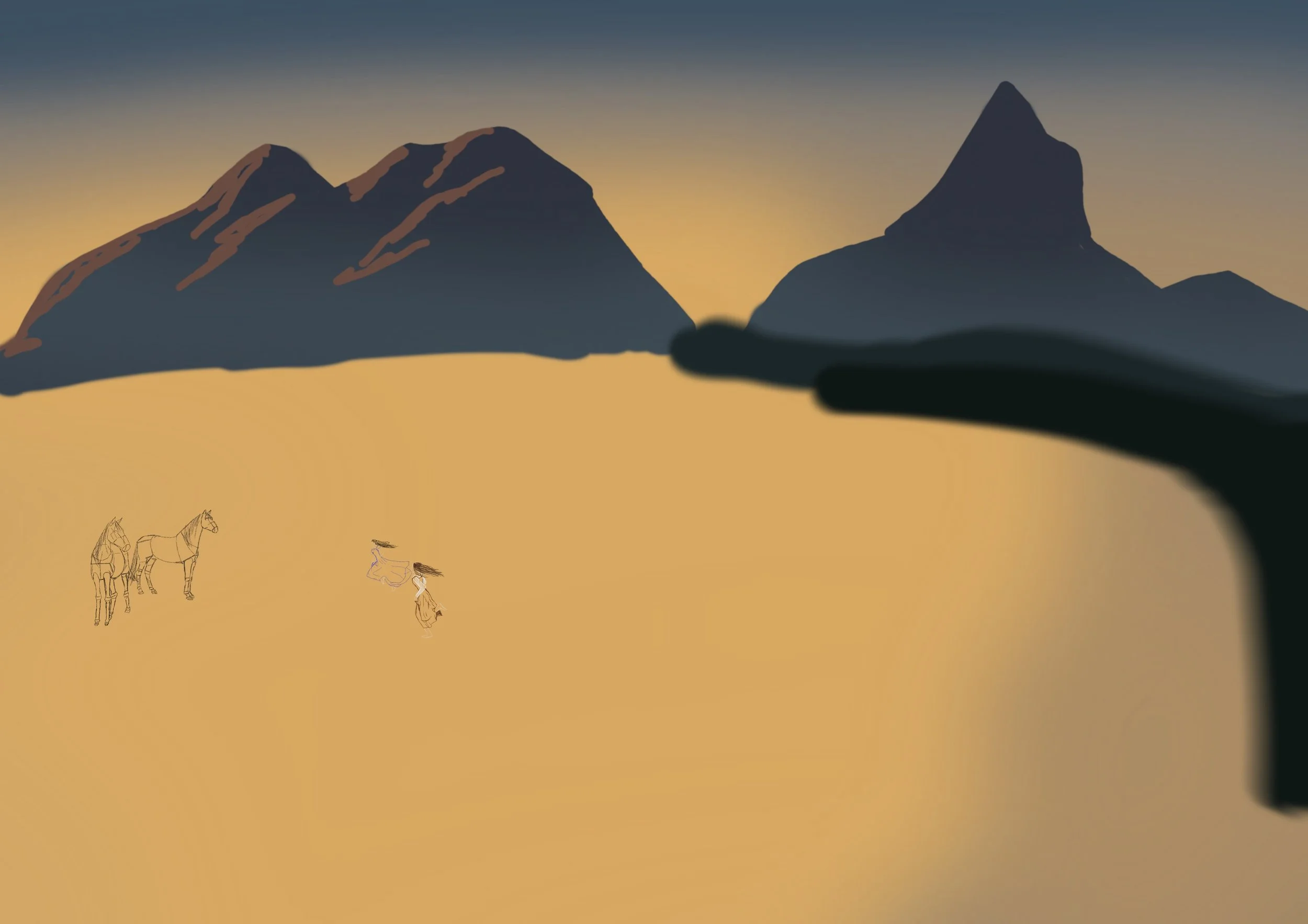
I tend to start off a lot of my drawings with very questionable sketches. It’s how I can map it out, as I am certain most artists do. So, I wanted to get a sense of how I’ll be building my scene.
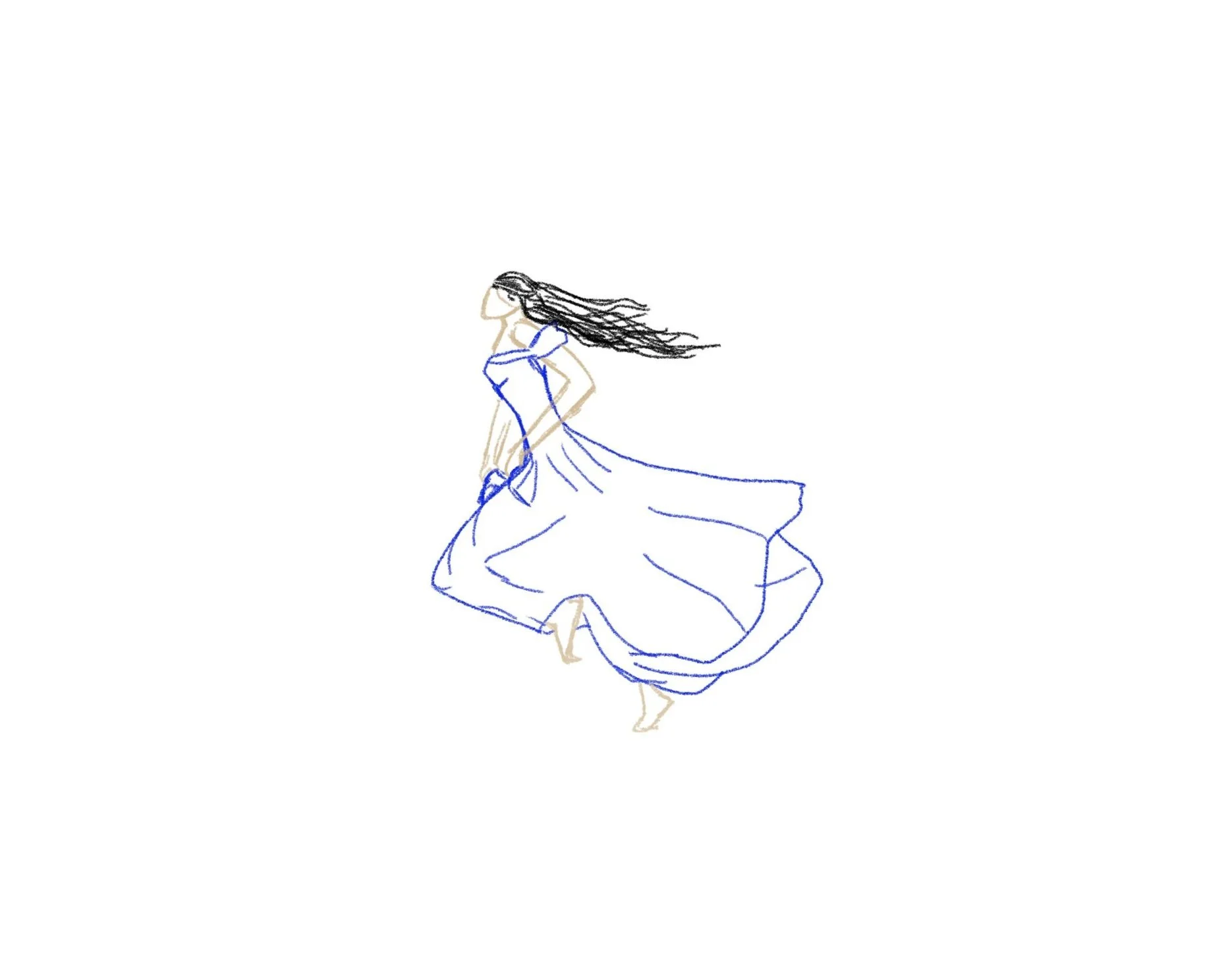
I started with Cynthia and Rosalie running, which was difficult for me because I wasn’t entirely sure how to make the character seem like they were genuinely running for their lives. When I googled for references, they were all very fake poses that didn’t seem natural.
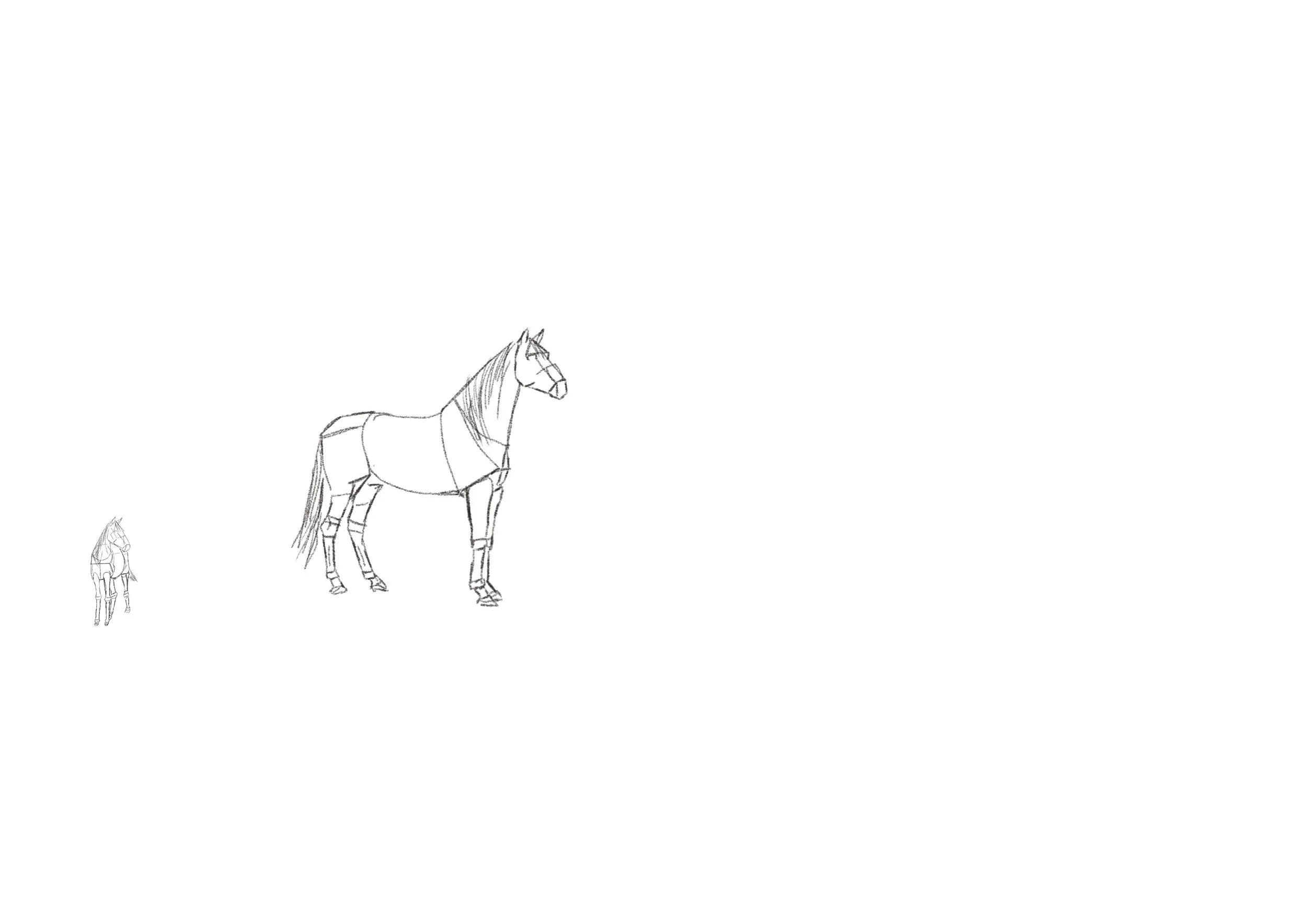
Understanding the shape of horses.
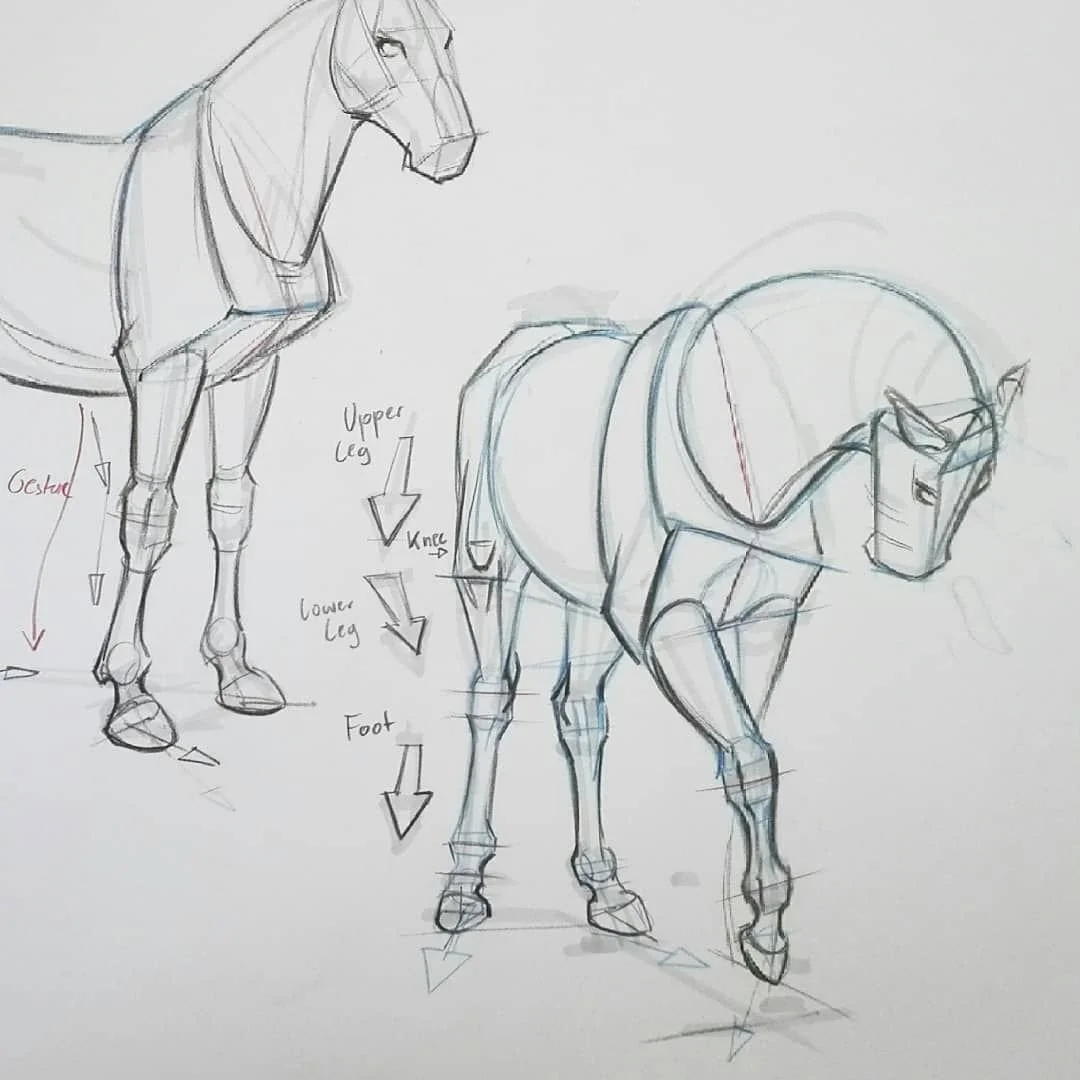
I don’t draw horses in my spare time, but this was a fun one to learn as I really love these creatures, and they will always feature in my stories one way or another.
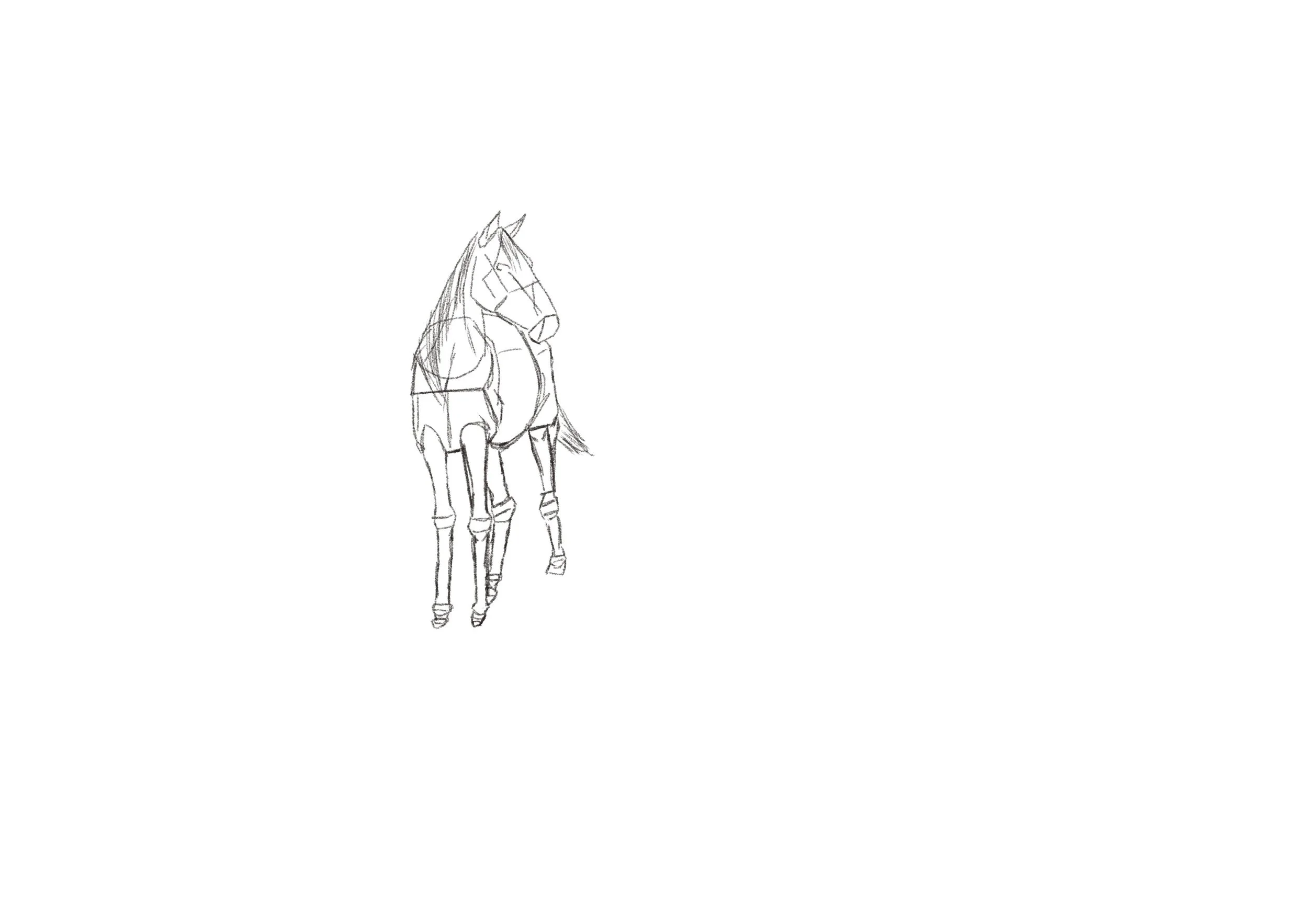
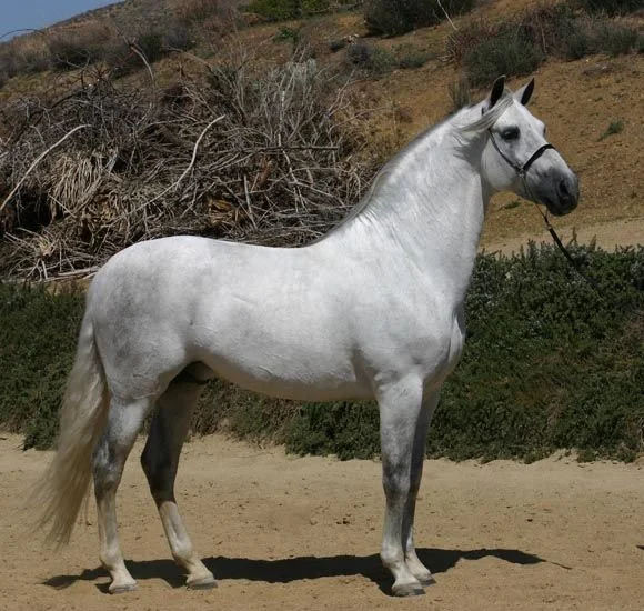
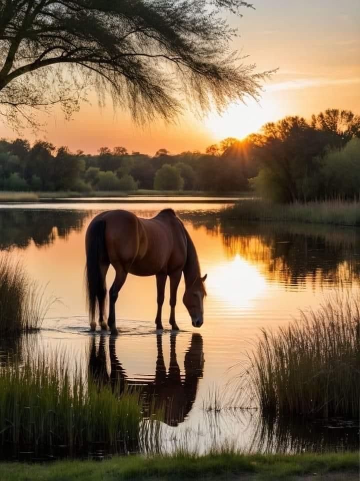
But in this moment, I didn’t want to just copy an image of a horse, I wanted to understand where the figure is built from within the shapes. This is where I found an image online and followed those guidelines for the horses I would be drawing.
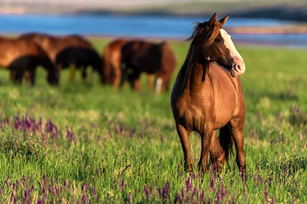
The reference images.
I tweaked the shape of the horses a little to match the image that was in my head, and the irony that the images I used are basically a swap for the colours I described them to have.
Landscaping
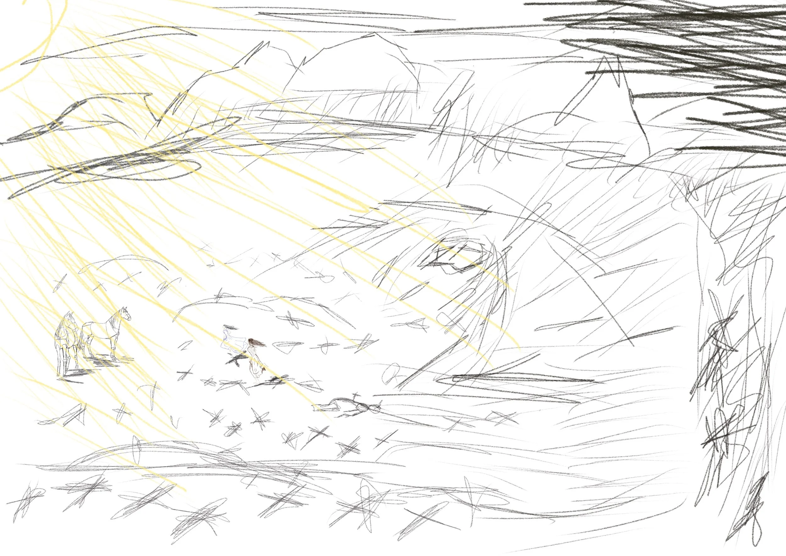
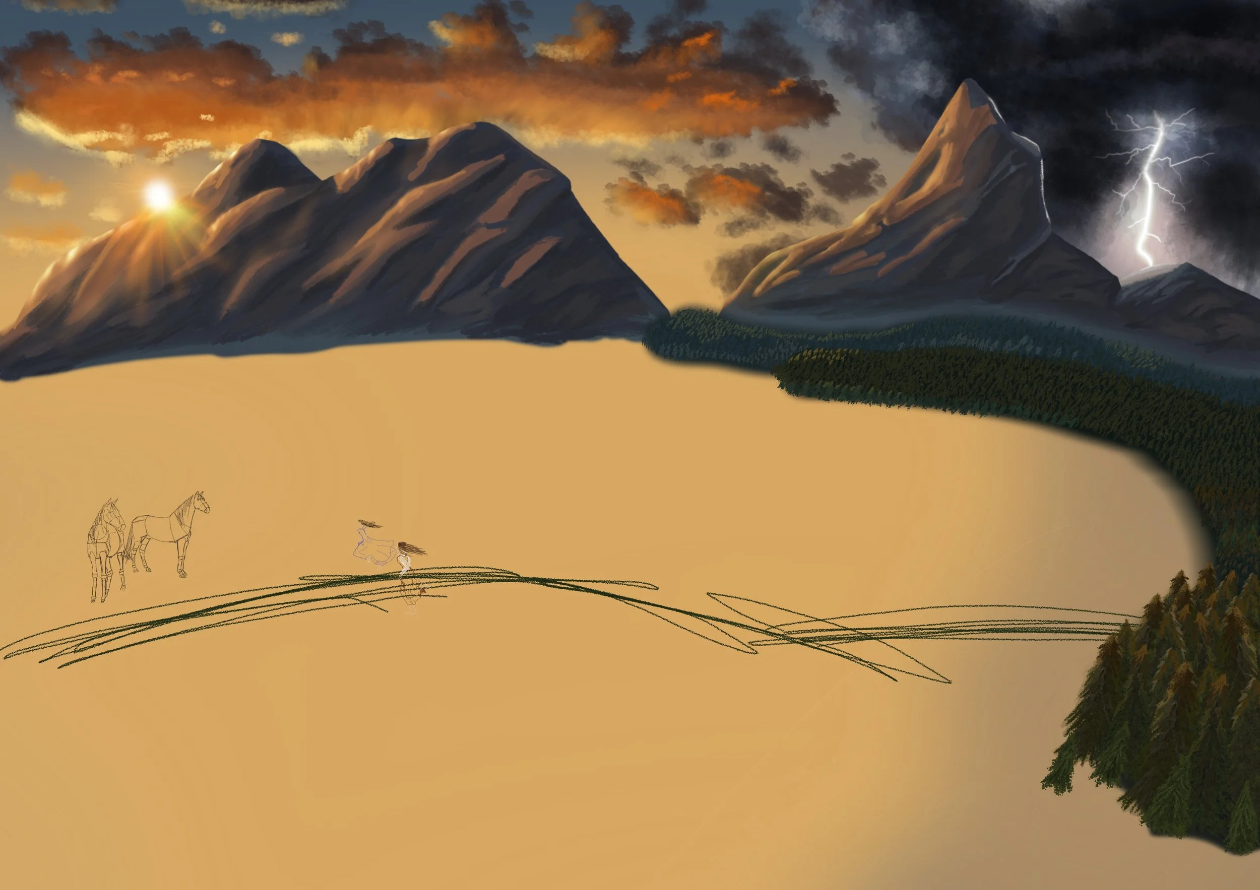
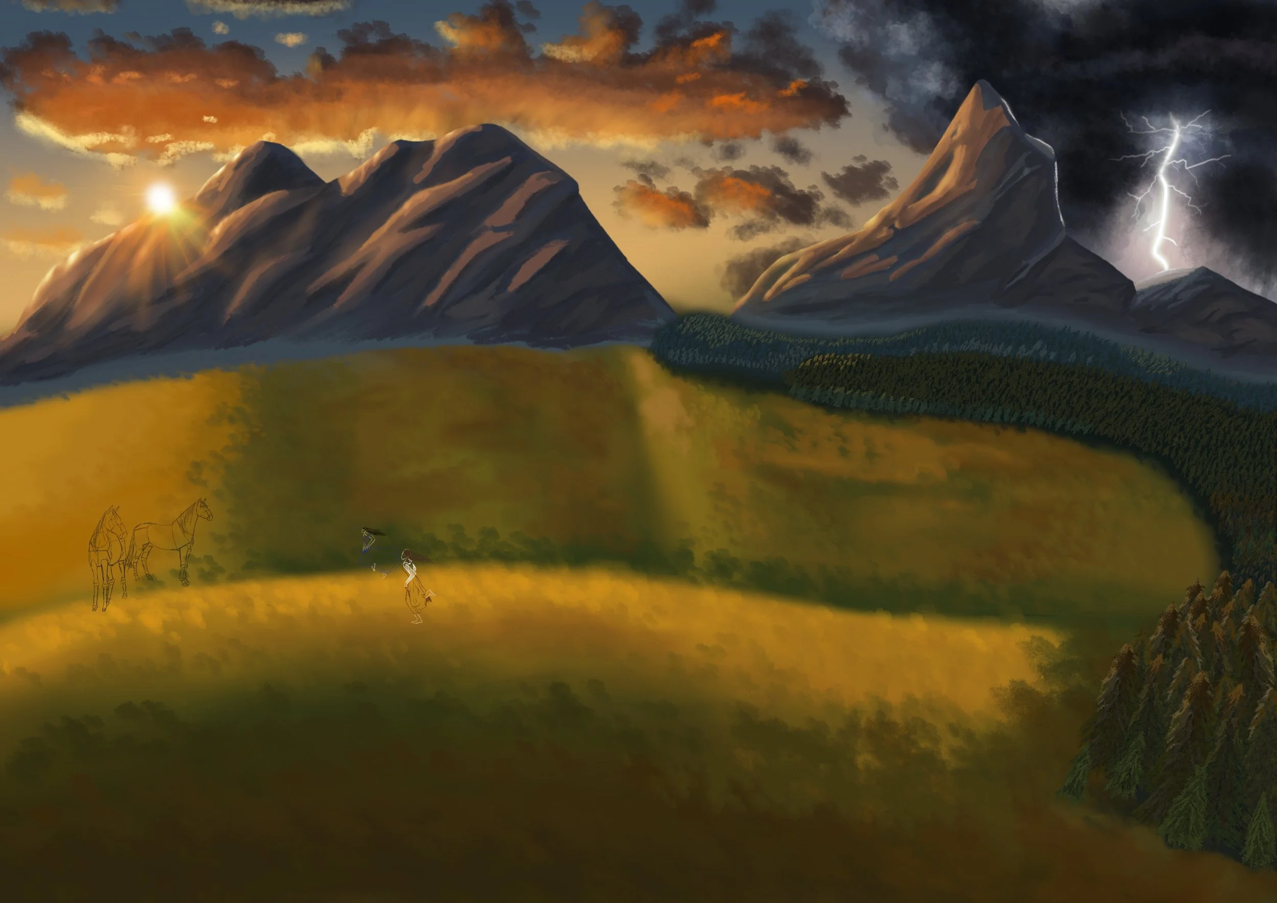
So, I had a vision in my head for how I wanted this to look. I wanted mountains, an open plainlands, a forest, a rock pile, and I wanted it to be reasonably zoomed out.
Alongside these things, I had a vision for one side being a beautiful sunshine and the other side to be dark, referencing the impending doom to follow. It mirrors the scene for the sudden drastic change to danger, as well as a contrast between a beautiful scene and a harrowing massacre.
I needed features like the rock pile and surrounding forest as they are referenced within the book. The goblins were hiding within them and run out for a surprise attack.
Adding Colour
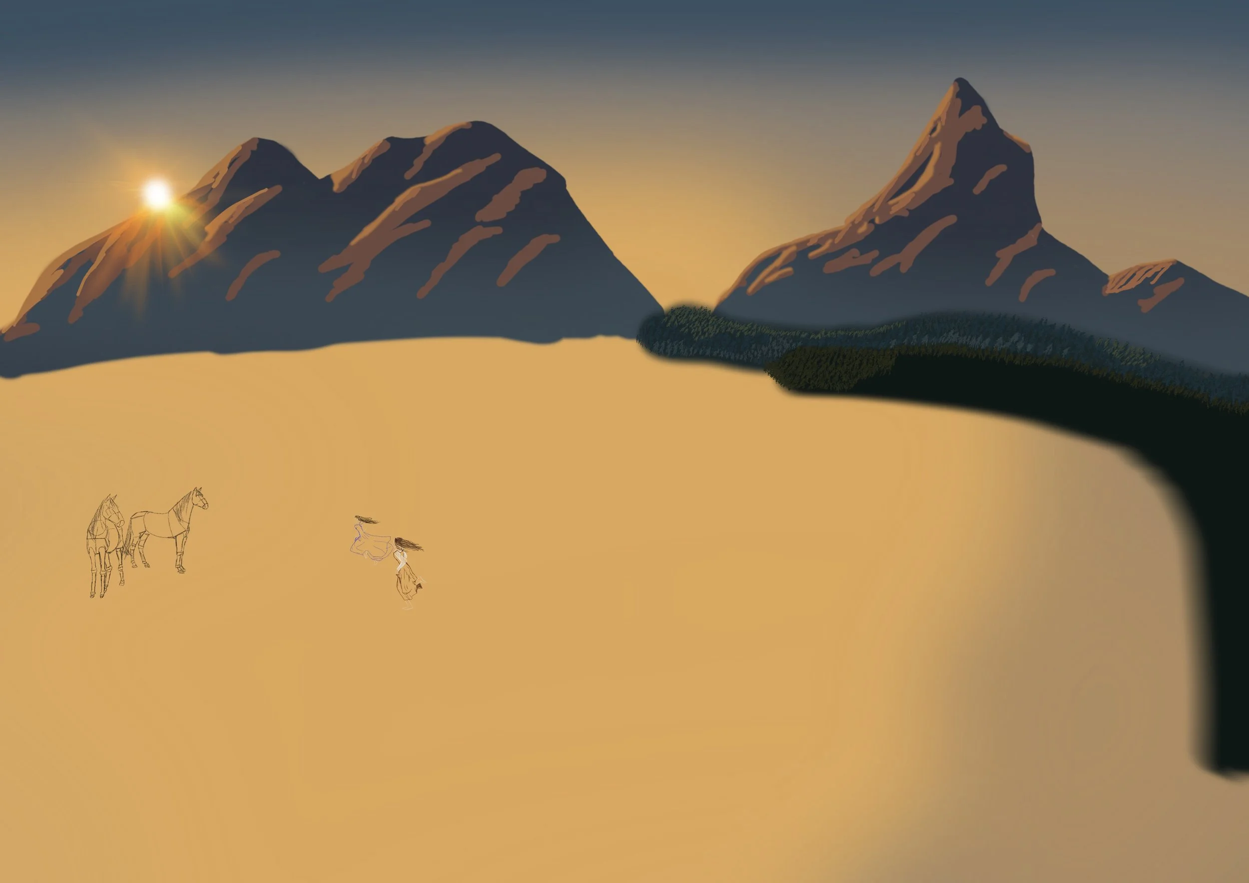
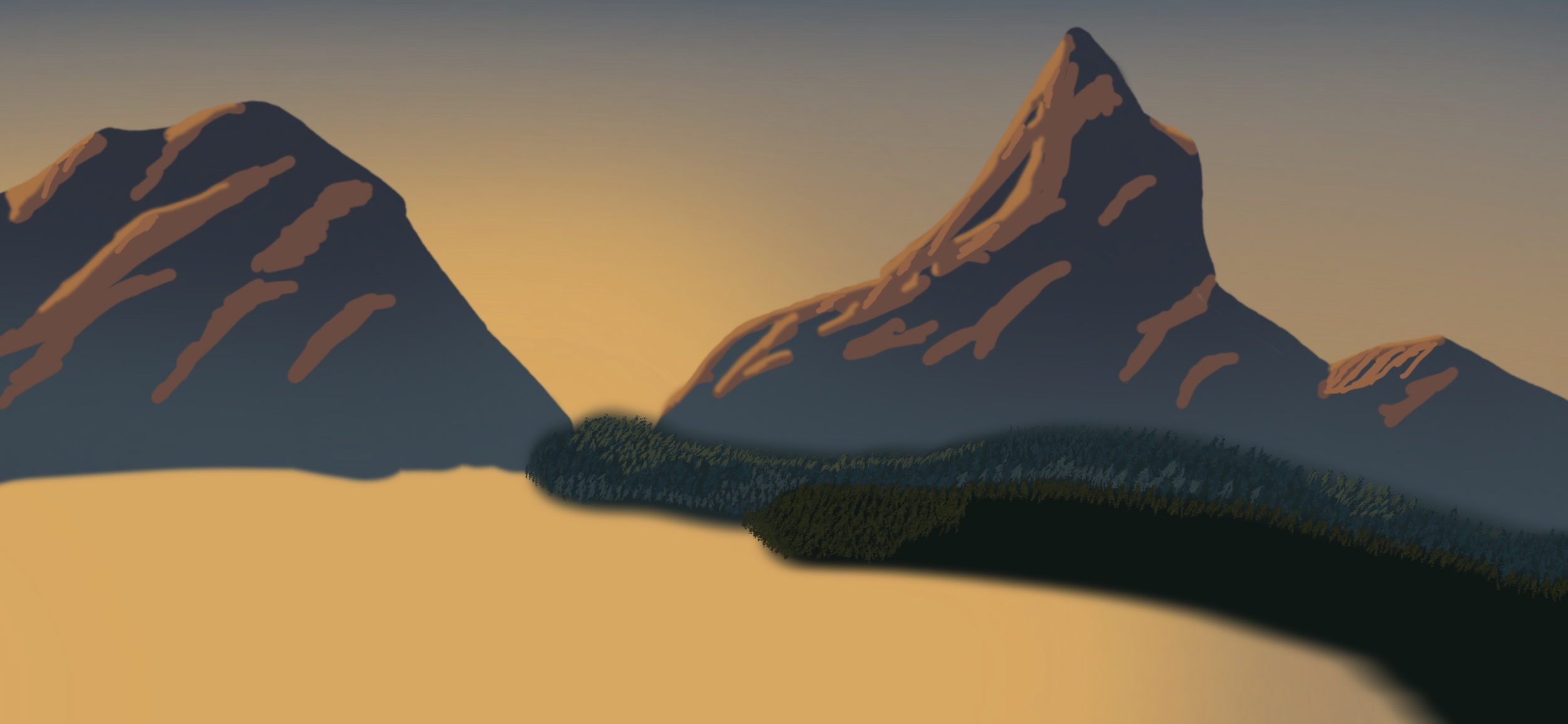
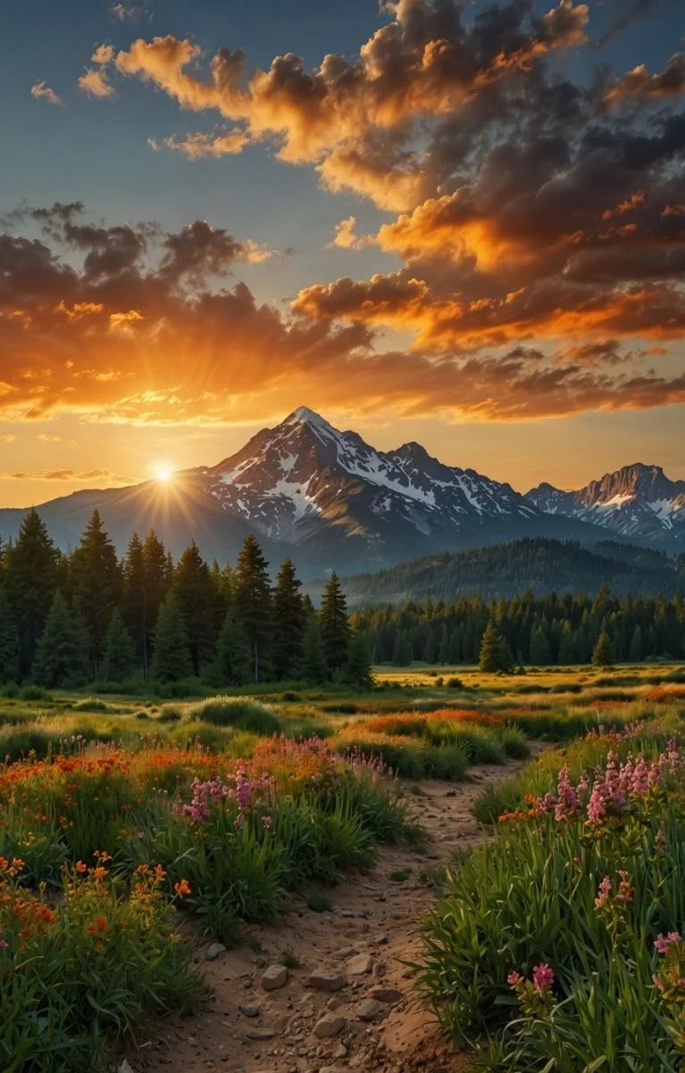
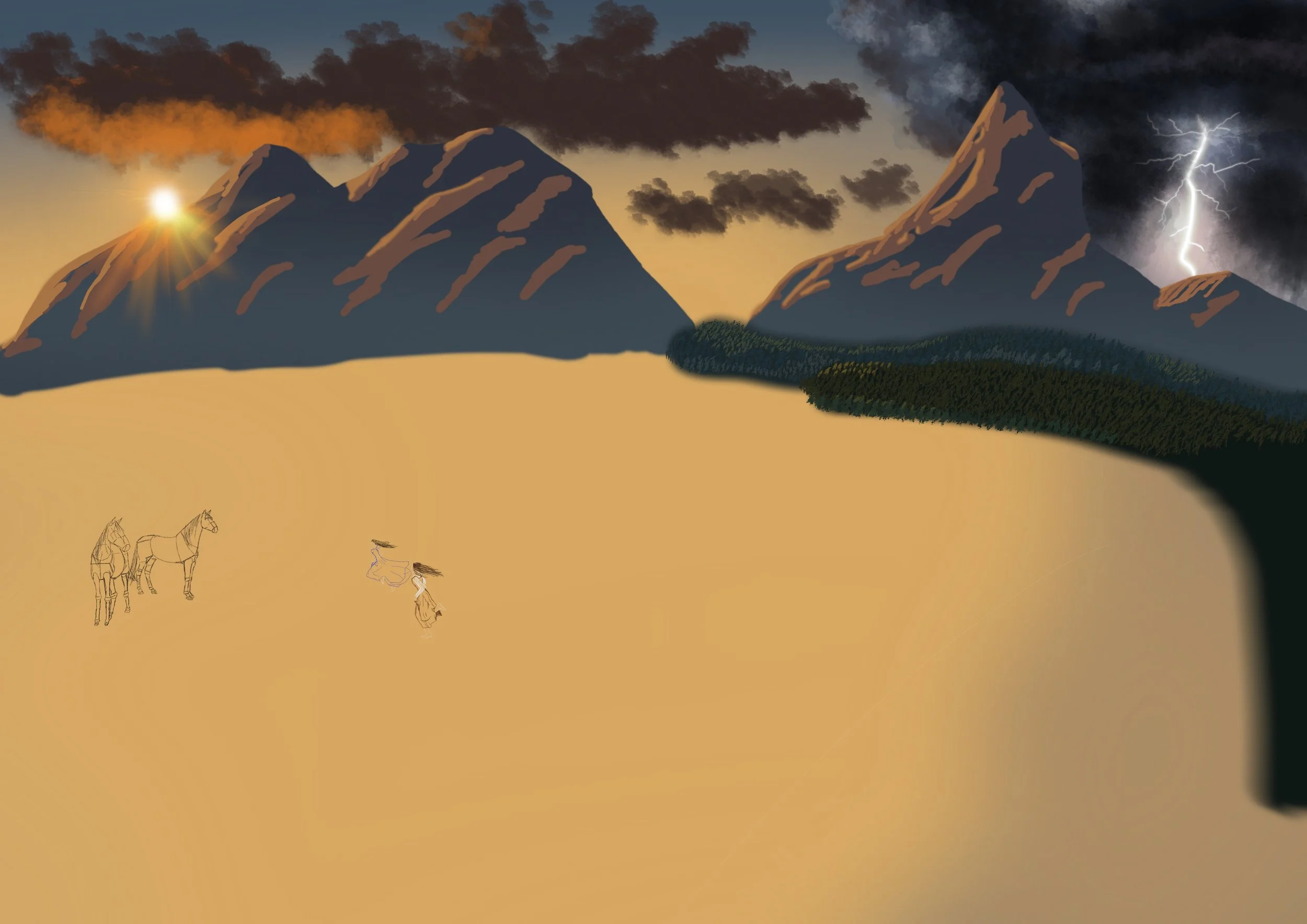
I started off by using the ‘airbrush’ tool on procreate to get the colours of the sunset sky. I then blurred the background so it would blend into an ombre. With this, I decided that it was time to add the fundamental shape of mountains in the distance, as well as the dark shaded tones of the forest.
I then used an illuminated tool to create the dot of the sunset for the sky. I added the beams in a different layer to have it shining through over the mountains as well. This is where I could start blocking out the shading to allow the mountains to take a 3D form.
I am not overly confident in making clouds, so I searched online for my references of a sunset and lightning strikes. Remarkably, I managed to find a sunset against a mountain which worked perfectly for my colour saturation.
Depth and Dimension
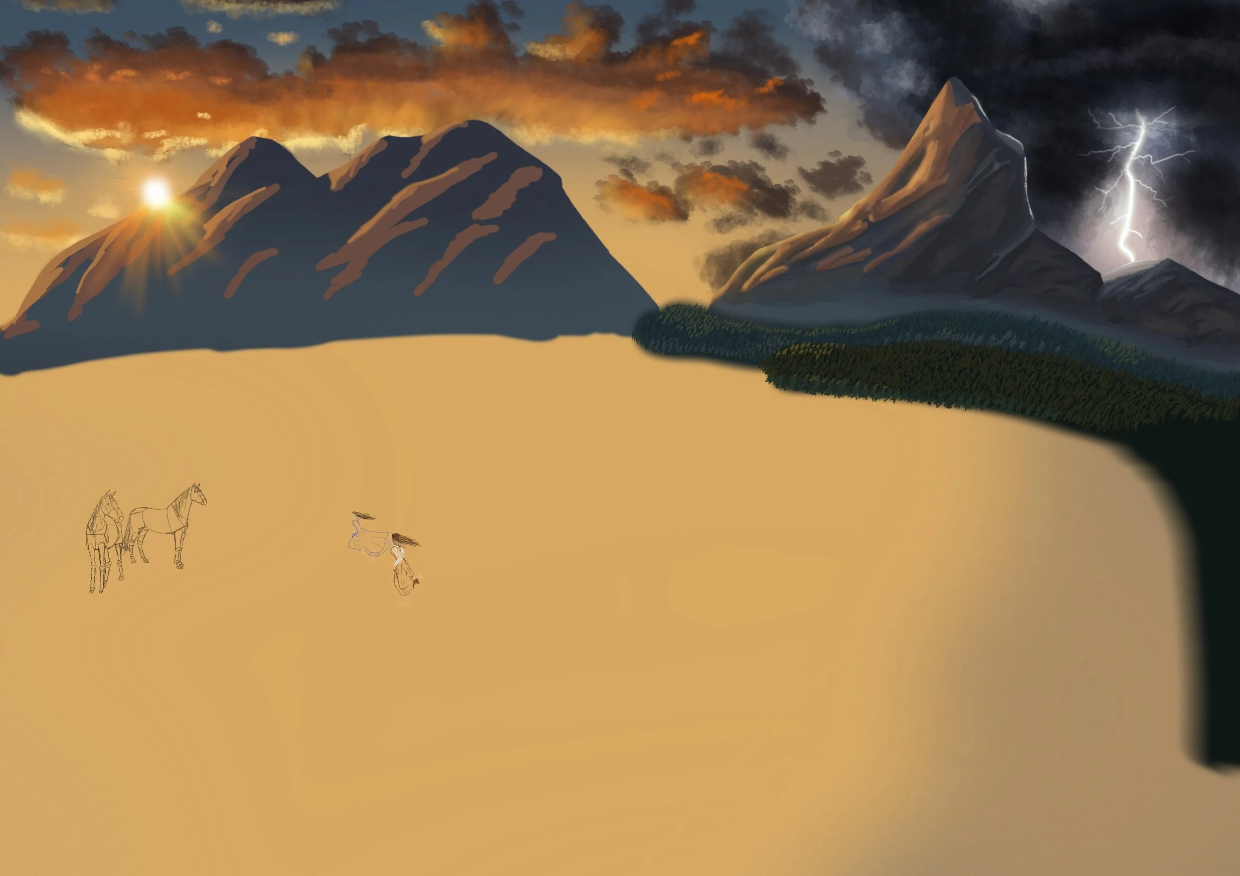
From here, I worked on creating volume to my clouds. I started with the dark, fluffy undertones, and then added lighter layers until it started to come to life. I wanted to make sure that one side was getting darker as we reach the brooding storm.
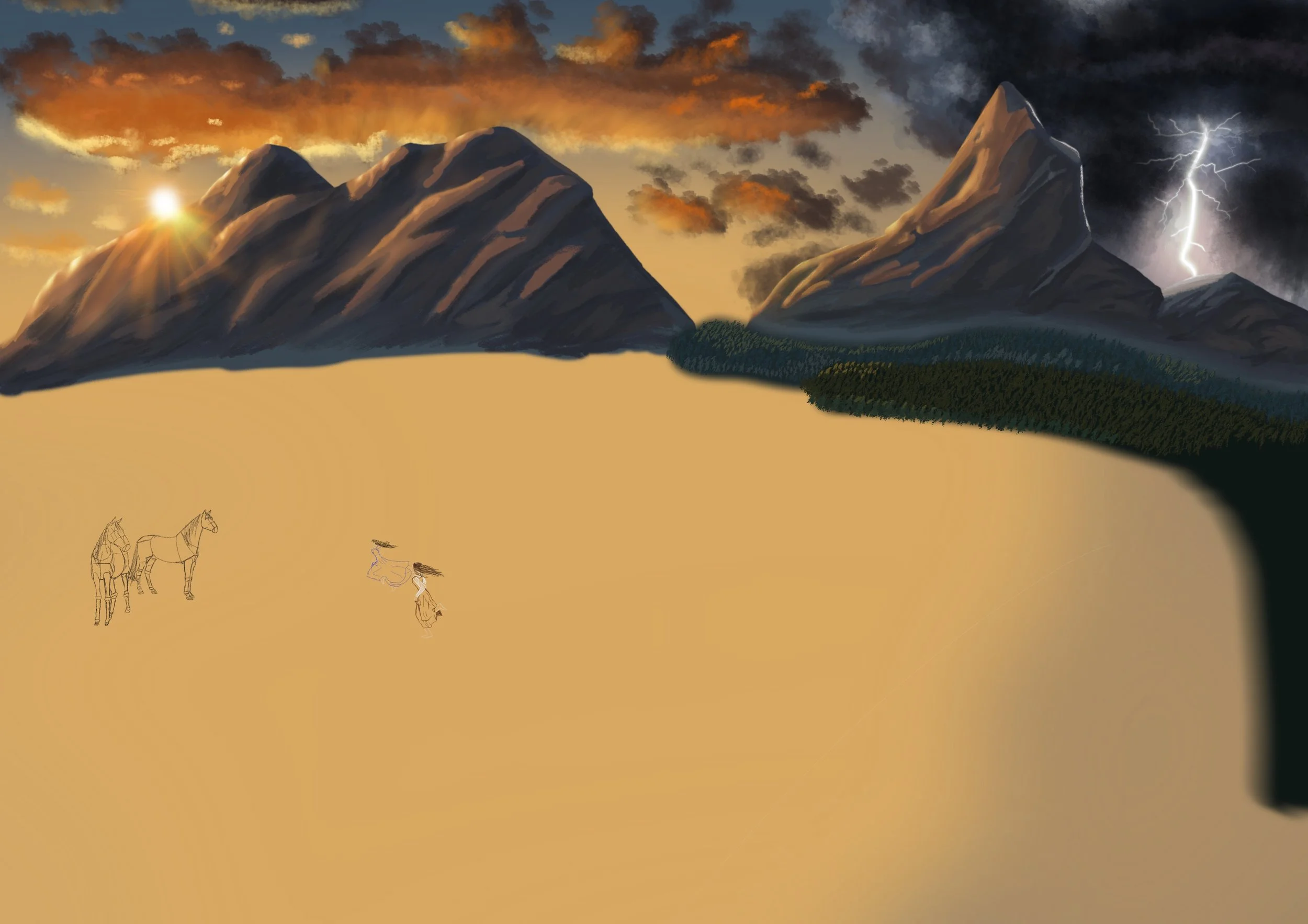
Now, this is my favourite part. I was creating the final overlay. I softened the edges to blend better and added darker tones to adapt to the directions of light (the sunset and lightening strike).
Then for the trees I went over the layers with a textured brush that added the branching effect to help quicken the process. I think I naturally always do things the long, tedious way, there’s definitely better ways out there … but ah well, this is my long process, you have no choice but to deal with it.
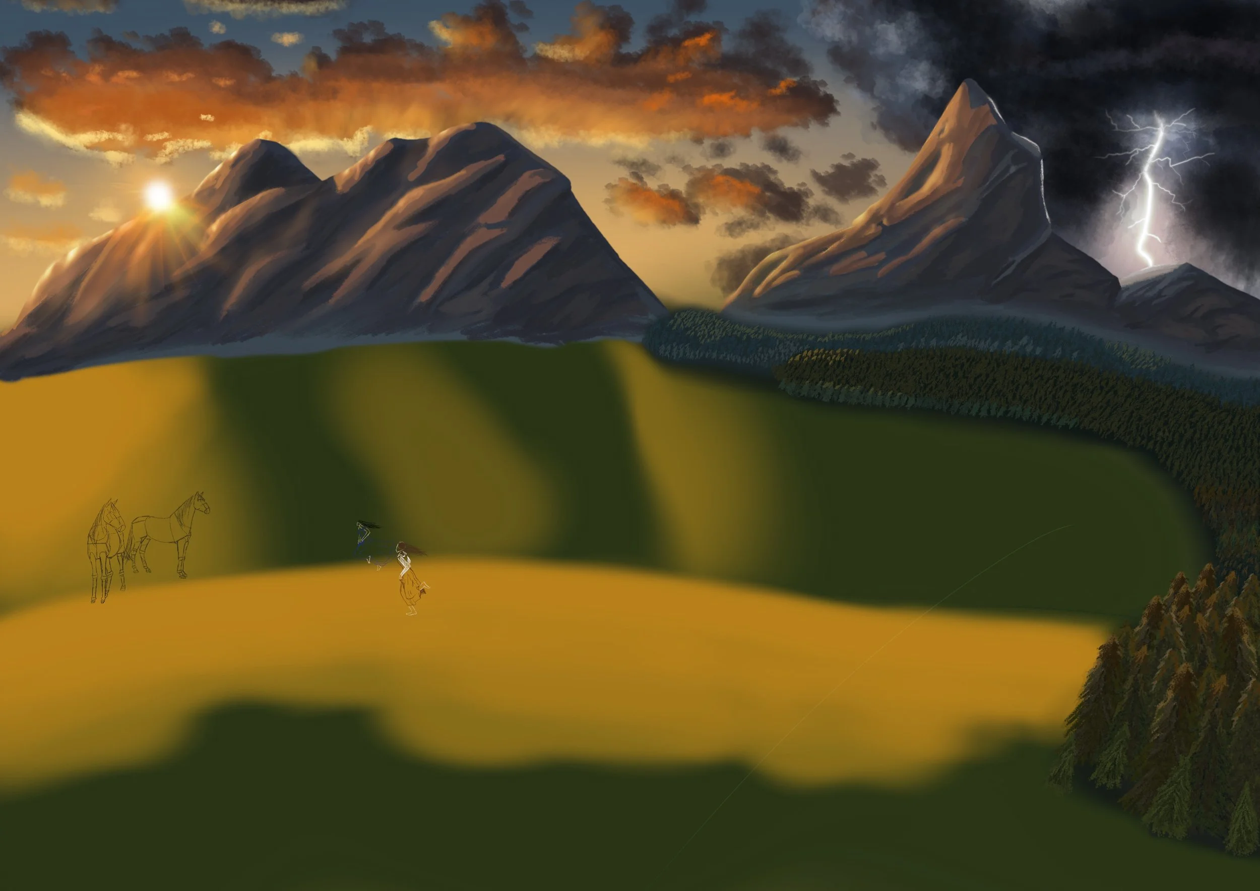
Making the Plainlands Unplain
I searched up a video to help with landscaping like this, and I found a helpful one that introduced me to new ways of using tools. I’ll link the video here.
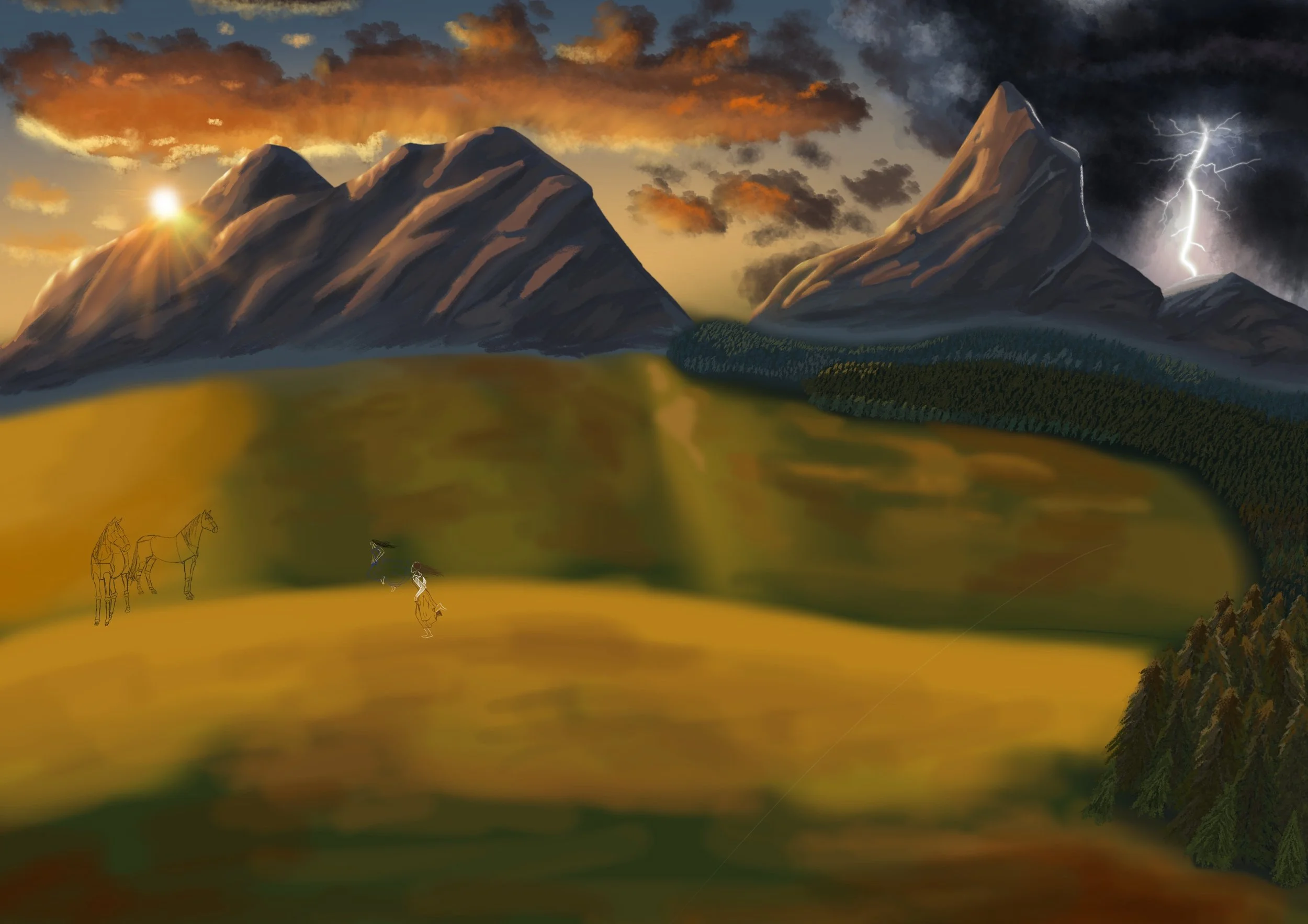
I used the airbrush tool to map out the colours and where I wanted the sun to be shining through. Then I used another layer to add further depth to the grassy texture.
I don’t 100% remember, but I think the video told me to use the rainforest rainclouds to add the texture on image three.
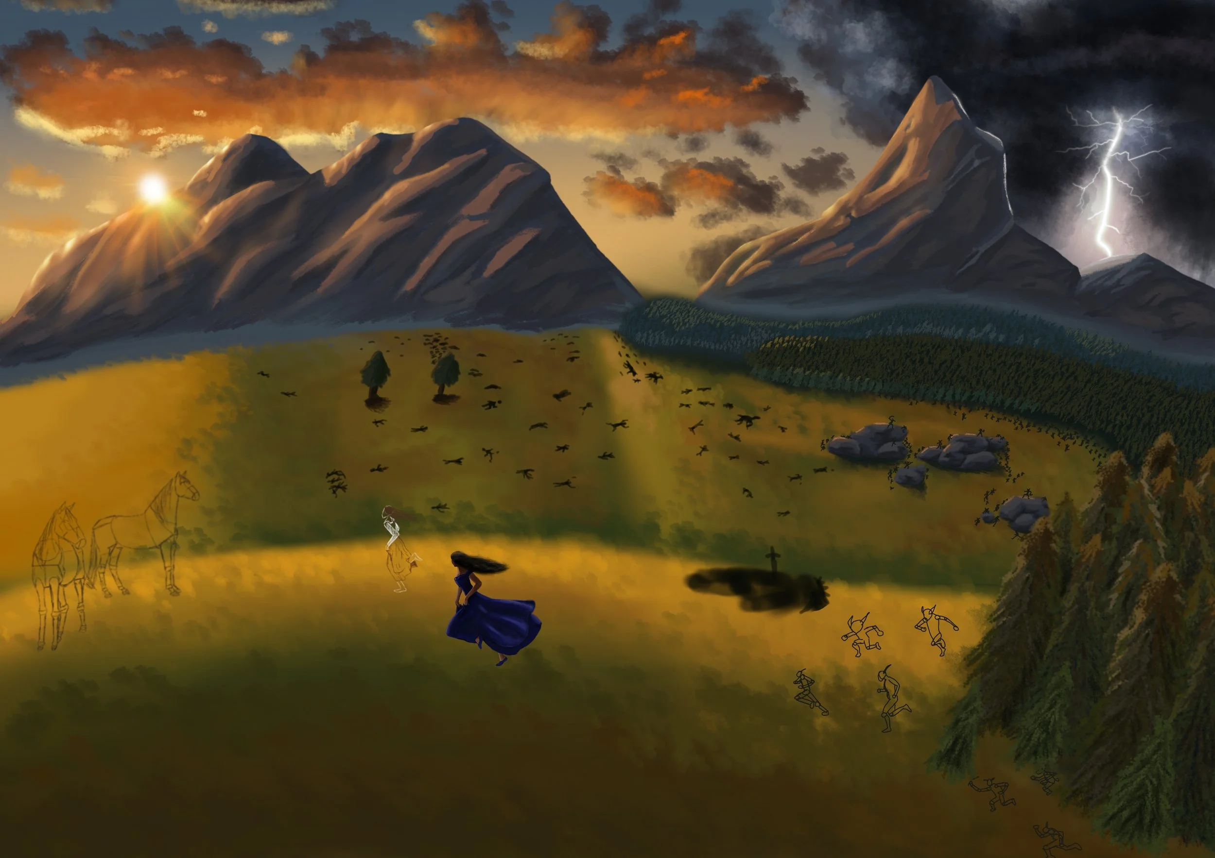
The book reference is here! I had now made the boulders and I wanted two shots for this. One without goblins. and one with after they chose to reveal themselves.
Cynthia, you better run!
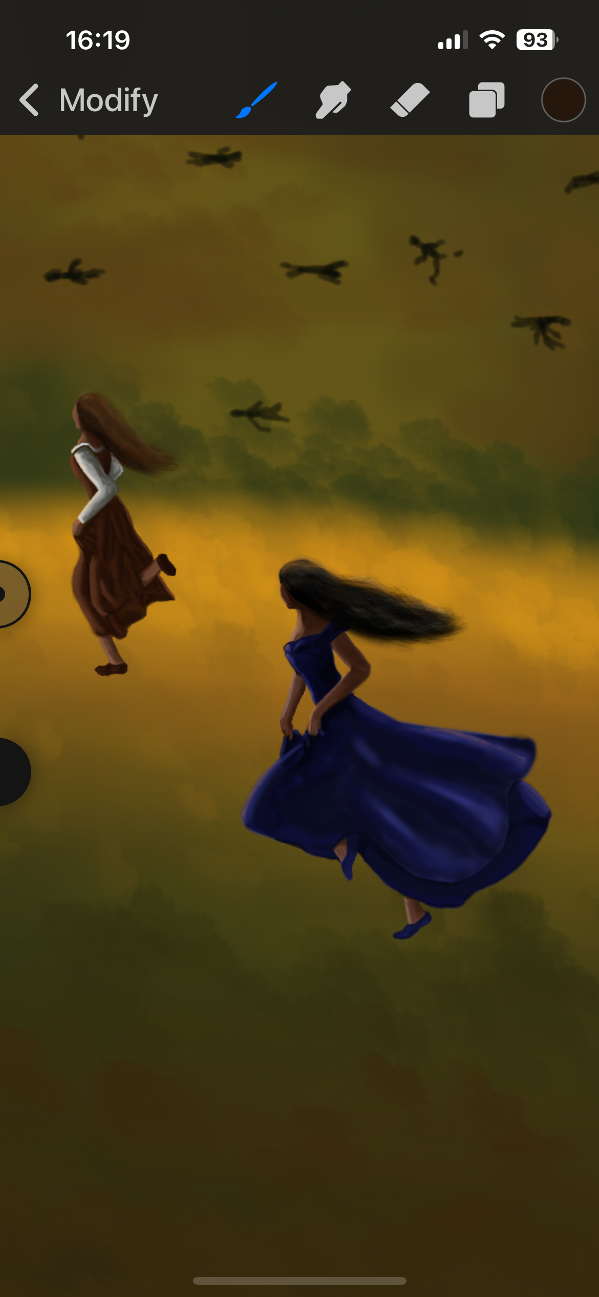
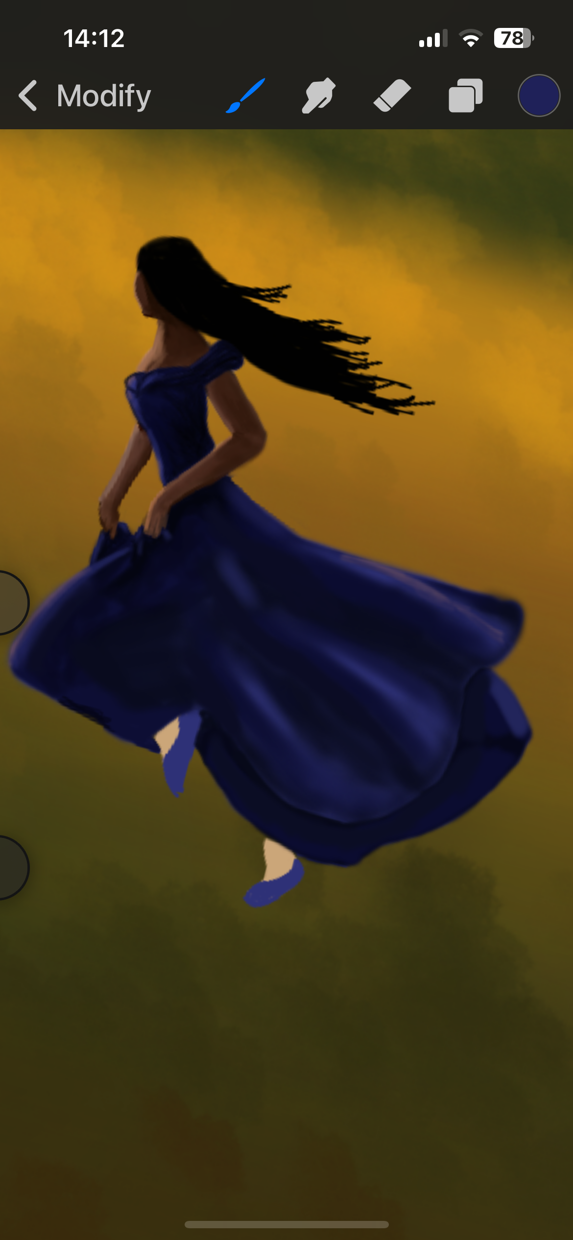
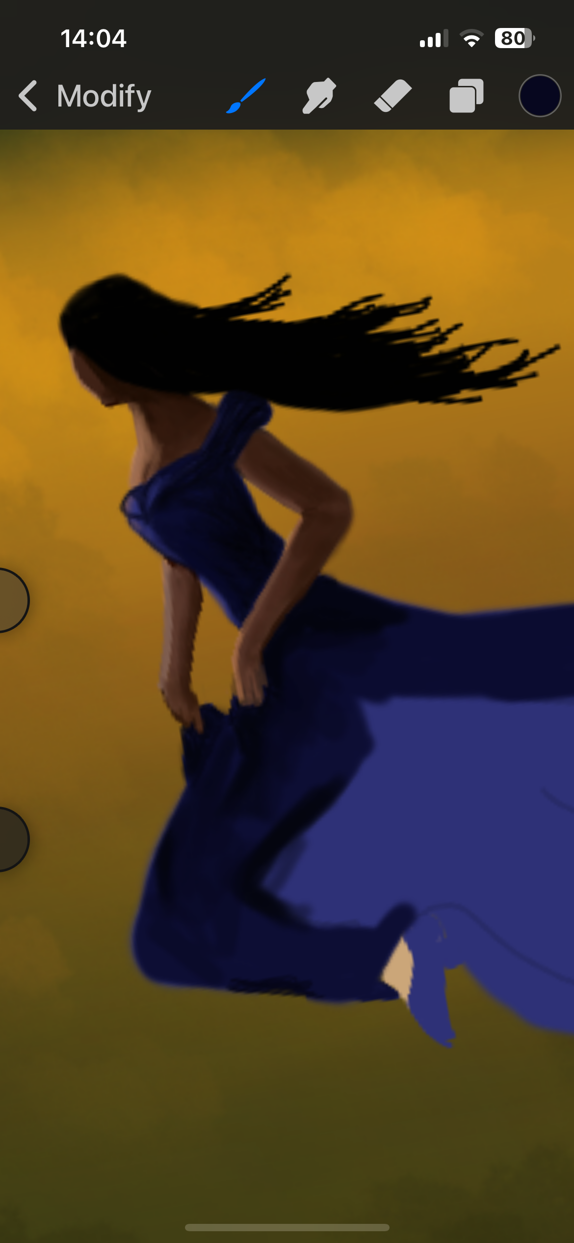
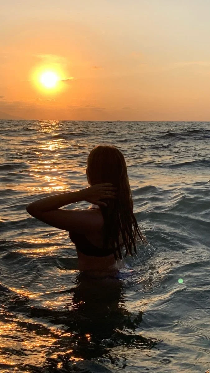
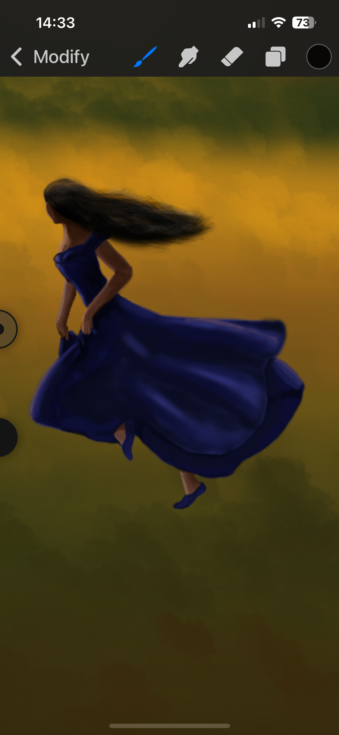
Okay, obviously this Cynthia needed some serious work. I needed a reference silhouette to help me work out the colours, but I started with a base layer before I found this beautiful image on Pinterest.
As for the dress, I used the colour references from the House of Bones image I had drawn. This time the blue dress is story accurate as this is what she is wearing for this scene.
For the tools, I used airbrush for the dress and arms, but as for the hair, I actually used the hair texture brush to give it that natural thin layer. I actually prefer the original outline for the hair, but let’s get real … when we run, our hair is naturally frizzy. I’m sorry Cynthia, But it’s true.
Aimilios (Strength)
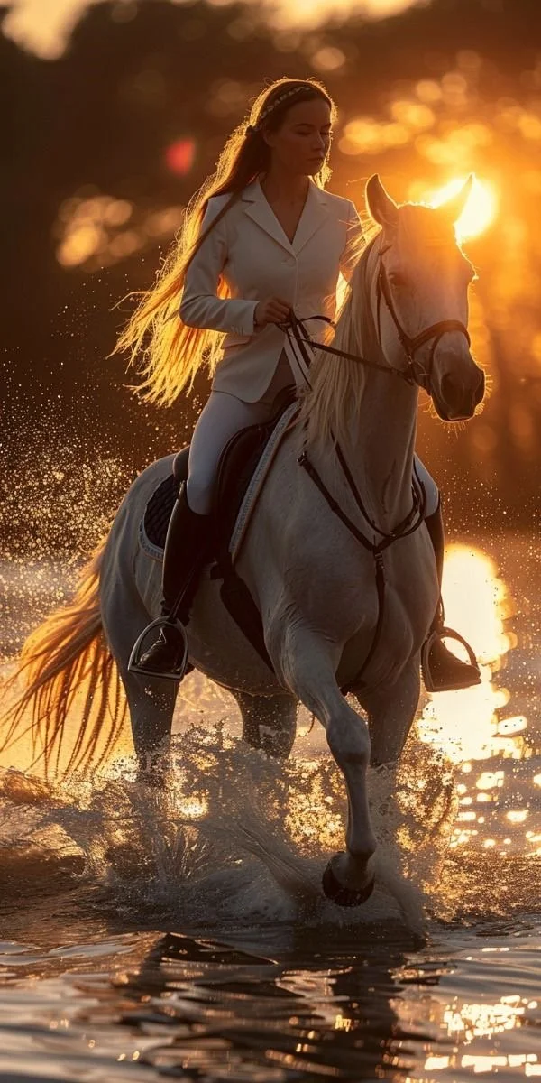
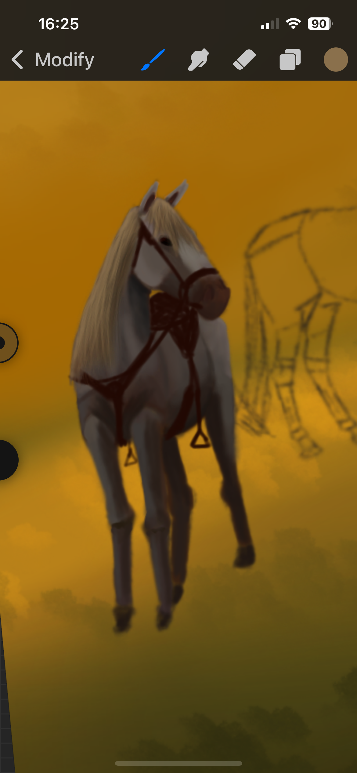
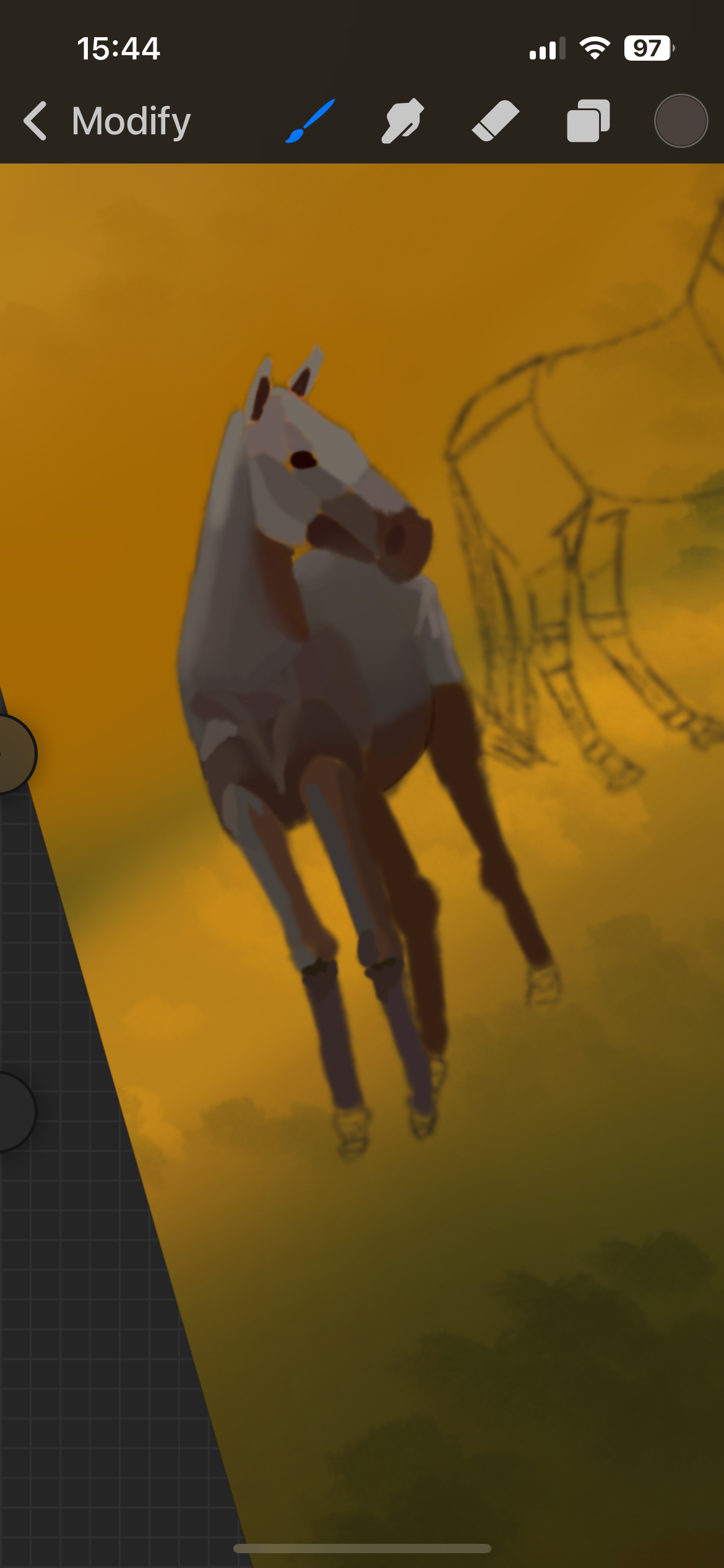
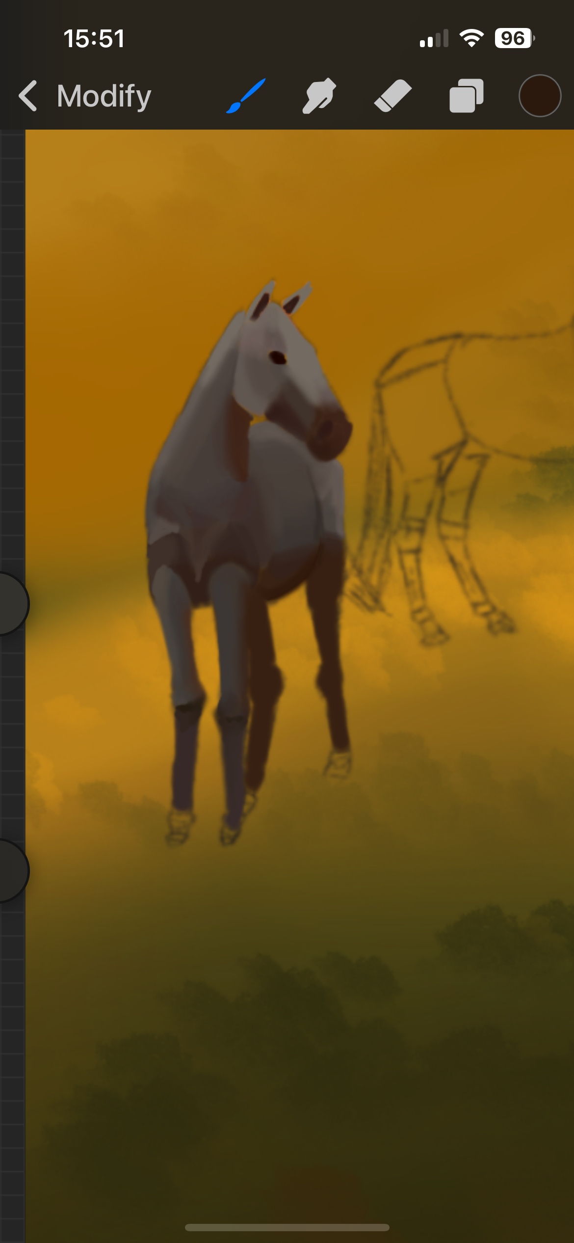
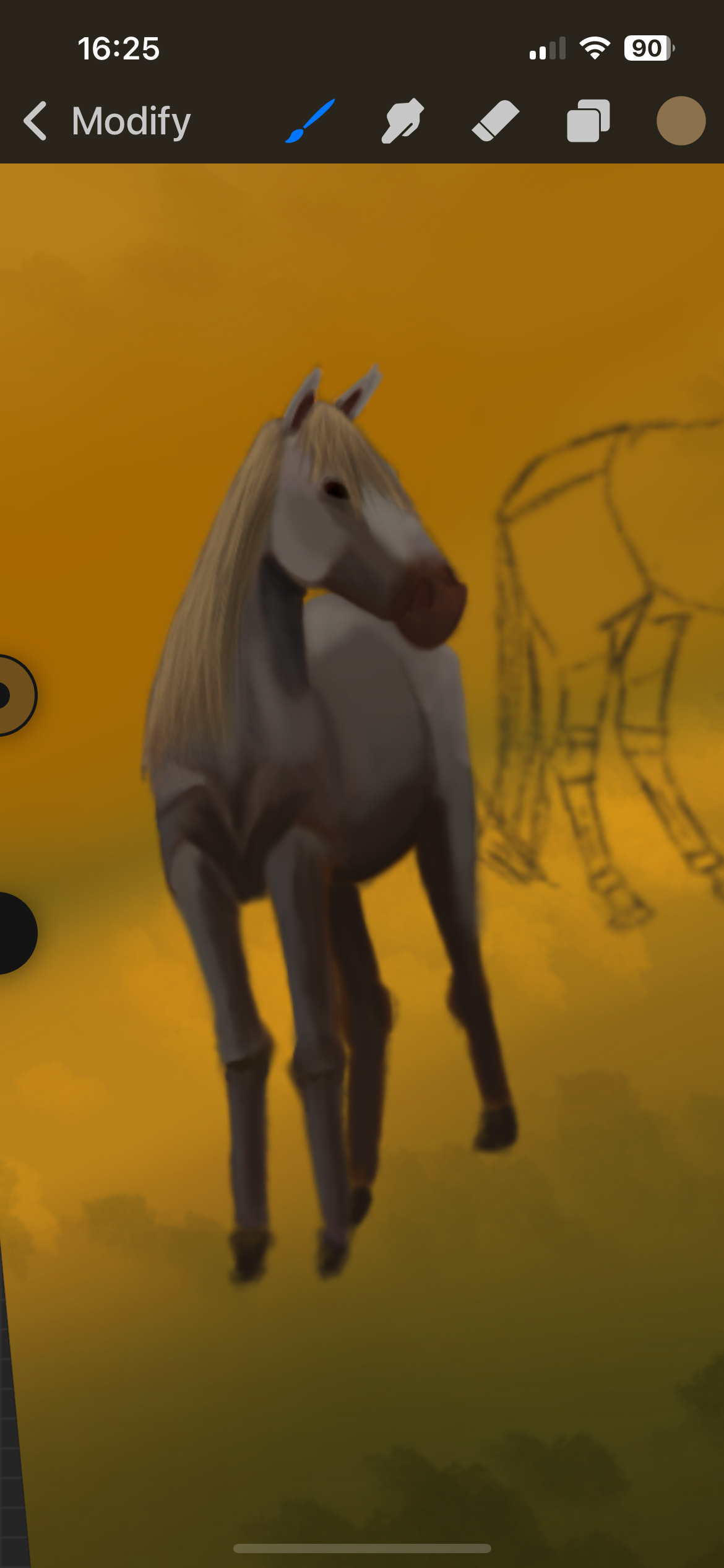
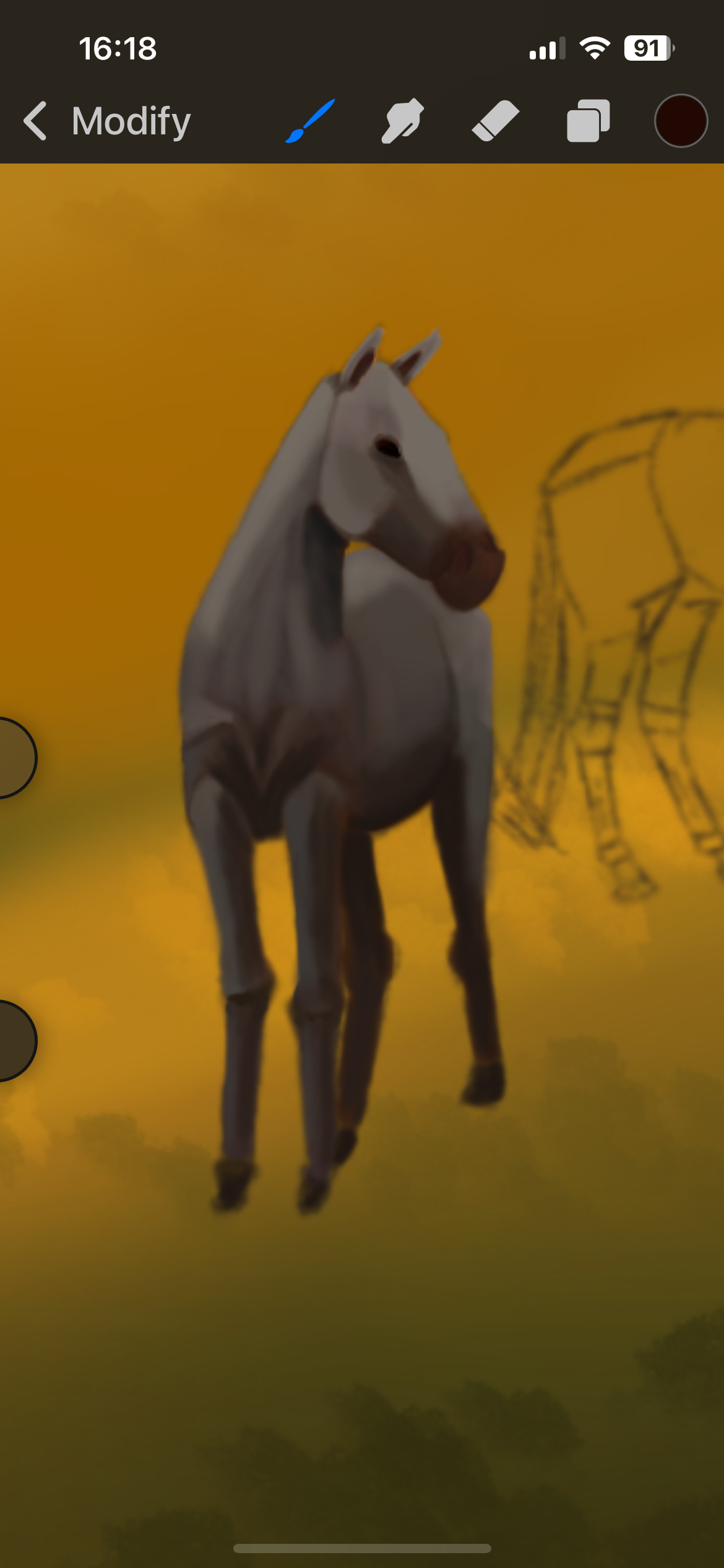
All of this was just the airbrush tool, starting with block colours and then blending it with the guide of the white sunset horse I had chosen to use as my reference.
“Cynthia jumped off the back of her horse. She was riding Aimilios, who was white with speckles of grey dotted from his deep-grey tail to the upper half of the body.”
I should have made the back end of the horse darker, and given him grey hair, but ah well, perhaps I shall update this image one day to match better,
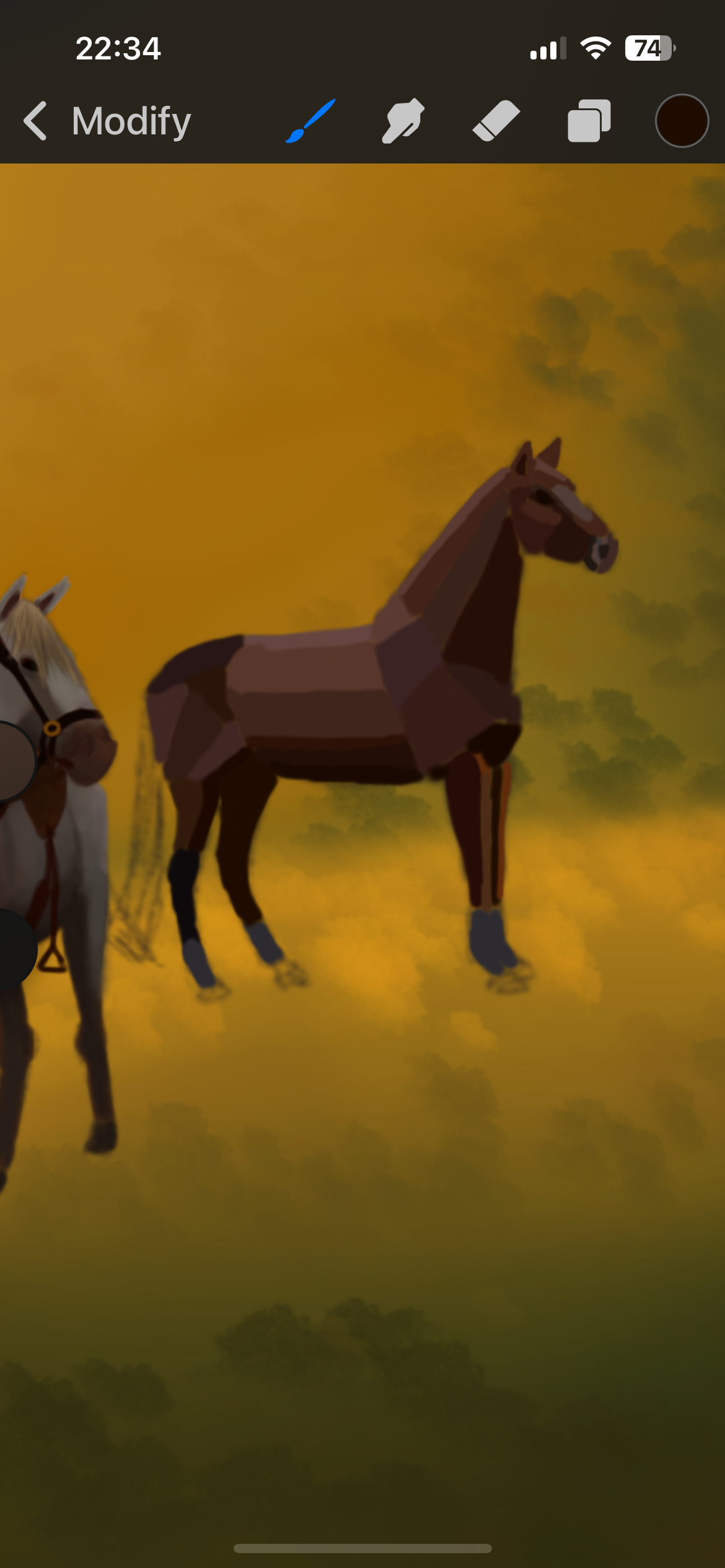
Rizu (Bravery)
Apologies, I have a terrible tendency of doing large chunks of work at a time and forgetting to save the progress … but it’s pretty much the exact same process as Aimilios, I just worked with a different colour palette.
“Rosalie still sat on Rizu, a warm brown horse with white socks.”
Sorry, Rizu, I really gave you nothing lol.
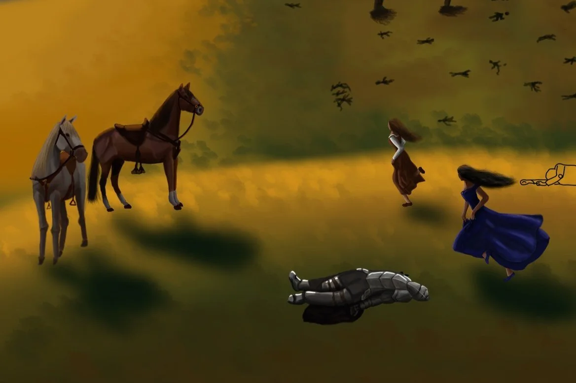
Don’t mind the random corpse, he is irrelevant in this moment. But what is important is that I added the shadows to help my characters be a part of the image, rather than elements that are clearly placed down *Cough, sorry dead solider, that is once again you.*.
Goblins and Knights
I’m a little dismayed with the goblins I had drawn. Originally I had these sketches down that were stock images of goblins running because once again, I have no idea how to make people (or goblins apparently) look like they’re actually running. But when I went back to these, I did not change them enough to really call them my own art. I added clothes and different colours, but the outline is pretty much the same. I would like to do an update on this work one day to amend this.
I was hoping to reference the actual images but of course, when you need something, you can’t find it. I’ll add them on when I track them down.
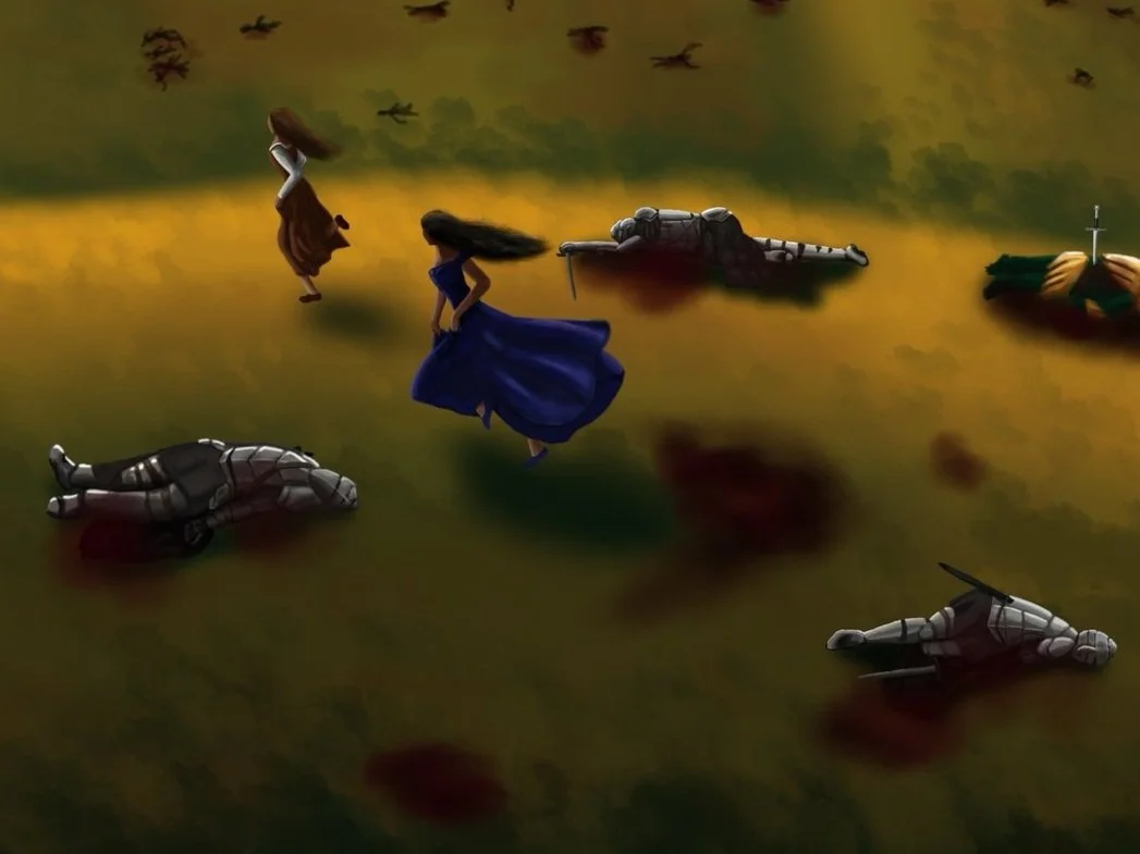
These knights … when I tell you that I don’t like repetitive things, these knights brought out the inner procrastinator in me. Worse than the trees would you believe it or not. I know they are all technically different because I had them all lying differently, but it was still the same process over and over again of founding shade, then gradually lightening it up. I don’t know why, I just couldn’t ever be bothered to go back to them. They look cool though.
I have no reference photos for these as my first thought was “Hmm, I maybe shouldn’t google ‘dead bodies’ and then save them to my phone. I might start having people tracking my searches if I did. They’re cool, though, I’m happy with how they turned out.
As for the blood and shadows, I just used the airbrush tool and decreased the visibility of the colour so it would come off as a little more transparent. Then I also blurred them so they would blend in.
That’s it for the Corpsed Battlefield, thank you for taking the time to read my process. :)
