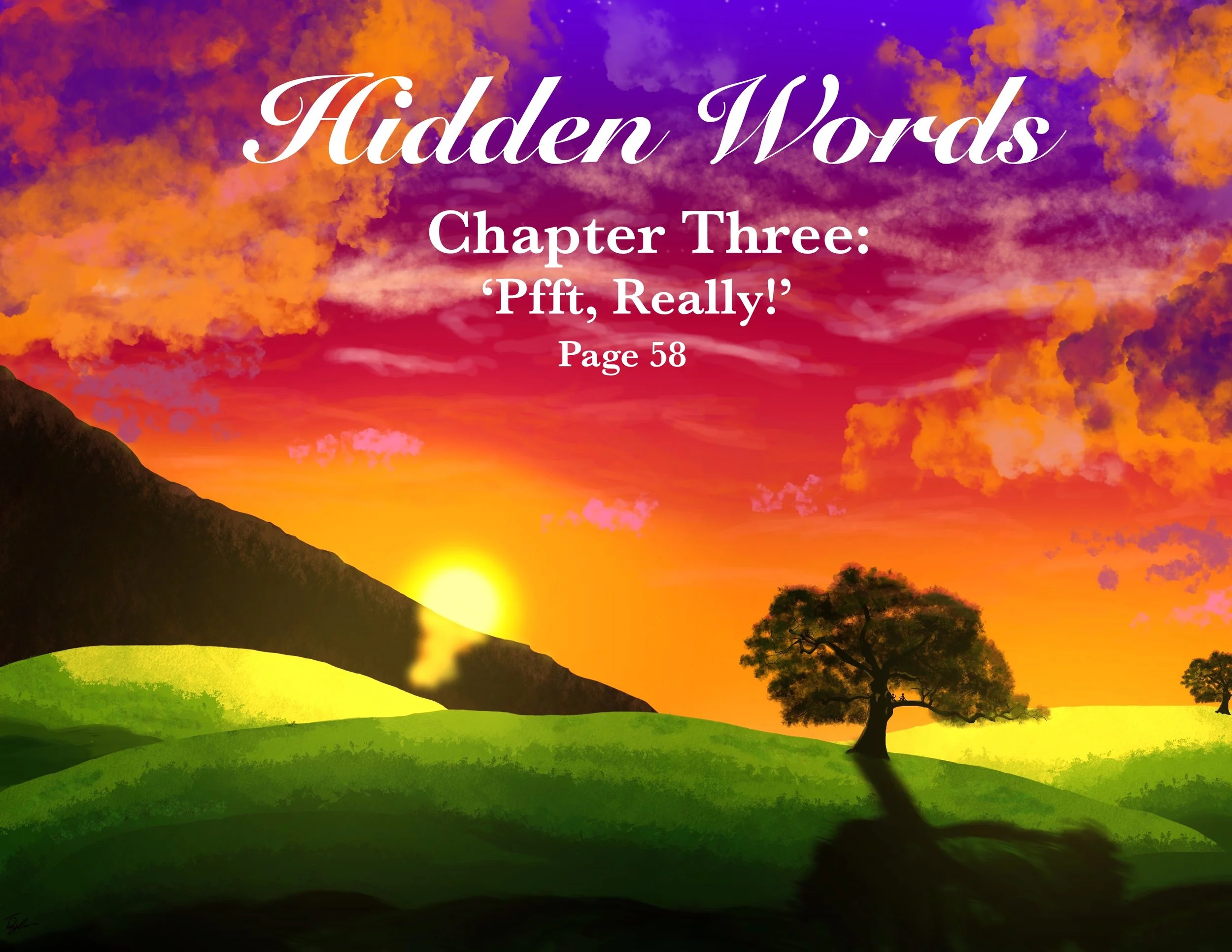
Hidden Words
Beyond the art of story telling
Context of Where it Began
I believe in trial and error, without it, there’s no depth to a finish. This story was my first for everything when it comes to putting things out into the world. I don’t share my stories until their finished because I have a perfectionist problem. Though I don’t see it as a problem anymore, it only makes me keep trying for better results. I have grown to appreciate the errors of the unfinished piece, which is why I’m making this section.
There’s an art behind failure, as long as you can look at your beginning with a smile for how you’ve grown.
I’d like to share my process of thinking, so everyone can see that I am no expert at anything. But things can be achieved if you’re passionate about trying again - even when it doesn’t work out the first time.
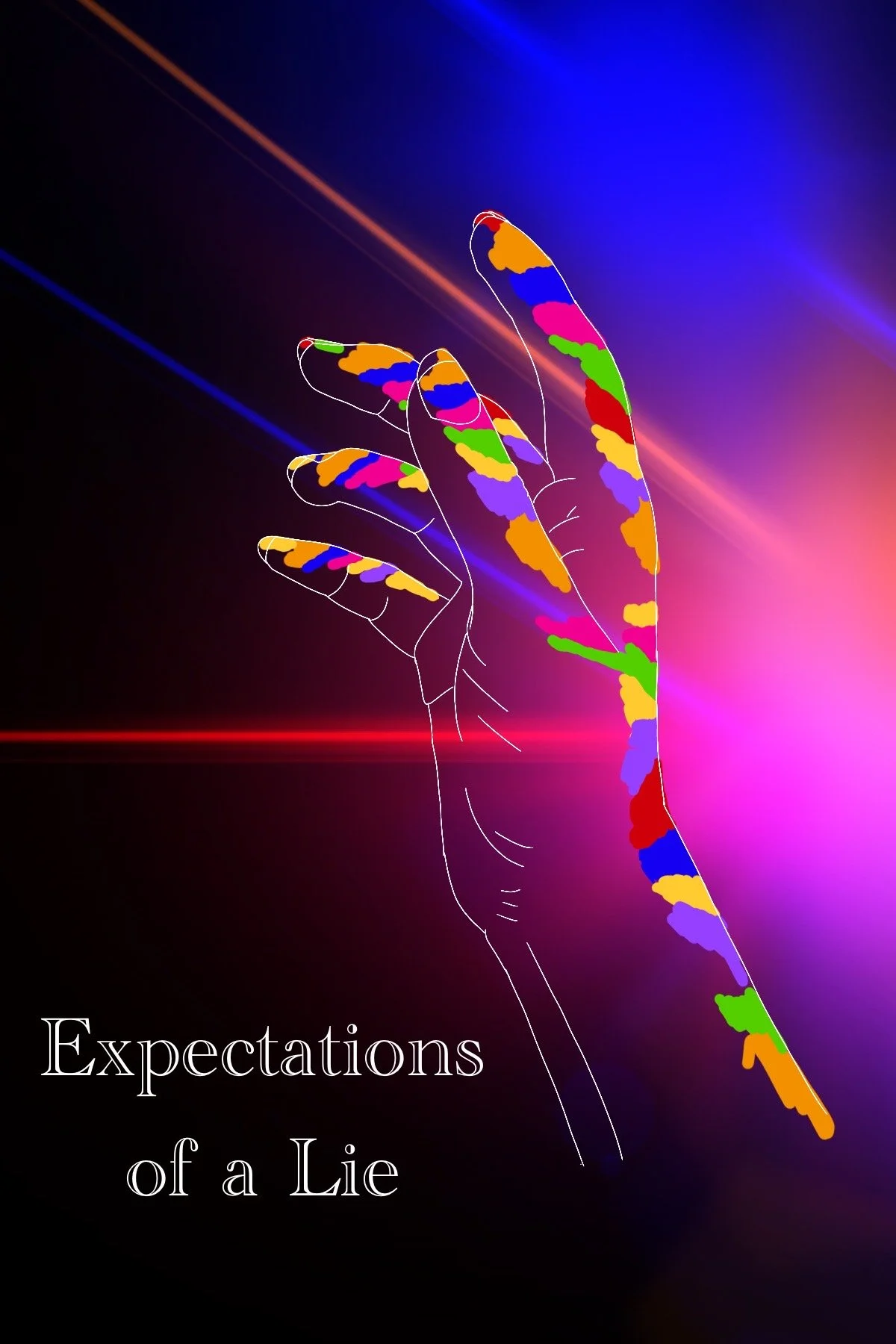
Cover Designs
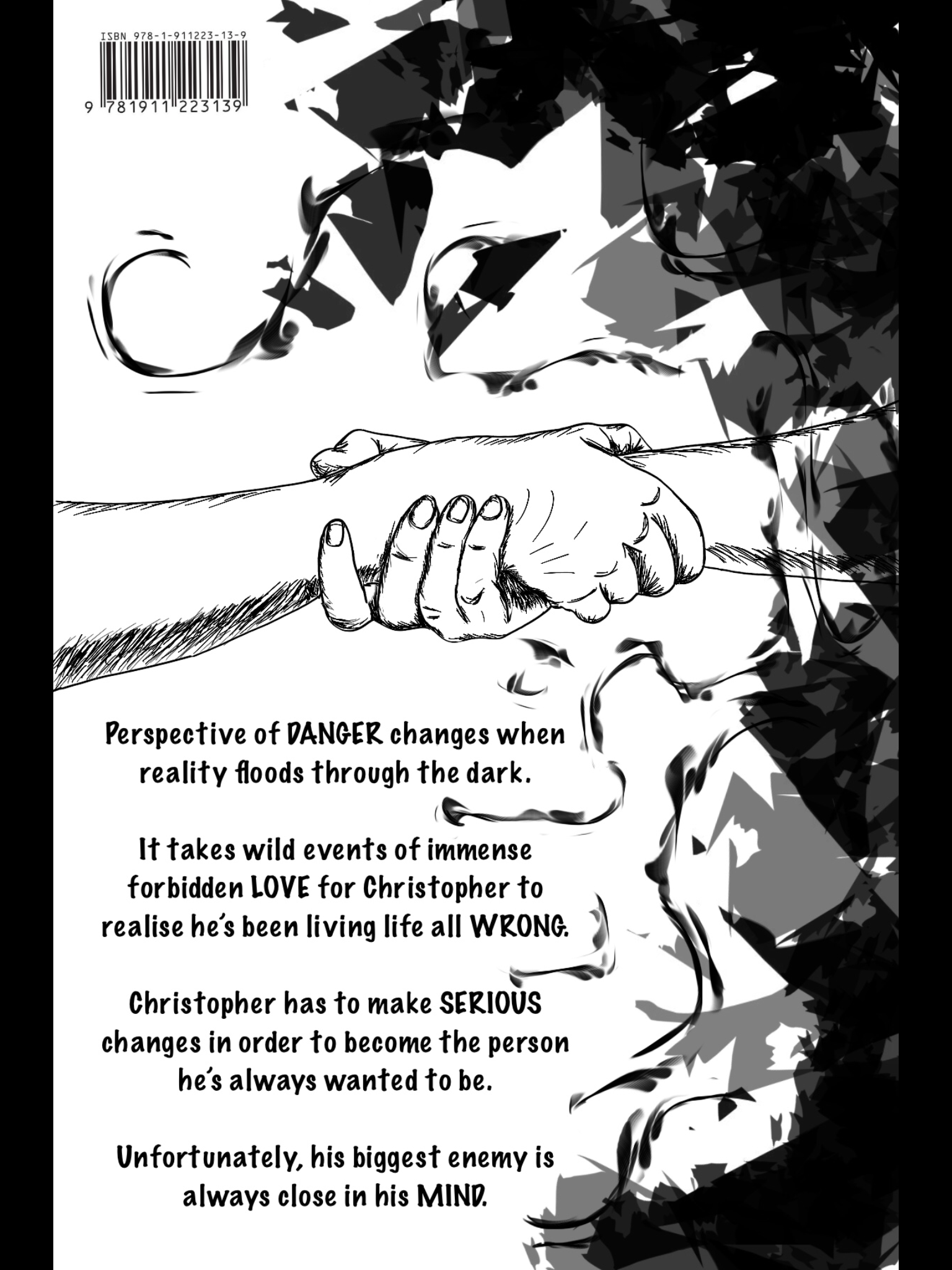
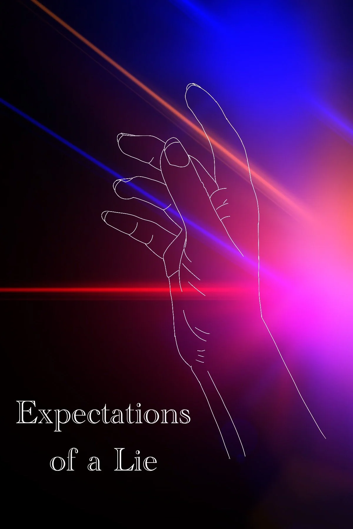
Now, I actually didn’t realise my own cover design would be used - if I had known, I might have polished it up better, but to be honest, I like the messiness. In context to the story, it actually works really well for my main protagonist. Perfection isn’t the perfected beauty. Faults are what brings depth and if you can look beyond these faults, there’s beauty to be found.
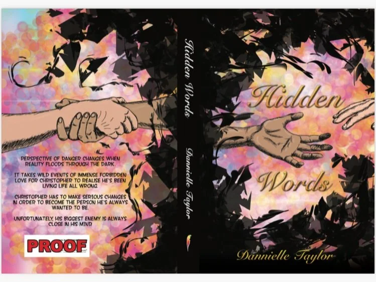
Ew, I know. But let’s start analysing, shall we?
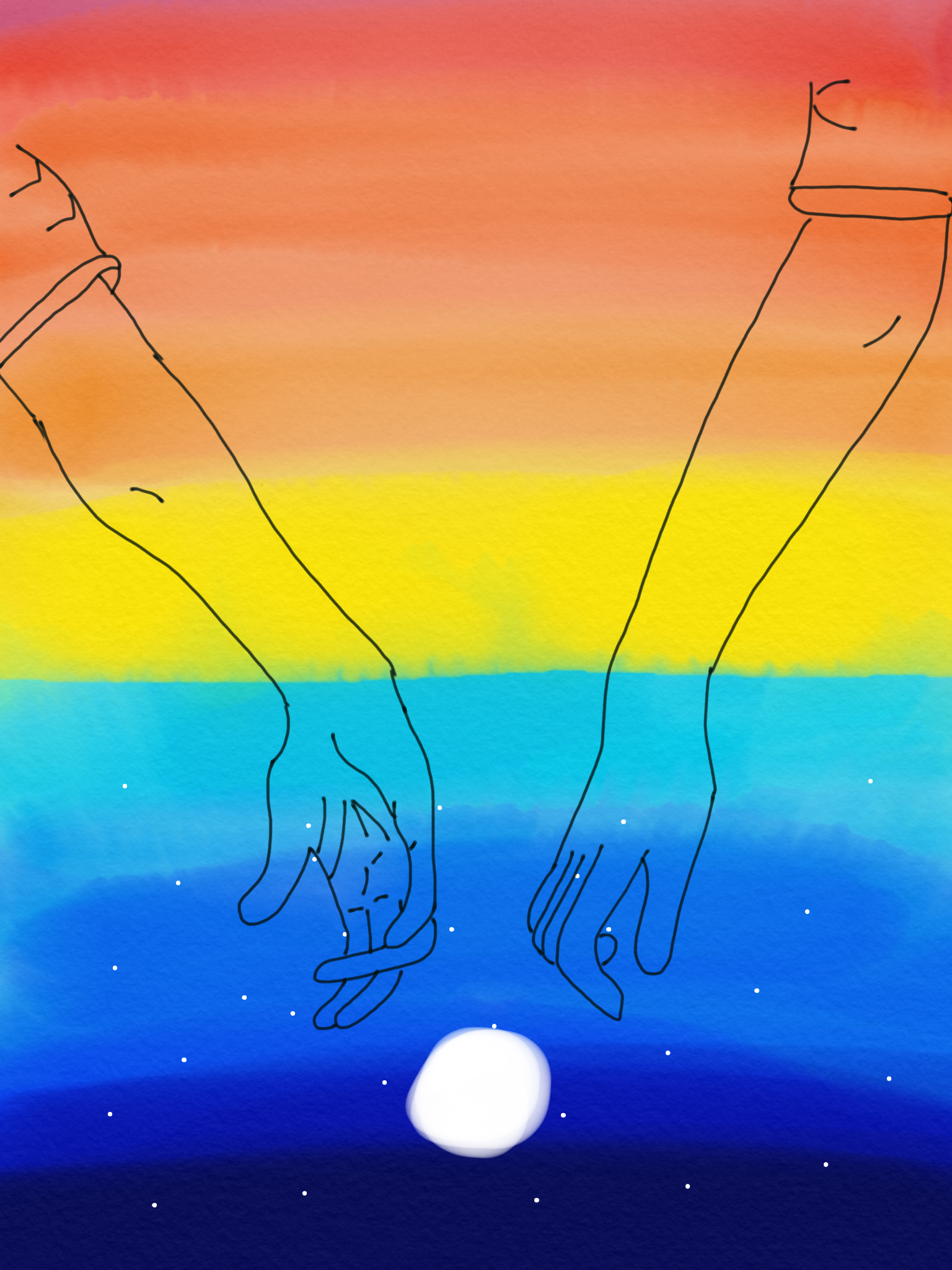
So, the most visual points; black, jagged edging, bright background, and hands. We know the hands are Christopher reaching out, but why is he needing help?
For anyone who hasn’t read this story, Christopher suffers from anxiety and depression. He experiences his traumas alone within his own head, and it’s starting to consume him. I used black, sharp edges to symbolise the harsh terrain within his own mind. In one of the main pivotal scenes, he describes his pain as like someone is throwing glass shards at his heart.
Okay, so the obvious analysis is that Christopher is reaching out for someone to take his hand. In this sense, that is exactly it. He is longing for someone to help him out of the darkness within his own mind, but luckily for him, someone is reaching out to lend him a hand.

Unfortunately, I do not have the other background colours I had designed, but basically, this one stuck out to me the most. It was bold and eye-catching, whereas the other’s were quite soft. My main goal for the background was to have a lights effect like one of the most pivotal scenes within the book (prom). All the lights were overwhelming against his anxieties, casting shadows over him to become lost in his own darkness.
I added the wispy swirls to aim to wrap around Christopher’s hand, but they bounce off of the helping hand, reflecting against the one thing that can pull Christopher out.
Original Concepts
I am very new to digital art, I know that is obvious already, but my ‘Hidden Words’ promo was me using digital art for the first time - along with these ‘wonderful’ attempts.
In my experimenting phase, I went through this whole idea of using the ‘Iceberg Theory’ where things aren’t always what they seem below the surface. In this case, I used mountains to represent Christopher’s mental state. What you see on the outside, isn’t always what is within.
Let’s analyse. In this instance, I used mountains as the visual instead of the iceberg as the mountains were Christopher’s mental outlet. He could be himself there, he could be free there, and most importantly, he had memorable moments there. Both night and day are scenes within the book.
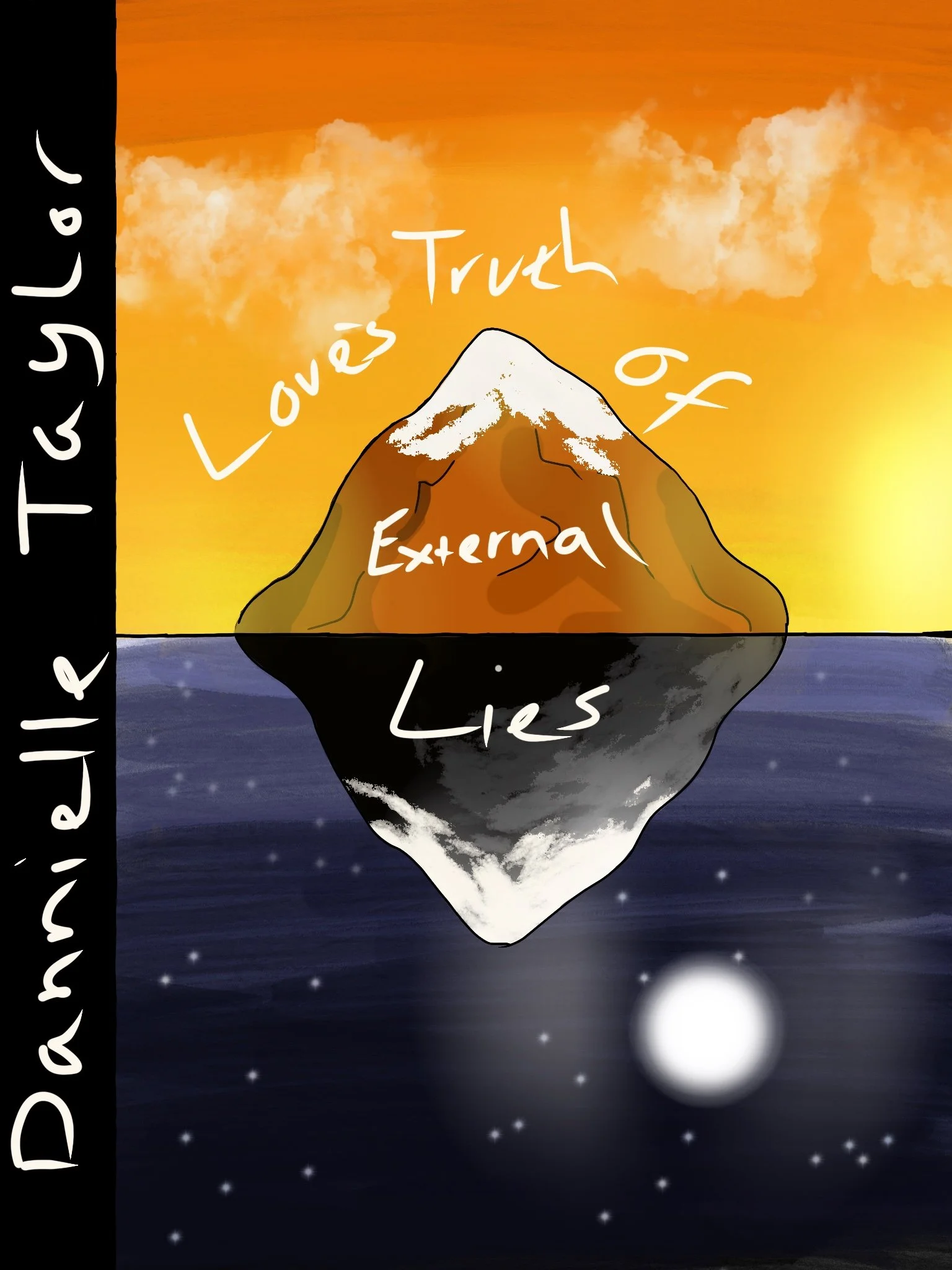
I was testing out filters for the first time, I think I liked the blue colours below, I’m not sure why I kept this but it’s funny to see.

I seemed to have this weird idea in my head that I had to have a black strip where I was meant to put my name. I have no idea where this came from, I’ve seen books before, none of them look like that, yet here we are.
‘Loves Truth of External Lies’ was one of the titles I was experimenting with. I remember making my friends review all the title ideas I had, and guess what? I didn’t use a single one of them (sorry guys), instead, I just made one up right on the spot when the question ‘What would you like to name your book?’ came up. And ‘Hidden Words’ popped into mind and it was the only one that ever clicked.
So there you go, here’s my thought process with the front cover designs. There was one more, but I have more to say on that.
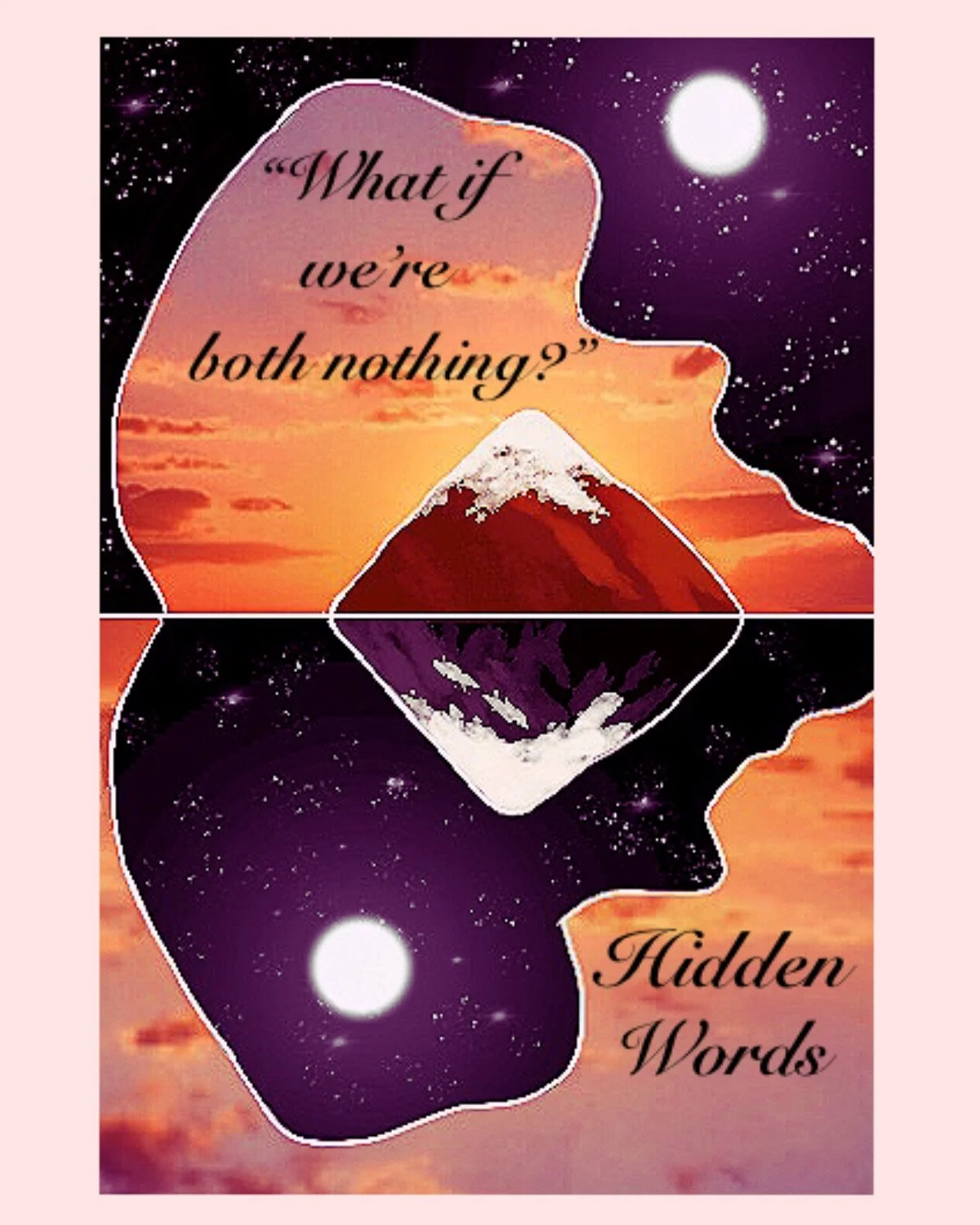
“What if We’re Both Nothing?”
^A quote from Christopher.
But What Does it Mean?
Good question me, it’s actually in reference to Christopher’s mental state within the book at this point. All his life, he has been feeling numb and empty due to torment of his troubles. He spends all his time worrying on the inside that there are times where all his pain and suffering fizzles into an intense nothingness. He always felt alone in his troubles, purely because he’s never had anyone to share his problems with. That is until Joseph came along and flipped his world around. In this moment, he finds that he isn’t as alone as he thought.
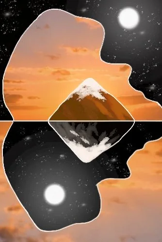
Where Did it Come From?
I posted this on Instagram as one of my first ever ‘promo’ pieces. At that point, I really didn’t have anything made because I wasn’t sure what the process of promoting was, so I decided to use this idea I had lying in the shadows.
Fun Fact
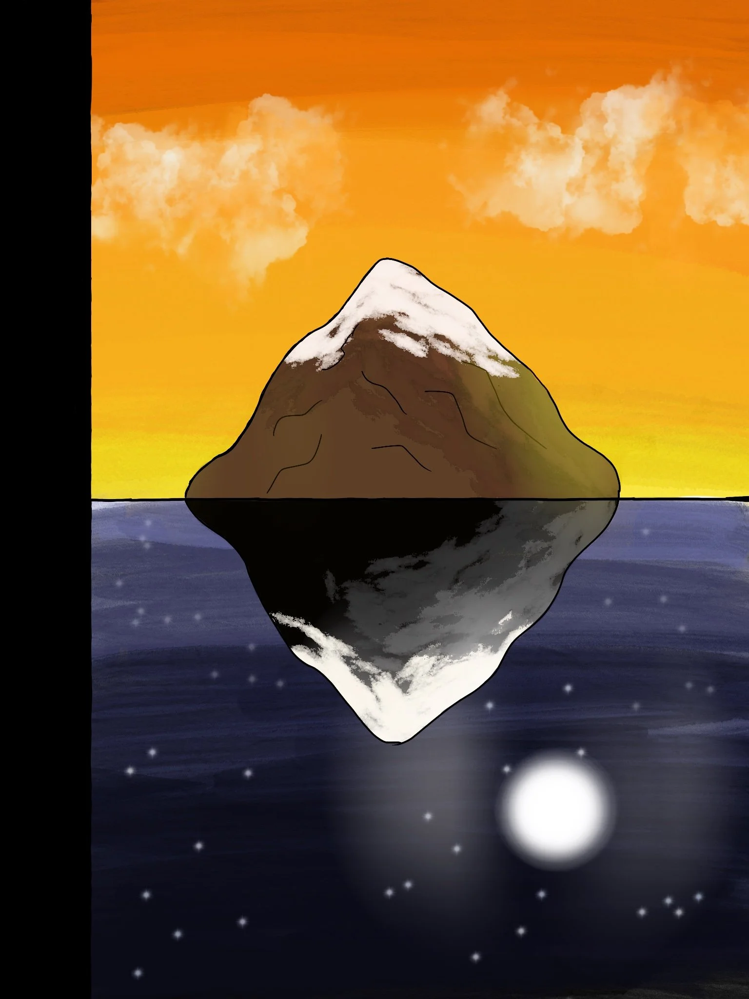
Once upon a time, this was actually in the running for my front cover design.
Yup, I was still trying to figure out a design idea and I was experimenting with ideas, this was the original contender.
I obviously decided against it. I thought it was too much of a centre focus for it to work as a cover. I had no idea where to put the title without it getting lost in the intensity of the piece - and this was just the scrappy idea, I probably would have gone more dramatic if I knew how to work digital art at this point.
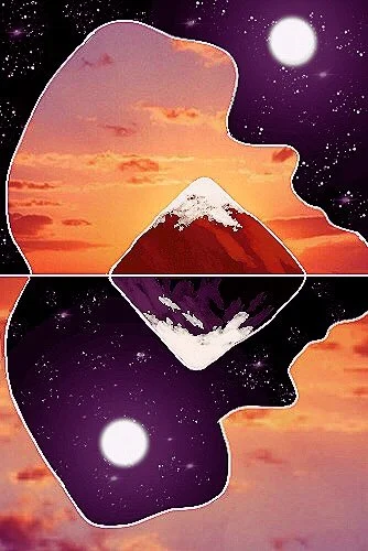
Analysis Time
Following the Iceberg Theory from above, I was using the same idea here. It’s both the light and dark side of Christopher’s mind, which is hidden below the surface.
The forms splitting the two skies is the shape of Christopher cowering into his knees. It shows that both his light side and darker side suffer all the same.
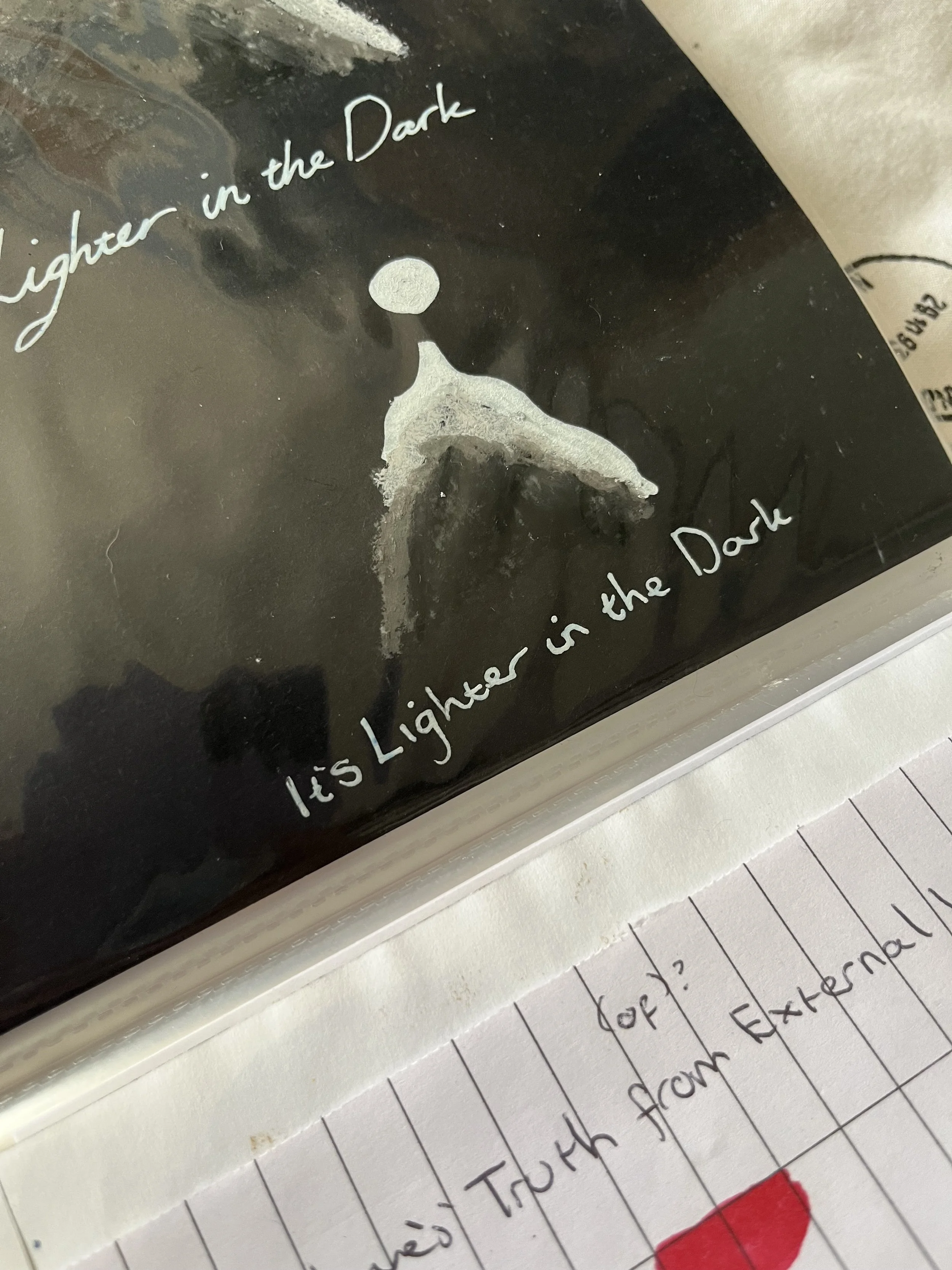
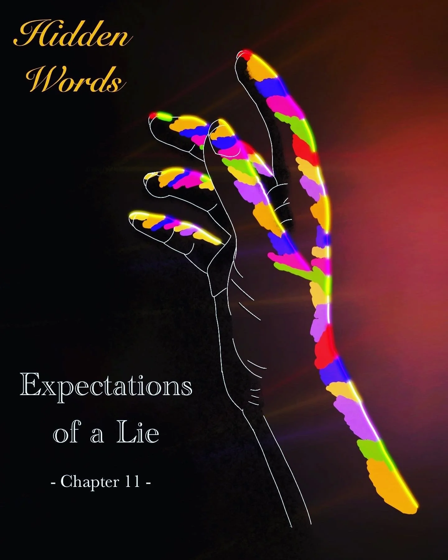
Of course, the mountains are the same above as well, it’s the two scenes where he finds happiness beyond the darkness of his hidden pain, and even when he’s out in the dark for chapter seven ‘It’s Lighter in the Dark’, he finds joy even amongst the surrounding shadows of the night. Where a moon shines, there’s always light in the dark - even the crack in the door for chapter eleven’s ‘Expectations of a Lie’, there’s always light shining through.
“But I don’t want to hide.”
^Another wonderful quote from our poor Christopher
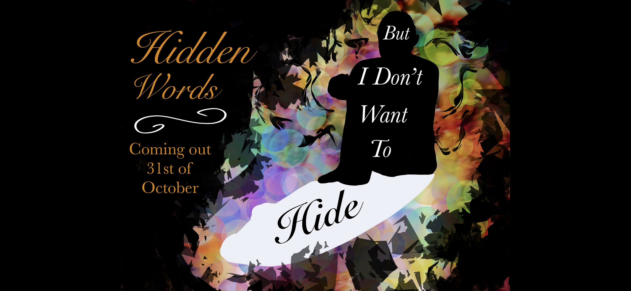
It’s obvious to guess that this quote comes from a place of pain, but don’t be fooled, it also comes from a place of enlightenment.
Christopher has finally had a taste of freedom, so now that’s he’s falling back into his world of anxiety and hurt, he knows now that this is not the life he wants or deserves.
This scene takes place at prom, the beginning and turning point of the story - Christopher is surrounded by the bright lights that cast shadows upon his body. Where he should be shining bright, he’s disappearing in his anxiety. The lights of the rainbows are mocking him because he cannot shine bright with them against his own internalised homophobia.
I chose to give him a white shadow with the word ‘Hide’ fallen onto it, to show that Christopher is in a dark place but outside of that, he knows that he deserves better. His shadows are within him. He doesn’t want to hide anymore. He just needs to learn how to fight it.

Okay, I didn’t think I’d ever show these, so do not shame me for my stick people and lack of professional effort. PERFECTION ISN’T EVERYTHING!
I had my little stick people dancing around him to show that when Christopher is in a state of crisis, no one notices him. Prom is supposed to be ‘the best night of your life’ but for Christopher, it is nothing but misery.
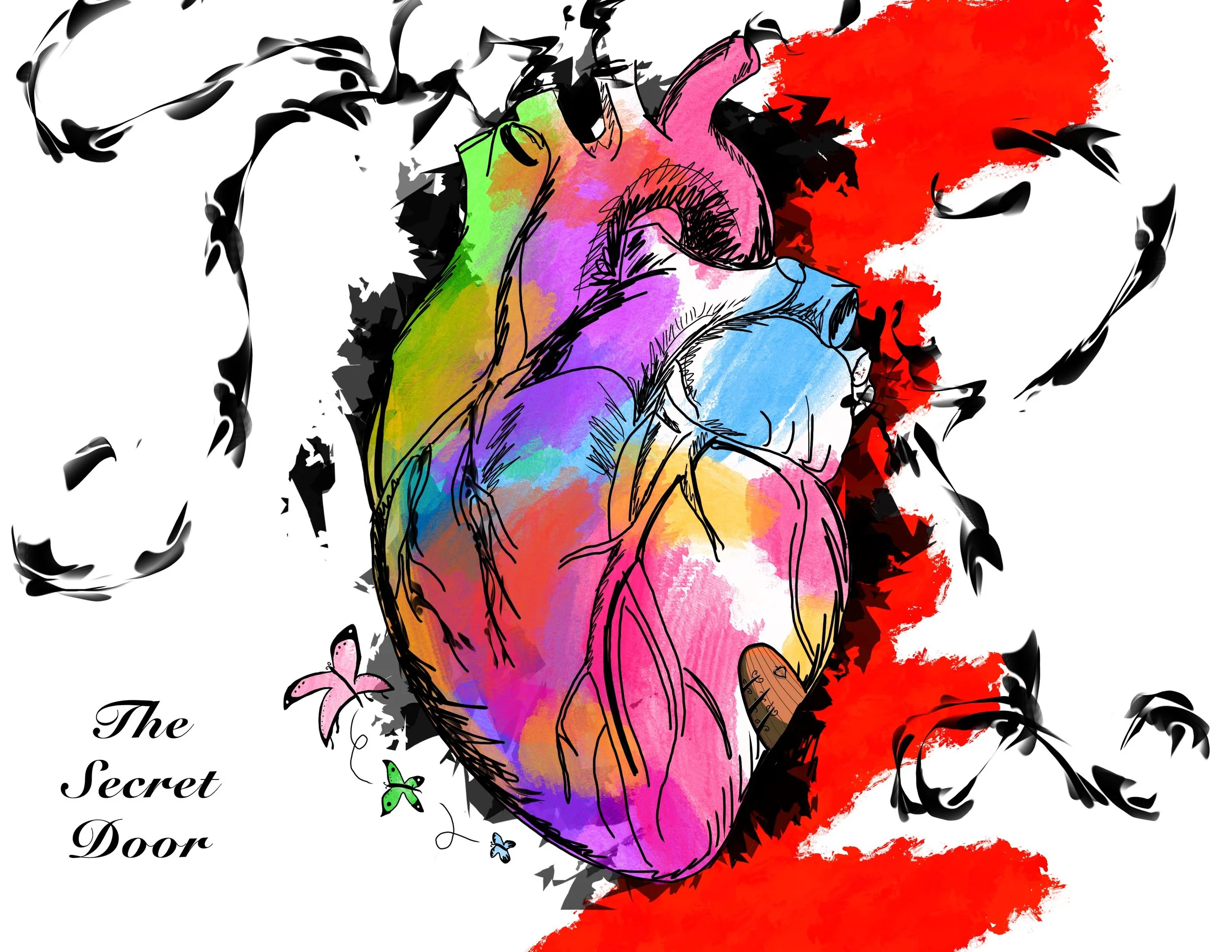

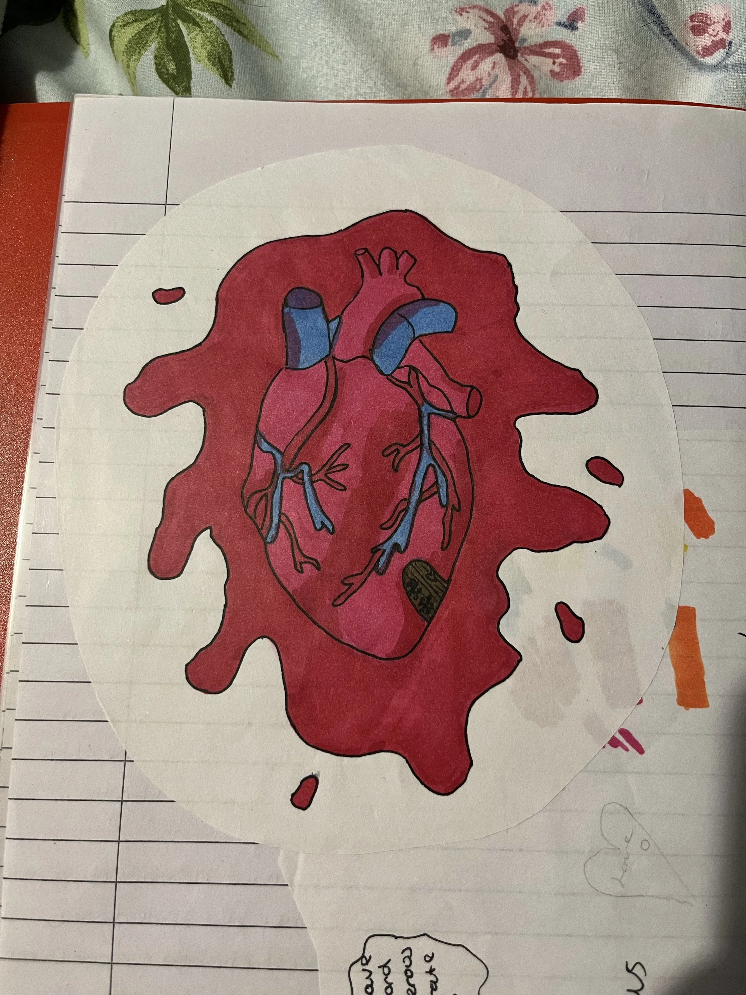
The Secret Door
This piece was in reference to a moment where Christopher says there must be a secret room within his heart. He insists that Joseph hides behind it whenever he tries to free himself from his feelings. I had an original concept of a drawing in reference to this and I decided to make it into digital form, but this time it was more as a depiction of his feelings all around. The black whirls of anxiety, the blood for his pain, the butterflies for his romantic flutters. All of it means something, even from the scruffy sketch of the heart, but I’ll get onto that in a second.

Colours and their Meanings
Yes, Christopher is gay, but that isn’t the reasoning for the colours being used. It’s an element but not entirely for that reason. It’s more in reference to his love amongst feelings beyond romance. Christopher is terrified of all of this, he’s angry, he’s sad - he’s in love and there’s nothing he can do to stop those things, he just has to accept that he feels these things because he’s human.
So, pink is obvious, it is the love he feels but it becomes pushed out or dominated by other things like blue, his sadness. He’s in love but he cannot chase those feelings but mostly because he’s scared (yellow), he’s outright petrified but that fear is clouded with jealousy (green), he’s jealous of the life he cannot have, which bubbles into faint anger (attempts of red), but he isn’t angry, not really. He likes the mystery of being in love (purple), he feels calm for small moments, when his anxiety becomes distracted.

Splattered Blood
I did consider keeping it the same with the blood surrounding the hurt, but I drifted off to do more of an abstract concept of the idea of his feelings. The blood showed his pain, but I wanted it to be more than that - he’s not just in pain, he’s dealing with love, and identity issues, and yes, his hurt, too.
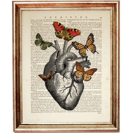
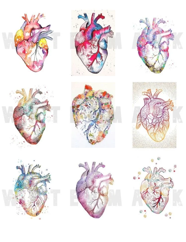
I knew I wanted to drift away from the blood red disaster, but this is where I went searching for inspiration. I liked the idea of adding colour like these nine hearts, and then I went searching for the feeling of butterflies and found this beautiful piece. Unfortunately, I do not know the artists, but they sparked life in order for me to create my own.
The Evolution of Butterflies
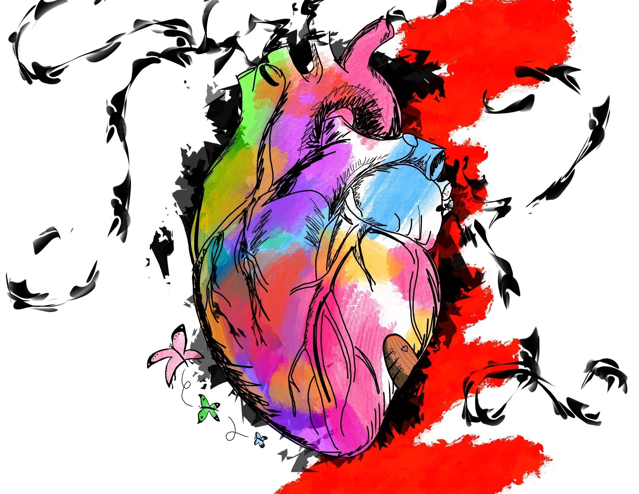


It originally was left without the butterflies, but I wanted to add them dancing around the heart to almost have them mocking Christopher. They’re out of his reach, fluttering around him because he cannot fight nature’s plans.
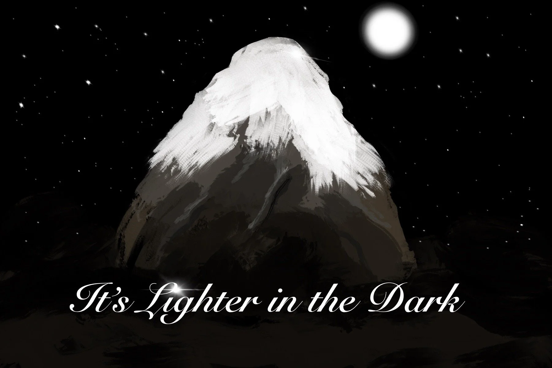
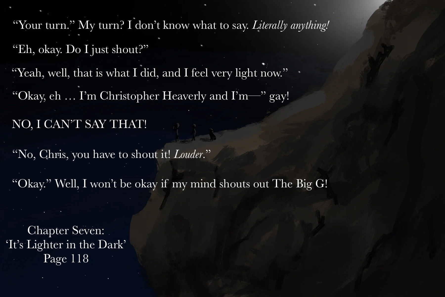
A play on words, ‘lighter’ meaning weight not brightness. I like to do wordplays like this as it does contradict Christopher’s choices, but in this case, he’s correct. This is where Joseph teaches him to shout out his fears into the world. Maybe not all of them, but Christopher learns how to open up and realise his freedom is within his own hands, if he chooses to take it.

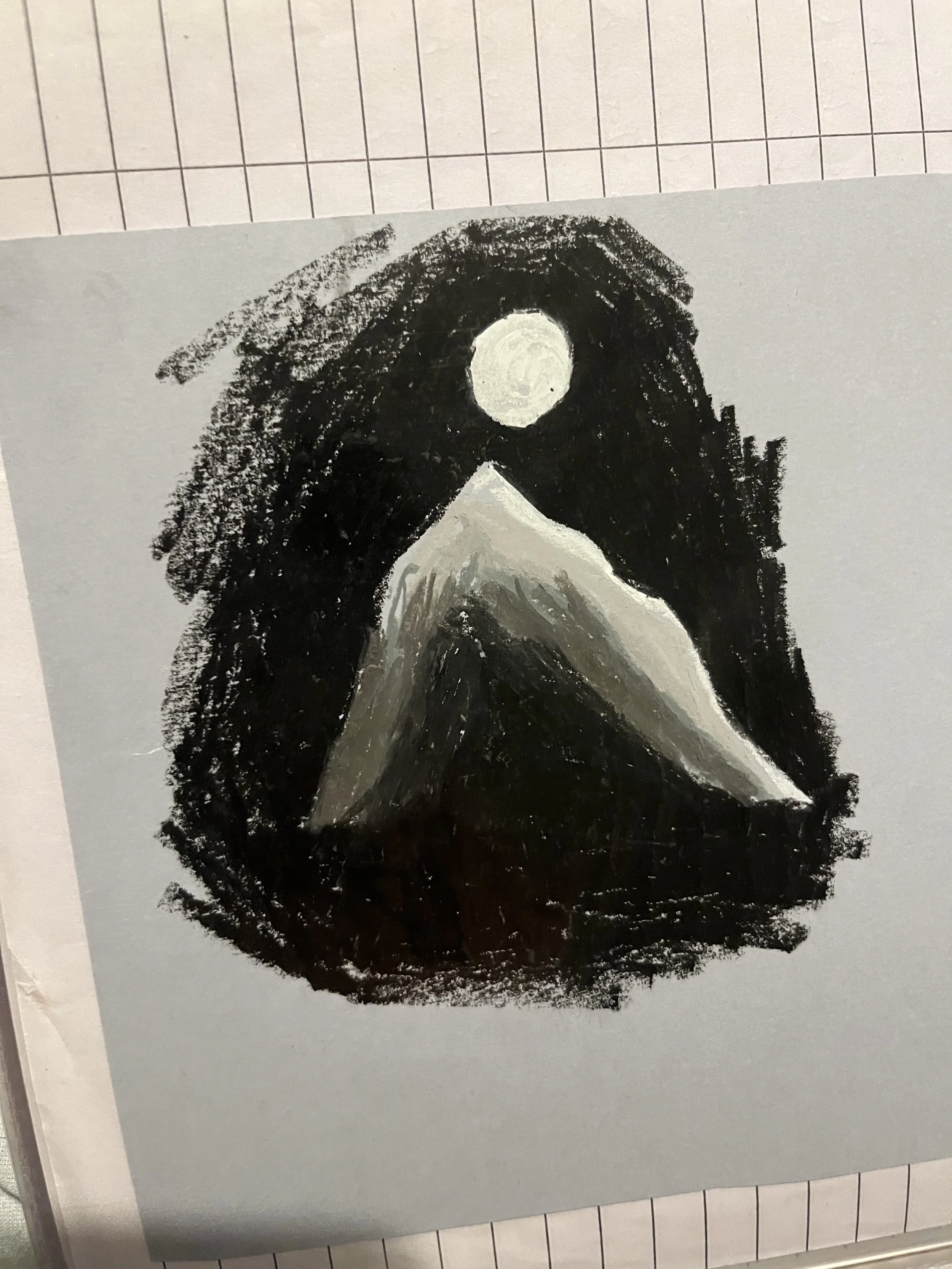
I liked the way this turned out. As I’ve explained before, I like the messy, quick sketchy look these give. It shows the imperfections of Christopher’s mind. But like in this scene, he learns he’s not the only one with faults.
I did a couple of test ideas when the image of the scene popped into my head. I liked this moment in the book and wanted to create a visual for it. I want it to be soft and pleasing to the eye, like the scene felt when writing it.
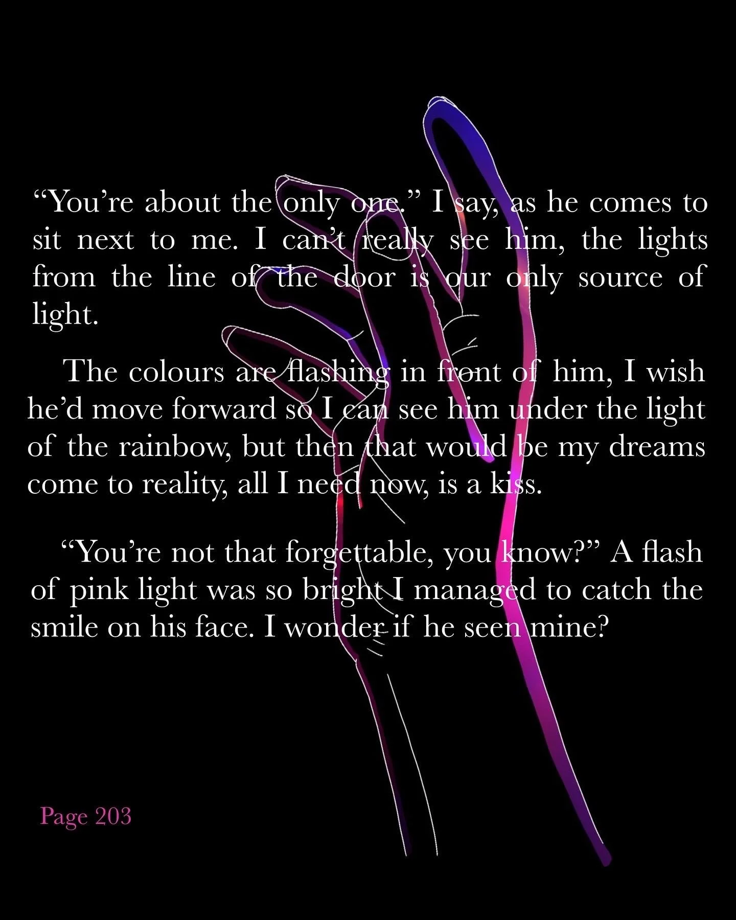
I had a vison for this scene. The lights shining through the gap between the door also made me picture their expressions, the bright flashes are the only times you can see them. In this scene, Christopher falls into a state of panic again, he’s about to have a panic attack but before he could suffer alone, Joseph finds him. For once, someone is in the dark with him. Seeing the world in his point of view.

I made this sketch as soon as I had written the scene way back in the beginning. I wanted to show it mostly in shadows, so all we can see are the flashes of the rainbow lights.
This is why I made the cover fractured colours like this. In homage to the original messy sketch.
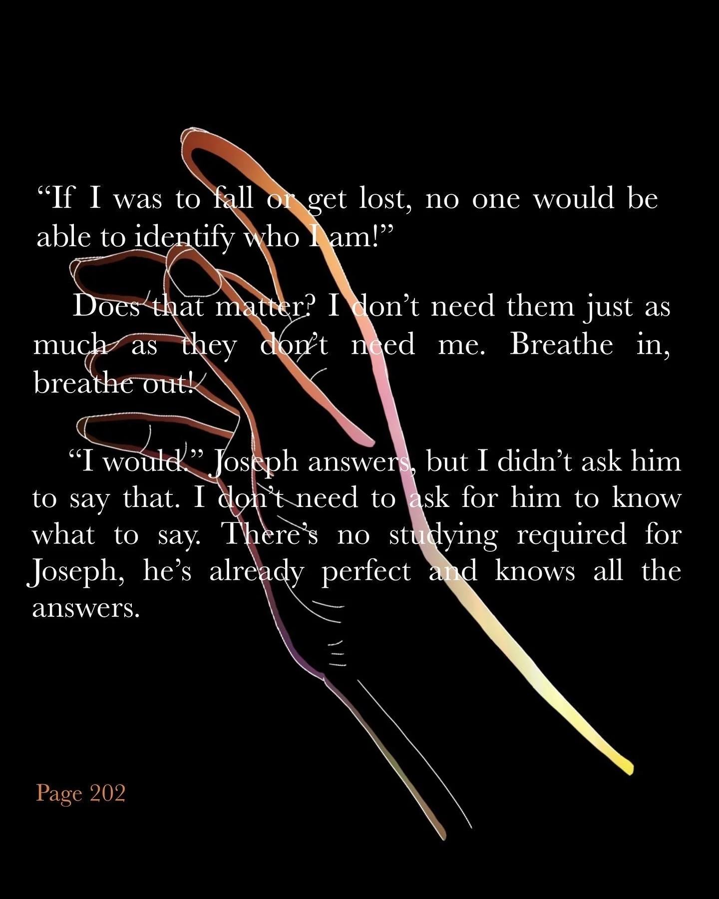
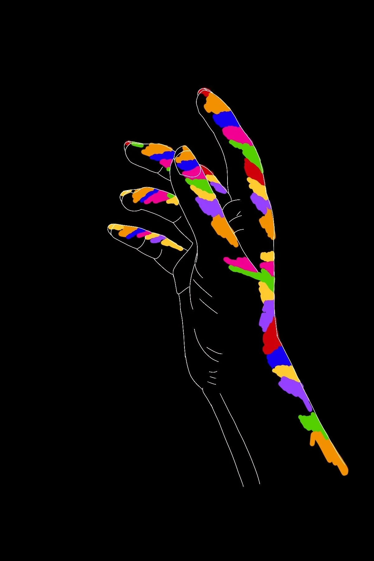
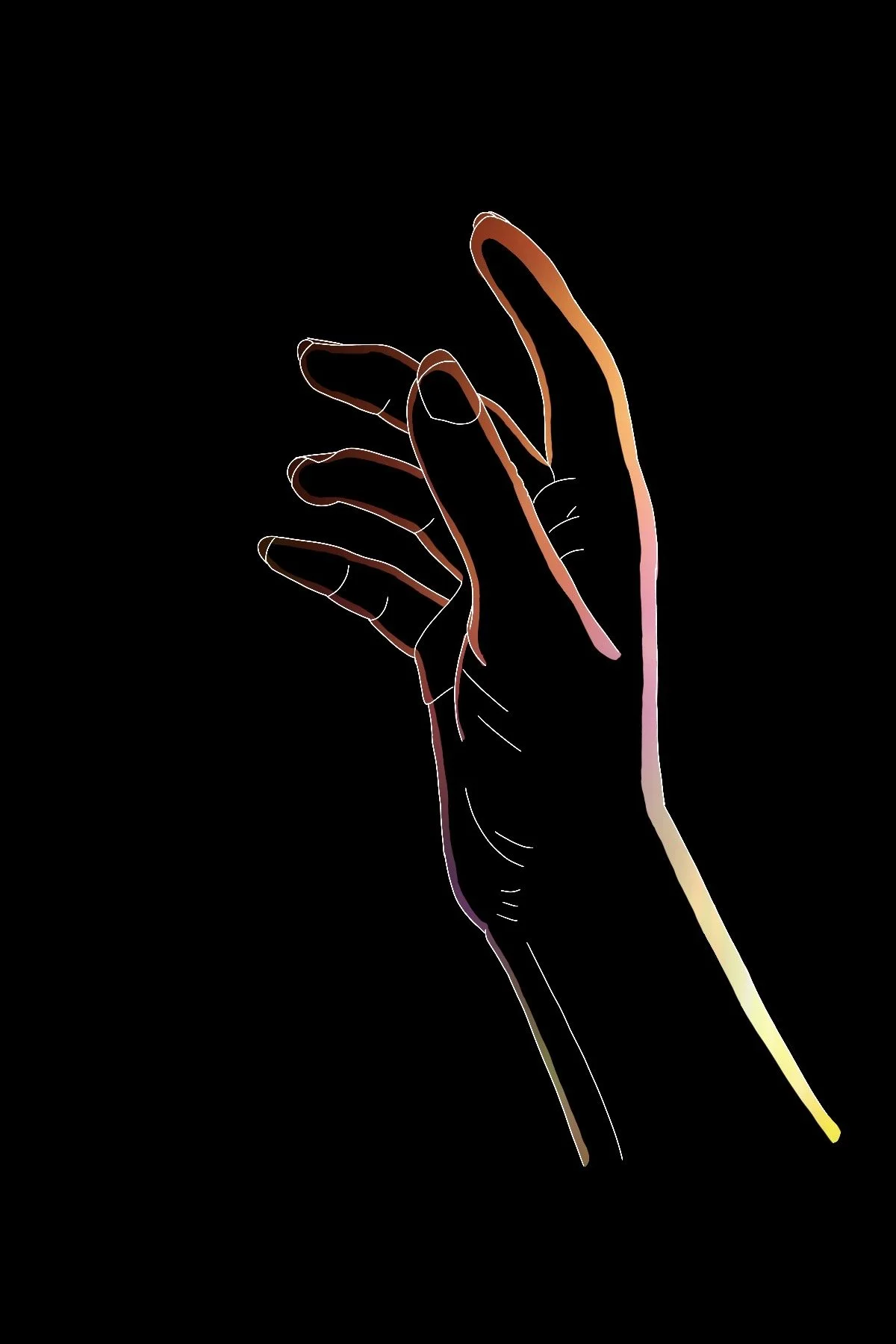
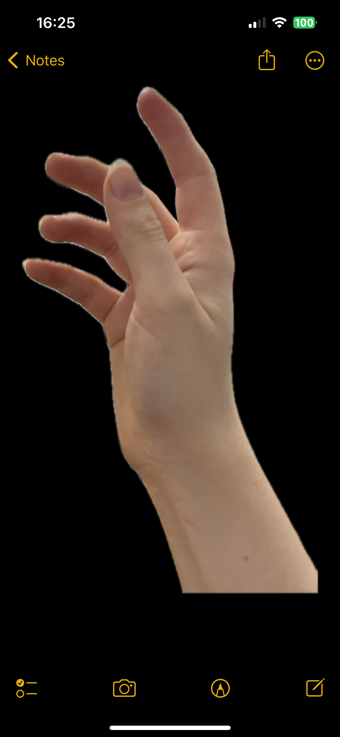
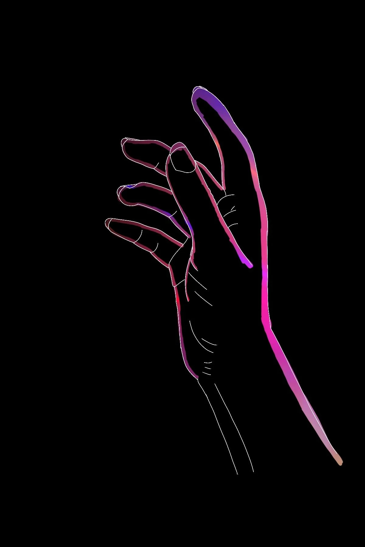
Hand Mechanics
When I want a hand composition, I usually just use my own. I did this while on my break at work and loosely sketched it down on my ipad to try to get the outline. I then followed the lines with the rubber tool after putting a black layer underneath. This is where I started experimenting with colours to have shining through.
This was before the platform provided an animation section, so I basically created the two layers with the separate colours to make it seem like the lights are changing as he’s speaking. The hands move because he’s struggling to express himself through words, but there’s more motion in him than his words can ever provide.
I’m pretty sure this was the lights I used for one of them underneath.
I remember telling my friend that this image makes it look like a poster for some dramatic play taking place in a city festival. Never fit what I was looking for, but I like its air of intense drama.
I think the final result for the opening image is a culmination of these two openers. I varied between the two softer tones of light, and added a glow onto the edges of the colours to act like the light was hitting the hand - still in the abstract form with the mix of colours. Again, like the heart, it’s colours of his emotions.
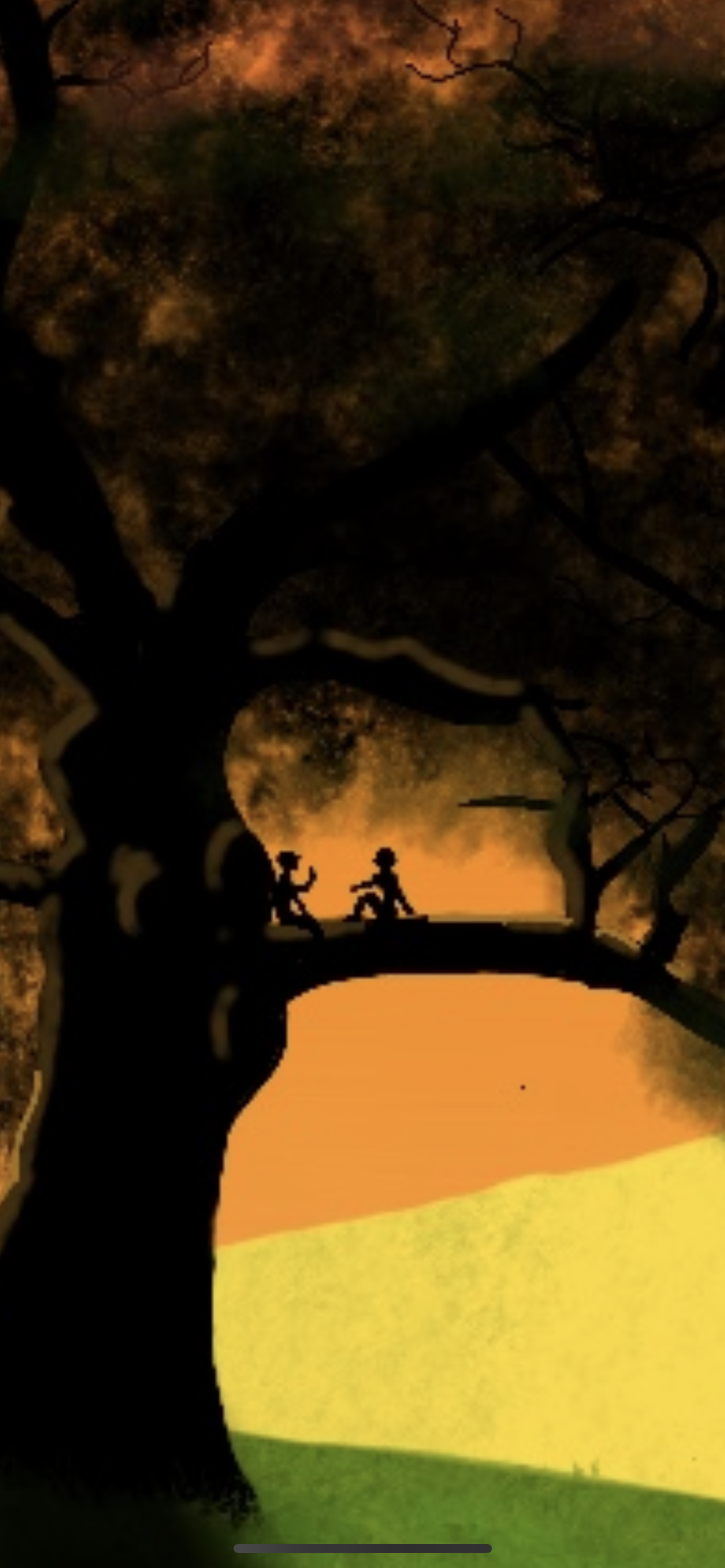
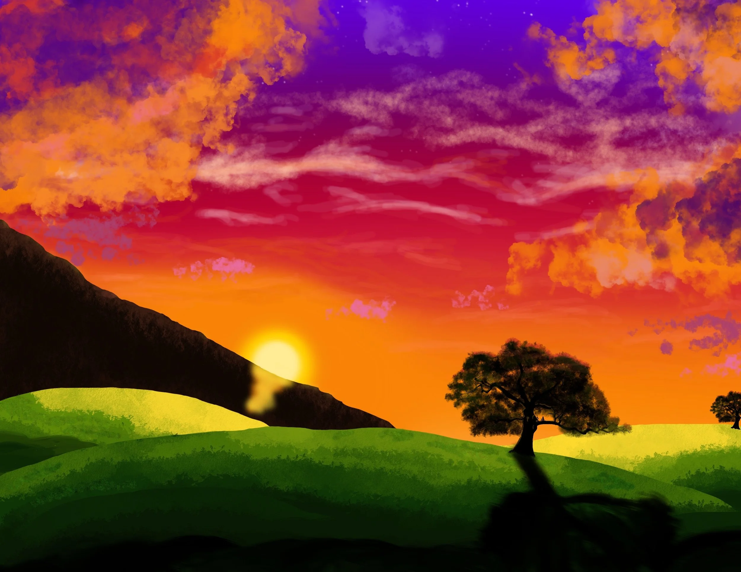
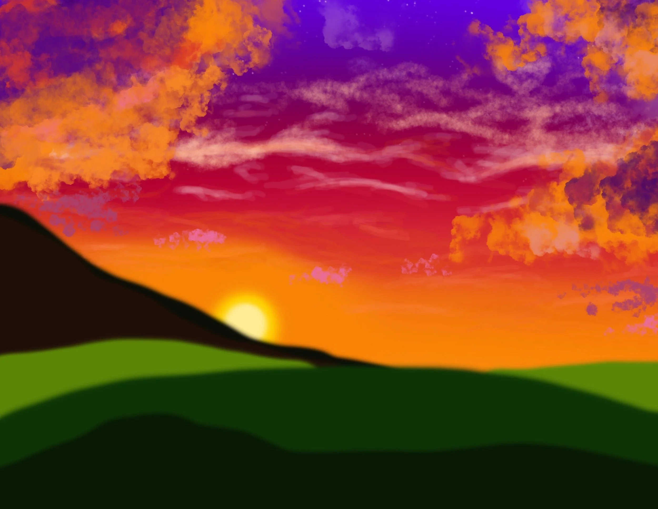
Silhouetted Tree.
Context of the Scene
In this moment, Christopher is in full bliss. He and Joseph had finally become friends and they’re hanging out while studying for their next exam. All seems perfect until Victoria appears to ruin everything, causing Christopher to feel alone again.
The Loss of Colour
No, it never turned to night like the black and white implies, but what I wanted to show here was how the time was passing by them while they were trapped in their own little world. Then the double meaning is the grey is how Christopher feels after the events of the scene plays out. The bliss ends along with everything he thought he knew. He feels numb.
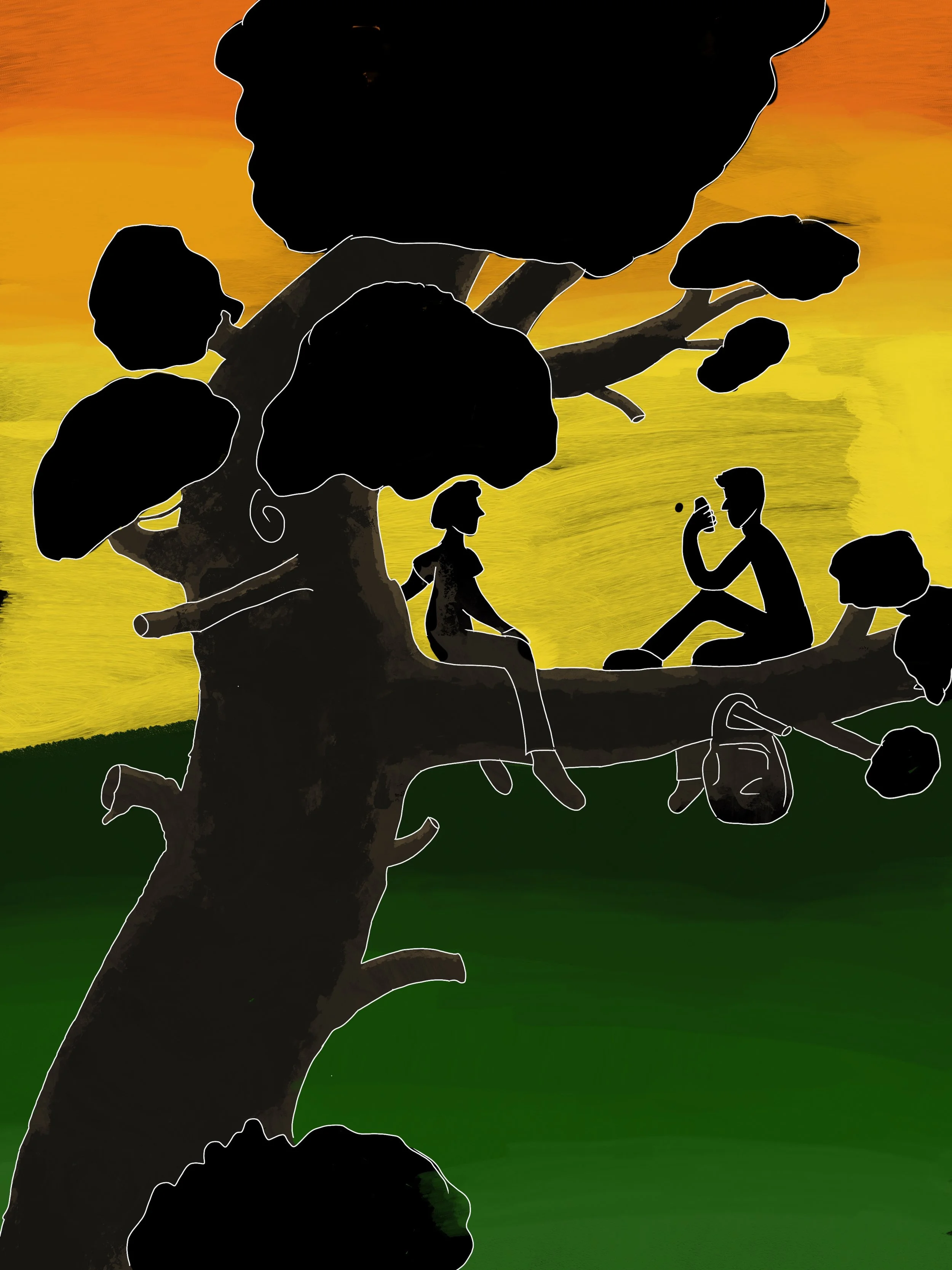
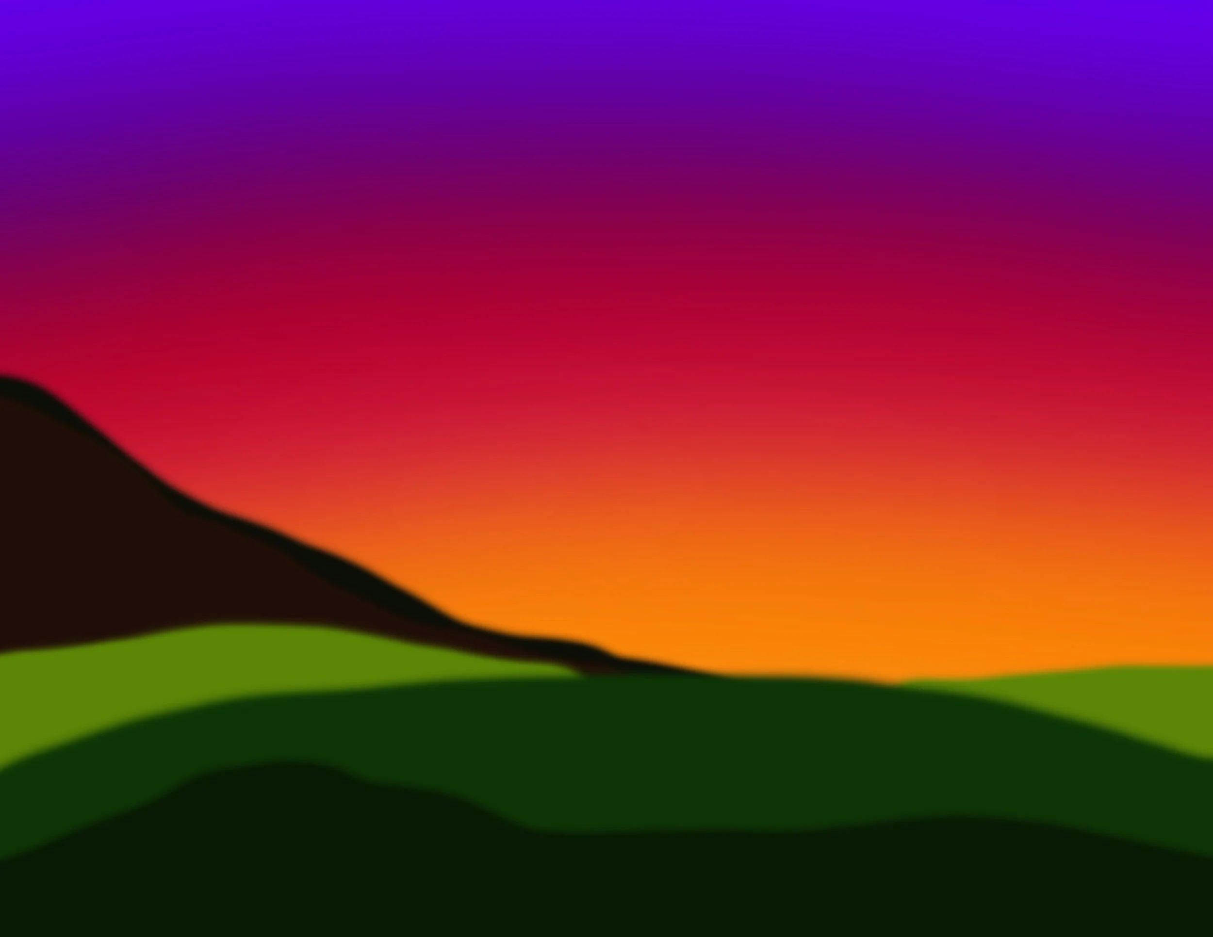
I made big changes from the original idea of this piece. Definitely stepped out of my comfort zone of what I know. I never draw landscapes and I’ve never made an attempt to draw a tree - believe me, you’ll see my attempt from the original.
It’s quite funny looking at it now. I originally had it planned to do the full image of them studying up the tree, but when I tried to transfer the idea into digital form, nothing was connecting in my head for the image I wanted, so I left it.
But then it came to me, too close is too much detail. This scene isn’t about details, it’s about feelings. I wanted to capture the peace before the storm that follows. Right in this very moment, Christopher is happy. The tree isn’t as tall and as beautiful as it is in this, the sunset probably wasn’t as bright and mesmerising, it’s all the illusion of perfection in his mind because his feelings are masking the reality.
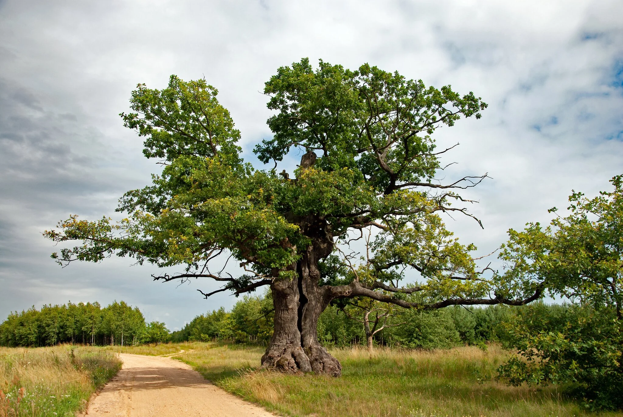
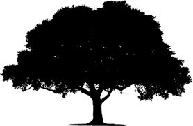
Tree Inspirations
I drifted between two as one had the low hanging branch I was looking for but the other was the silhouette I was trying to create. I used the two to create the perfect tree for the moment (psss, I’m going to tell you a secret. The tree in the distance is the exact same tree just thrown far enough away that you can’t call me out for being lazy. Lazy … or resourceful?).
Experimenting with Tones
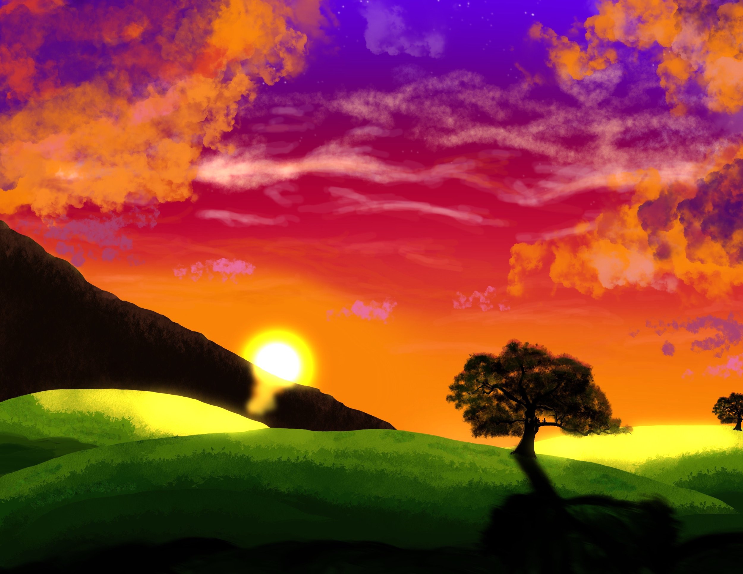
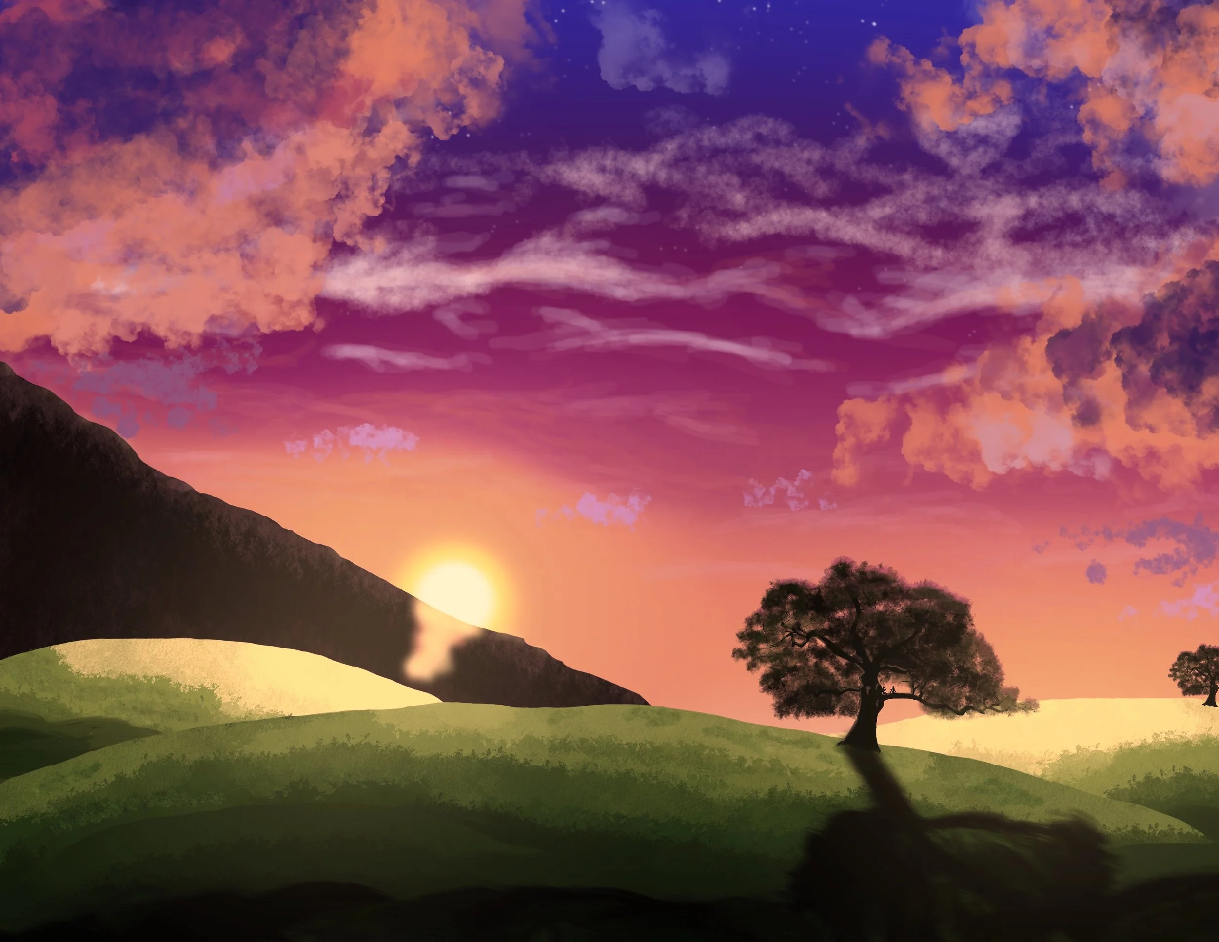
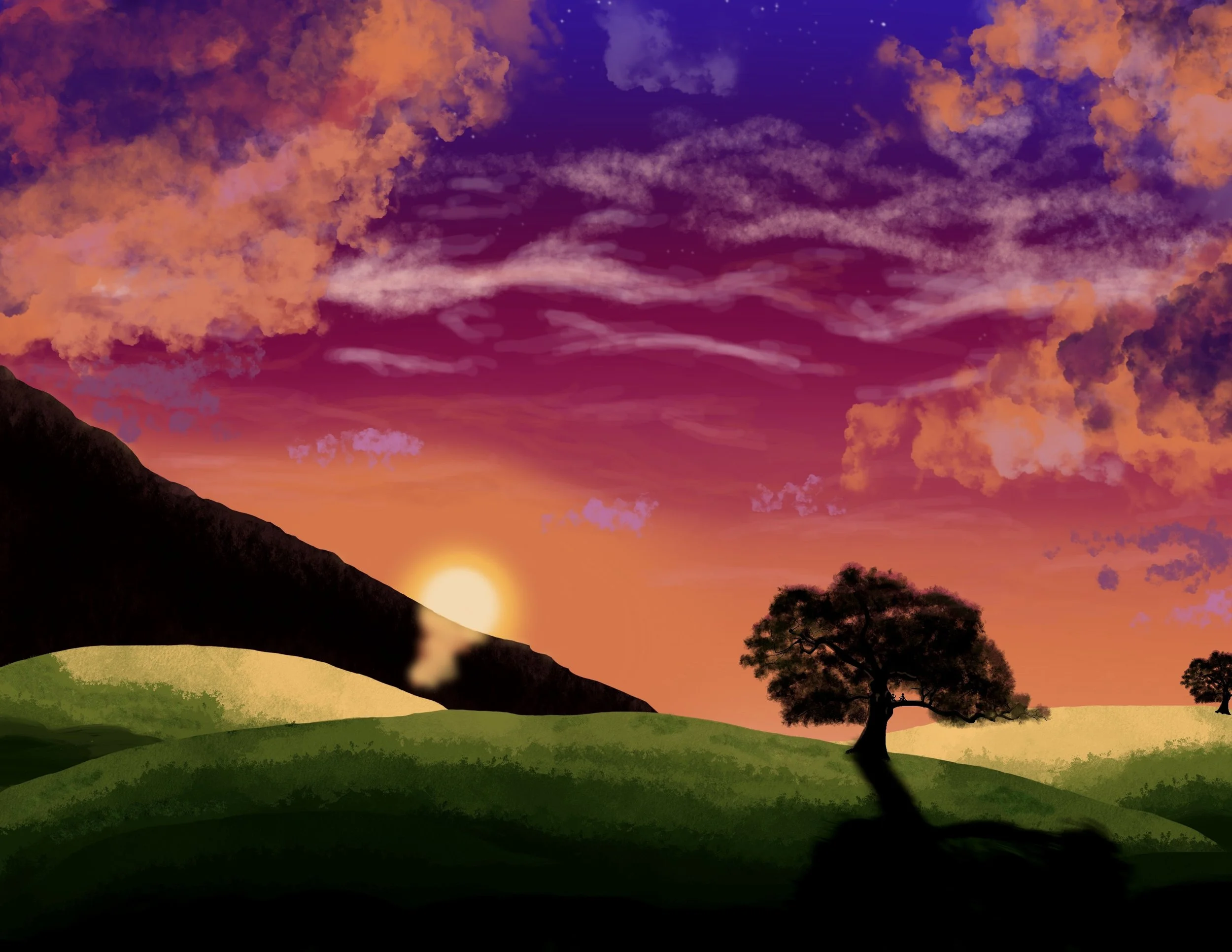
I drifted between using the ‘bloom’ intensity of the sunset and there was a part of me that was only going to use the cooler toned piece - as it matched the calmness I was looking for, but I liked the original colours, too, and my friend said the same, which is where I got the idea to split the text into ‘scenes’.
Colours and Textures
Building a scene. Not my strong-suit in art, but I trudged along to find a way. I started off by looking up how to blend a sunset sky where I learnt to do strips of colour and use a blurring tool to blend them together into a haze.
I then searched up how to make clouds. I’ll be honest, I don’t remember what tool I used, but I think I put it onto a low colour intensity so it was giving a lighter effect. It must have been a chock tool of some kind to create the fluffiness in the background. Apologies, but as useless as this information was, just know that when I go to try and make clouds again … I’m not going to remember either.

And of course, I added the texture onto the grass. I used the layers to allow myself to overlap without spilling the wrong shadows onto the other hills. This was the same when I decided to add texture to the mountain. When I’m walking into new territory, I tend to take it steps at a time. I’m a little bit of a perfectionist, so when I first create something, I usually dislike it when I’m comparing it to better things, but when I come back a day later with a fresh pair of eyes I go, “Huh … did I do that? I remember hating this … but it’s actually decent.”.
You Liked This?
Check out the others!
That’s it for now in the ‘Hidden Words’ front, but more things may come in the future. Keep up with my work and who knows, maybe there will be more.
I hope you enjoyed, thank you for making it to the end. I know I waffle a lot. :)
-
![]()
Art Page
Return to th beginning of the page.
-
![]()
The Curse of The Darkest Flame
Explanations for the teasers.